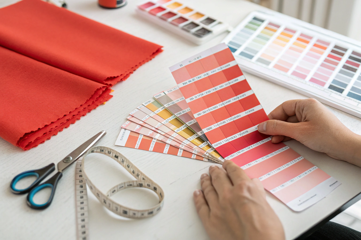
You’ve spent months refining your brand’s color palette. That specific shade of "Dusty Rose" is the cornerstone of your entire Spring collection. You spec it as Pantone 15-1624 TPX. You send the Pantone number to three different fabric suppliers. Supplier A sends back a swatch that looks like bubblegum pink. Supplier B sends a swatch that looks like peach. Supplier C sends a swatch that’s "close," but under your office lights, it has a weird greenish undertone. You’re not just off by a shade. You’re in a different universe. And the launch clock is ticking.
Here is the harsh truth about Pantone matching in textiles: Pantone is a printing standard, not a textile standard. The Pantone books are printed with ink on paper. You are asking a factory to replicate that color using dyes on yarn or fabric. The physics are completely different. Paper reflects light one way. Textured cotton reflects light another way. A "perfect match" is a negotiation between chemistry, physics, and budget.
I’m Jack, and I run Shanghai Fumao. I’ve managed the color matching process for thousands of custom fabric orders. I’ve seen the frustration in designers’ eyes when a lab dip is "just not right." I’m going to walk you through the specific, technical steps you need to take to get a commercially acceptable Pantone match—and how to know when you’re asking for the impossible.
What Is the Difference Between Pantone TCX and TPX for Fabric?
This is the first and most critical piece of education for any fabric buyer. When you pull a color from your Pantone Formula Guide, you are likely looking at a Coated or Uncoated paper chip. But Pantone has a specific system for textiles called the Fashion, Home + Interiors system. And within that system, there are two very different physical formats: TCX and TPX.
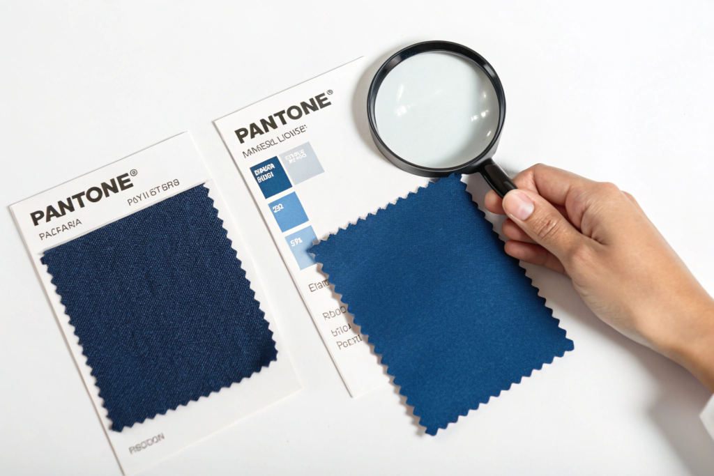
- Pantone TCX (Textile Cotton eXtended): This is a physical swatch of 100% Cotton Twill Fabric dyed to the specific color. It is the Gold Standard for fabric matching. Why? Because the dyer can look at the TCX swatch and see exactly how the color behaves on a textile substrate. They can see the white fibers that don’t fully dye, the way light catches the weave.
- Pantone TPX (Textile Paper eXtended): This is Ink Printed on Paper. It is a reference guide, not a matching standard. It’s useful for inspiration and for communicating with graphic designers. But it is Useless for a textile dyer to match against.
If you send a dyer a TPX number (or worse, a "C" or "U" number from a graphics book), you are giving them an impossible task. They are trying to hit a target that doesn’t exist in their medium. It’s like asking a baker to replicate the exact taste of a photograph of a cake.
At Shanghai Fumao, our first question when a client gives us a Pantone reference is always: "Is that a TCX reference? If not, do you have a physical TCX swatch we can purchase, or would you like us to match to a physical cutting of your own fabric?" We refuse to work from TPX paper for critical color approvals. It’s a recipe for disaster.
Why Does a "Paper" Pantone Never Match the "Fabric" Pantone?
This is the Metamerism Trap on a fundamental level. The ink used to print the Pantone book is a mixture of Pigments. Textile dyes are Dyestuffs. They absorb and reflect light differently. Even if you have the exact same TCX color in both paper and fabric formats, they will look different under certain lights.
Furthermore, the Gloss of the paper affects perception. A glossy paper reflects more light, making the color look brighter. A matte cotton twill absorbs light, making the color look slightly duller. This is why a professional color matcher never looks at a paper swatch and a fabric swatch at the same time expecting them to be identical. They are different things.
You need to invest in the right tools. If you are a serious brand, you need the Pantone Cotton Swatch Set (the big ring binders with actual fabric chips). Yes, they are expensive (several hundred dollars). But they are cheaper than a single container of off-shade fabric that you can’t sell. You can explore the official product line by visiting the Pantone Fashion, Home + Interiors color system explained and learning how to use Pantone TCX cotton swatches for textile color development.
Can You Match a Pantone Color on Polyester, Nylon, or Silk?
This is where it gets even more complex. The Pantone TCX swatch is made on Cotton. Cotton is dyed with Reactive Dyes in a hot water bath.
- Polyester: Dyed with Disperse Dyes under high pressure and high heat (130°C). The color gamut (range of achievable colors) for disperse dyes is different from reactive dyes. Some brilliant, clean shades of pink and turquoise that are easy on cotton are Impossible on polyester. They will always look slightly muddy or dull.
- Nylon: Dyed with Acid Dyes. Nylon takes color brilliantly, but it has a different Luster (shininess) than cotton, which changes the perception.
- Silk: Dyed with Acid Dyes. Silk reflects light in a unique, multi-layered way due to its triangular fiber shape. A color on silk will always look brighter and more luminous than the same dye on cotton.
At Shanghai Fumao, we manage expectations on this from day one. We tell clients: "We can match the Pantone 19-4052 Classic Blue TCX intent on your polyester satin. But it will not look exactly like the cotton swatch. The texture and luster will give it a different character." We then provide a Lab Dip on the Actual Substrate for approval. This is the only way to see the true color.
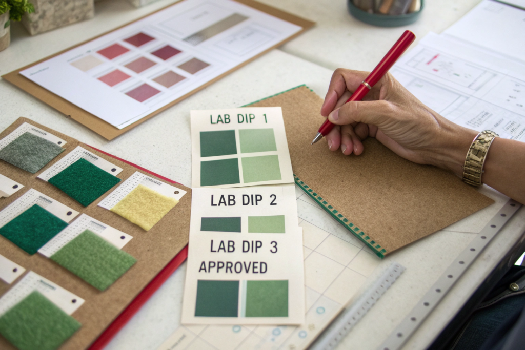
How Many Lab Dips Should You Expect Before Approval?
The lab dip process is the Scientific Iteration of color matching. You provide the target. The dye house mixes a small batch of dye and colors a small piece of your actual fabric. They send it to you. You look at it. It’s probably not perfect on the first try. This is normal. This is expected.
The question is: How many rounds is reasonable, and who pays for them?
A complex color on a tricky substrate (like a dusty rose on linen) might take 3 to 4 rounds to perfect. A simple navy blue on cotton might take 1 to 2 rounds. If you’re on round 7 and it’s still not right, there’s a fundamental problem: either the dyer isn’t skilled, the Pantone target is unachievable on that fiber, or you are being too picky.
At Shanghai Fumao, our policy is transparent:
- First 2-3 Lab Dips: Free of Charge for qualified bulk orders. This is the cost of doing business. We want to get the color right.
- Excessive Lab Dips (4+): We charge a Nominal Fee (usually $30-$50 per round). Why? Because each round consumes dyestuff, water, energy, and skilled labor time. If we didn’t charge for excessive dips, some clients would request 10 rounds for a 200-yard order. That’s not sustainable for us.
This fee structure also serves a purpose. It forces the buyer to be Decisive. You can’t just say, "Hmm, I don’t know, maybe a touch more red?" You have to give specific, actionable feedback. "Lab Dip 3 is too yellow. Please move towards Lab Dip 2, but reduce the brightness by 10%."
What Is the Difference Between a "Lab Dip" and a "Strike-Off"?
This is a common point of confusion, especially with printed fabrics.
- Lab Dip: This is for Solid Dyed fabric. It’s a small piece of fabric dyed in a beaker. It shows the color.
- Strike-Off: This is for Printed fabric. It’s a small sample of the actual print on the actual fabric. It shows the color and the design registration (how the colors line up). A strike-off is made on a small sample printing machine, not the giant production rotary screen.
You cannot approve a printed fabric from a lab dip. You must see a Strike-Off. The strike-off reveals if the red flower overlaps the green stem, or if the fine details are blurry.
At Shanghai Fumao, we provide Digital Approvals for layout, followed by Physical Strike-Offs for final color and registration approval. We do not proceed to bulk printing without a signed physical strike-off. This is the "lock" that protects both us and the client. You can read more about the process by exploring the difference between lab dips and strike-offs in textile printing and how to evaluate a strike-off for color and registration accuracy.
How Do You Communicate Color Feedback Effectively?
Sending an email that says, "This looks too dark," is useless. The dyer in China is looking at the swatch under different lights, with different eyes. You must speak the language of Colorimetry.
Here are the three dimensions of color feedback:
- Hue: Is it too red? Too blue? Too yellow? Example: "The hue needs to shift slightly from blue-red to yellow-red."
- Chroma (Saturation): Is it too bright/vibrant? Too dull/muddy? Example: "Reduce the chroma by 10%. It’s too clean/bright for the vintage look we want."
- Value (Lightness): Is it too light? Too dark? Example: "Increase the depth/value by 5%. We need a slightly darker, richer shade."
Even better, use a Spectrophotometer reading. If you have access to a digital color reader (like a Pantone Capsure or a Datacolor ColorReader), you can send the *Lab Values** (CIELAB color space) of the approved target. This is a digital fingerprint of the color that transcends human language and lighting conditions.
At Shanghai Fumao, when a client sends us Lab values, the match rate on the first lab dip jumps from 60% to 90%. It removes the guesswork. It’s the difference between "I think it’s a bit green" and "The a value needs to move from -2.5 to -1.8." Precision leads to speed.
How Do You Ensure Bulk Production Matches the Approved Lab Dip?
This is the moment of truth. You approved Lab Dip #3. It’s perfect. Six weeks later, the bulk fabric arrives. The color is Off. It’s a shade lighter. Or the undertone is wrong. You’re furious. You think the factory "bait and switched" you.
In reality, what usually happened is Scale-Up Error. The lab dip was made in a 5-Gram Beaker. The bulk was made in a 500-Kilogram Kettle. The physics of heat transfer, liquor flow, and dye exhaustion are completely different at scale. The recipe that worked in the beaker doesn’t work in the kettle.
A professional dye house knows this. They use Engineered Corrections. They don’t just throw the beaker recipe into the big machine. They run a Pilot Sample (50-100 meters) on a small production machine first. They adjust the recipe for the scale-up effect.
At Shanghai Fumao, we have a Scale-Up Database. We track how specific dyes behave when moving from beaker to bulk. For example, we know that Reactive Blue 19 builds depth faster in bulk than in the lab. So we automatically reduce its concentration by 2% in the bulk recipe. This is institutional knowledge that prevents bulk shade issues.
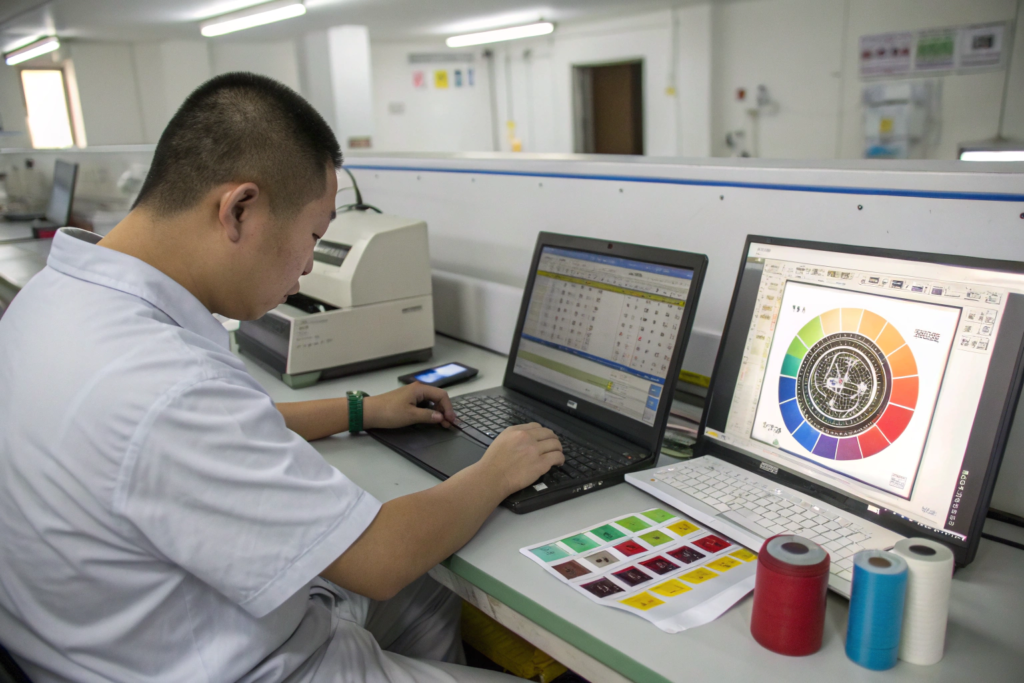
What Is a "Spectrophotometer Reading" and Why Does It Matter?
A spectrophotometer is a digital eye. It shines a calibrated light on the fabric and measures the exact wavelengths of light that are reflected back. It generates a Reflectance Curve and CIELAB Values (L, a, b, C, h°).
Here is why this matters more than your human eye:
- Objectivity: Your eyes are tired. The office lights are warm. You had a fight with your spouse. Your perception of color changes. The spectrophotometer does not have feelings. It is consistent.
- Pass/Fail Tolerance: You can set a Delta E (dE) Tolerance. Delta E is the mathematical difference between the target color and the bulk color.
- dE < 0.5: Invisible difference. Perfect match.
- dE 0.5 – 1.0: Visible only to a trained eye under perfect lights. Commercially acceptable for most apparel.
- dE 1.0 – 1.5: Visible to most observers. Acceptable for casualwear, not for formal suiting.
- dE > 1.5: Obvious difference. Reject.
At Shanghai Fumao, we measure every single bulk dye lot against the Approved Lab Dip Master Standard using a spectrophotometer. We provide the dE Value on the inspection report. If the dE is under 1.0, we ship. If it’s over 1.0, we don’t ship without the client’s written consent. This is objective quality control. You can learn more by reading how to use spectrophotometers for textile color quality control and understanding Delta E color tolerances in manufacturing.
How Do You Handle Metamerism in Bulk Production?
Metamerism is when two colors match under one light source (e.g., store fluorescent) but look different under another (e.g., daylight). You approved the lab dip under your office LED lights. The bulk fabric looks fine under our factory D65 lights. But when you take it outside, it’s a disaster.
The only defense against metamerism is to Specify the Primary Light Source for approval. At Shanghai Fumao, our standard is D65 (Artificial Daylight) . We ask clients to also check the lab dip under A (Incandescent Home Light) and F (Cool White Fluorescent) . If the match holds under all three, the fabric is Non-Metameric. If it fails under one, we have a conversation about which light source is most important for the garment’s end-use.
There is no magic fix for metamerism. It’s a property of the dyestuffs. To fix it, you have to change the dye recipe, often at a higher cost. The key is to find it during the lab dip stage, not during bulk inspection. This is why we always recommend clients view lab dips in the environment closest to where the garment will be worn or sold.
What Are the Alternatives If a Pantone Match Is Impossible?
Sometimes, the honest answer is: "This Pantone color cannot be dyed on this fabric." It’s not a failure of skill. It’s a limitation of chemistry. Fluorescent neon colors, for example, are almost impossible to achieve with standard reactive dyes on cotton. They require Fluorescent Pigments which sit on top of the fiber (coating) or are printed.
A professional supplier will tell you this before you waste three weeks on lab dips. They will offer Engineered Alternatives.
At Shanghai Fumao, we don’t just say "No." We say, "We can’t dye it, but here is how we can achieve that look."
Alternative 1: Printing the Solid Color. If you need a specific, brilliant Pantone on cotton, and dyeing won’t work, we can Print the fabric with that solid color using pigment inks. This is more expensive than dyeing and the hand feel is slightly different (the print sits on the surface), but the color accuracy is extremely high.
Alternative 2: Substrate Shift. "We can’t hit this on 100% Cotton. But we can hit it on a Cotton/Polyester Blend or 100% Polyester Satin ." The synthetic fiber often takes brighter, cleaner colors. If the drape and end-use allow it, switching the substrate solves the color problem.
Alternative 3: The Nearest Commercial Match. "Pantone 18-1664 TCX (Fiery Red) is not achievable on this linen. The closest commercial match we can achieve is this." We send a swatch of the closest possible shade. Often, the designer looks at it and says, "Actually, this is better. It’s more sophisticated." The Pantone is a starting point, not a prison.
Is "Pantone Validated" or "Pantone Licensed" Fabric Worth the Cost?
You may see some mills offering "Pantone Validated" fabrics. This means Pantone has certified that the mill’s color management process meets their standards, and the specific color is an official match. This comes at a premium cost.
For 95% of brands, this is Overkill. It’s necessary for corporate branding (e.g., Tiffany Blue, T-Mobile Magenta) where legal color consistency is required across all materials worldwide. For a fashion brand, a commercially acceptable match (dE < 1.0) achieved through standard lab dip process is perfectly sufficient.
At Shanghai Fumao, we follow Pantone’s recommended workflow and use their physical TCX standards. We achieve excellent matches daily. But we are not "Pantone Licensed" for every shade. We are transparent about this. We focus on delivering Commercial Accuracy at a Competitive Price. You can read more about this by looking at the Pantone Validated and Pantone Licensed textile programs.
Conclusion
Matching Pantone colors on fabric is one of the most demanding and technical aspects of apparel sourcing. It requires a shared language, the right physical tools (TCX swatches), and a realistic understanding of the chemistry involved. The goal is not "perfection" in the abstract. The goal is a Commercially Acceptable Match that honors the design intent and protects the brand’s identity.
The secret is in the process: Start with a TCX swatch. Expect 2-3 lab dips. Use objective language (or Lab* data) for feedback. Approve a pilot sample before bulk. And know when to accept a substrate shift or a print solution. This is the disciplined path to a color-accurate supply chain.
At Shanghai Fumao, we love color. We have the spectrophotometers, the skilled dyers, and the patience to navigate this process with you. We won’t promise you a match that physics can’t deliver. But we will work tirelessly to get you as close as humanly possible, and we will be transparent with you every step of the way.
If you have a challenging Pantone color and you’re tired of getting swatches that miss the mark, let’s put our lab to the test. Send us your TCX reference and your fabric specs. Our Business Director, Elaine, can coordinate a set of lab dips and show you what a disciplined color matching process looks like. You can email her at elaine@fumaoclothing.com. Let’s bring your palette to life, accurately.