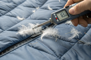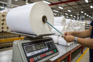
Let me tell you about a panic call I got last spring. A client in Los Angeles—a streetwear brand owner—had just received 5,000 custom hoodies. The fabric was a beautiful, muted Sage Green fleece we had developed for them. The logo embroidery? It was Bright Mint Green. It looked like a highlighter on a forest floor. It was supposed to be a Tone-on-Tone logo. Subtle. Premium. Instead, it was a billboard for a color mismatch. The client was looking at a $45,000 chargeback from their retail partner. And the worst part? The thread supplier in China had matched the color based on a JPEG photo the client had emailed them.
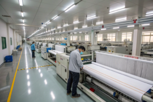
This happens all the time. And it breaks my heart because it's 100% preventable. You spend weeks, maybe months, perfecting the hand feel of the fleece, the fit of the hoodie, the GSM of the jersey. Then you slap a logo on it with thread that looks like it was chosen by a colorblind intern. In the world of custom apparel, the logo is the punctuation mark on your brand sentence. If it's wrong, the whole statement looks sloppy. At Shanghai Fumao, we don't just weave and dye fabric. We manage the whole package, including embroidery and printing coordination. I've learned the hard way that "matching" thread is a science, not an art. Let me walk you through the exact process we use to make sure the thread melts into the fabric or pops exactly the right amount.
Why Is Thread Color Matching Different from Fabric Dyeing?
Here's the fundamental disconnect that causes 90% of thread matching disasters. Fabric is Porous. Thread is Solid. When you dye a piece of cotton fabric, the dye soaks into the fiber. The surface is slightly fuzzy, it traps light, it scatters it. It looks matte and deep. When you make polyester embroidery thread, you are extruding Plastic. It's a solid, continuous filament. It's shiny. It reflects light like a mirror.
You can have a fabric and a thread that measure exactly the same on a spectrophotometer—the machine says the color formula is identical—and yet, to your eye, they look like two different colors. Why? Luster. The thread will always look brighter and lighter than the fabric because of that sheen. This effect is even stronger with Rayon/Viscose Thread (which is super high-sheen) compared to Polyester Thread (which is slightly duller).
And it gets more complicated. Fabric is almost never a single color. It's a blend of fibers that take dye differently. A "Navy" cotton/poly fleece has a Heathered effect because the cotton dyes dark blue and the poly stays white. The thread is a solid, flat navy. Against that heathered background, the thread will look Too Dark and Too Flat. This is why you can't just pull a Pantone number off the fabric lab dip and order thread in that Pantone number. You have to understand the physics of light hitting different surfaces.
How Does Luster Affect Thread Appearance on Matte Fabric?
Let's talk about Light Reflectance Value (LRV) . This is a measure of how much light a surface bounces back. Matte Cotton Fleece has an LRV of maybe 4-6%. Polyester Embroidery Thread has an LRV of 20-40%. That's a massive jump. Your eye interprets "more light bounce" as "lighter color."
I learned this lesson the hard way in 2019 with a client who wanted Black on Black embroidery for a luxury loungewear line. They wanted it subtle. We used standard Black Polyester Thread on a Carbon Black Brushed Fleece. The result? The logo looked Shiny Grey. It wasn't black. It was a glossy, reflective silver-grey against a deep matte black background. It ruined the stealth-wealth vibe they were going for.
The Fix We Use Now at Shanghai Fumao:
When a client wants a tone-on-tone or tonal look on a matte fabric, we almost always recommend stepping One Shade Darker or Two Shades Darker in the thread color. This compensates for the luster.
Here is a table from our internal QC manual that illustrates this adjustment:
| Fabric Appearance | Desired Look | Thread Choice Recommendation |
|---|---|---|
| Matte Black Fleece | Tonal/Subtle Logo | Dark Charcoal Thread (Looks like faded black) |
| Matte Black Fleece | True Black Logo | Black Thread + Matte Finish Additive |
| Heathered Grey Jersey | Matching Grey Logo | Thread matches the Darkest fiber in the heather |
| Bright White Cotton | Crisp White Logo | Bright White Poly Thread (Matches well due to high contrast) |
I always tell my clients: If you want the logo to disappear, use Matte Finish Embroidery Thread. It costs about 10-15% more, and the color range is smaller, but it eliminates that plastic sheen. It looks much closer to the fabric's natural reflection. If you're using standard thread, expect it to look 10-20% lighter than the fabric swatch. This article dives deep into the technical differences: understanding thread luster and its effect on perceived color in embroidery. And for a more visual comparison, this guide to choosing between rayon and polyester thread for specific fabric types is quite helpful.
Why Do Heathered and Melange Fabrics Trick the Eye?
Heathered fabric is the ultimate thread matcher's nightmare. It's made by twisting dyed fibers with undyed (white) fibers before spinning the yarn. So at a distance of 3 feet, it looks like a solid Burgundy. But get up close, and you see it's a mix of deep red fibers and tiny white specks.
Your eye averages this out. The embroidery machine does not. It lays down a solid, opaque line of 100% burgundy thread. That solid line of thread will Always Look Darker and More Saturated than the heathered fabric surrounding it. It will stand out like a sore thumb.
The QC Checklist for Heathered Matching:
- Identify the Dominant Fiber: Is the heather 70% Red / 30% White? Or 50/50?
- Match to the "Deep" Tone: If you pick a thread that matches the average color, it will look too bright. You need to match the thread to the Darkest Red Fiber in that mix. The white fibers will provide the contrast in the fabric, and the dark thread will anchor the logo.
- Test on a 12" x 12" Swatch: You cannot judge a thread match on a 1-inch snipping. The heather effect needs space to "breathe" visually. You need a swatch big enough to see the overall fabric effect.
I had a client in 2024 making custom corporate fleece vests in a "Charcoal Heather." The thread supplier matched it perfectly to a Pantone chip of the average grey. When embroidered, it looked like a black logo on a grey vest. We had to strip the test garments and re-embroider with a thread that matched the darkest charcoal fiber in the yarn. The new thread looked too dark on the cone, but perfect on the garment. This is a great resource for understanding the manufacturing side: how heathered yarns are made and why they affect print and embroidery color matching. And for a practical guide on design, this discussion on embroidering on heathered fabrics and thread selection tips is a good read.
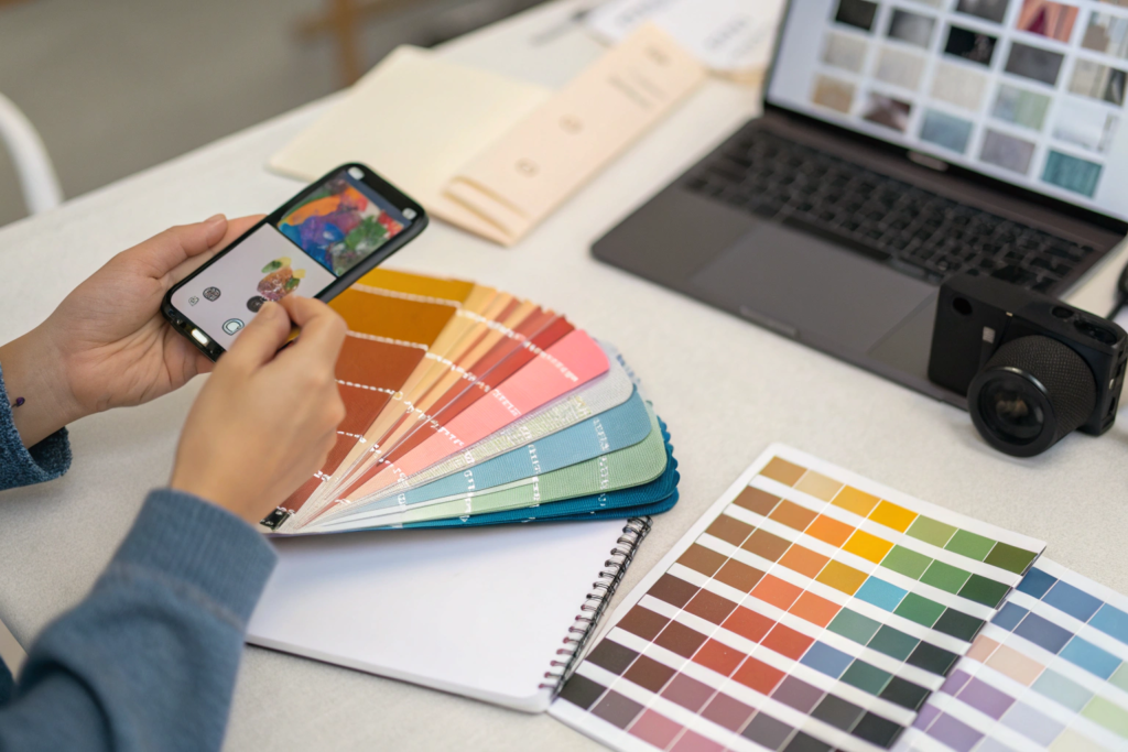
How to Use Pantone and Thread Color Cards for Approval?
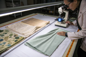
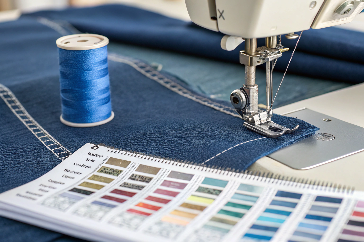
Alright, we know the fabric lies to the eye. So how do we communicate color across 7,000 miles and two different languages? You need Physical References. Not JPEGs. Not iPhone photos. Physical Swatches.
At Shanghai Fumao, we have a library of thread color cards from major manufacturers like Madeira, Gunold, and Coats. These aren't printed pictures of thread. They are Actual Thread Samples wrapped on a card. And we have Pantone TCX (Textile Cotton) books. The process of matching thread to fabric is a three-step tango between the Fabric Swatch, the Pantone Book, and the Thread Card.
You cannot skip a step. If you try to go straight from "Fabric Lab Dip" to "Buy Thread," you will fail. You need the intermediate step of the Pantone Number as a universal translator.
What Is the Difference Between Pantone TCX and TPX for Thread?
This is a technical detail that makes a huge difference in accuracy. If you've ever seen a Pantone book, you've seen the letters TCX or TPX on the back of the chip.
- TPX (Textile Paper eXtended): This is Ink on Paper. It's for graphic designers making mood boards and tech packs. The color is vibrant and flat.
- TCX (Textile Cotton eXtended): This is Dye on Cotton Fabric. It's a physical swatch of dyed cotton twill. It has texture. It has matte reflection.
Why This Matters for Thread Matching:
If you give a thread supplier a TPX number, they are matching their thread to a Piece of Shiny Paper. The thread will come out looking like shiny paper—bright and plasticky. If you give them a TCX number, they are matching their thread to a Piece of Fabric. The thread will still be shinier than the TCX swatch (because it's plastic vs. cotton), but the undertone will be correct.
My Golden Rule:
Always, always, always reference Pantone TCX when communicating with a textile mill or embroidery house. And better yet, send the physical TCX swatch with your PO. They cost about $15 each. It's the cheapest insurance policy in the business.
I had a US client who sent me a spec sheet with "Pantone 19-4052 TPX" for a classic navy thread. I called him and said, "I need the TCX reference, or I need you to pick a thread from this Madeira card." He was confused. He thought all Pantones were the same. We waited the extra three days for him to get the TCX book and confirm the number. The thread matched the fabric perfectly. If we had gone with the TPX match, the thread would have been a "Cobalt Blue" instead of a "Classic Navy." You can read more about the specific applications here: Pantone TCX vs TPX explained for textile and fashion designers. And for the thread side, this explanation of how embroidery thread manufacturers map their colors to Pantone values is very useful.
How to Approve a Thread Color Without a Physical Sample?
(Here's where I sigh heavily.) Ideally, you do a Strike-Off. You send us the fabric, we sew the logo with 2-3 thread options, and we FedEx it to you. That takes 5-7 days and costs $40 in shipping. It's the Right Way.
But sometimes, you're launching a pre-order in 72 hours and you need to lock the thread spec Now. You can't wait for DHL. In that emergency scenario, you can use Digital Approval, but you have to do it scientifically.
The Emergency Remote Approval Protocol:
- The Photo Setup: Do NOT take the photo in your yellow-lit living room at night.
- Lighting: Use Indirect Daylight (stand near a north-facing window) or a 5000K Daylight Bulb.
- Neutral Background: Use a Grey Card (18% grey) as the background. If you don't have one, use a plain white piece of printer paper. This helps the supplier's eye calibrate to the white balance of the photo.
- The Arrangement: Lay the Fabric Swatch flat. Lay the Thread on top in a Thick Layer (not a single strand—it looks too thin and dark). Place the Pantone TCX Chip next to it.
- The Disclaimer: I always tell clients: "I will approve this based on this photo with the understanding that the physical match may vary by 1 shade level. We accept no liability for exact match unless a physical strike-off is approved."
I did this with a Canadian yoga brand last month. They needed a "Dusty Rose" thread for a launch event. We used the photo protocol. I sent them three thread choices laid out on their actual fabric (which I had in my Keqiao office). They picked #2. It was 95% right. It saved the launch. But for the bulk 10,000 unit order? We waited for the physical strike-off. For more tips on this process, check out this guide on how to take accurate color photos of fabric and thread for remote approval. And this article on the limitations of digital color matching and why physical samples are essential is a sobering read.
What Are the Technical Requirements for Embroidery Thread Quality?
Color is only half the battle. The thread also has to Perform. You can have the most perfectly matched shade of navy thread in the world, but if it snaps every 50 stitches, or if the spool is full of knots, your production grinds to a halt. And in a US embroidery shop where machine time is billed at $60-$100 an hour, a bad cone of thread wipes out your margin faster than a bad color match.
There are two specific specifications you should care about: Thread Weight (WT) and Colorfastness/Bleeding. These are the technical specs that separate a professional job from a hobbyist job. Let me break down why "40 Weight" is the magic number and why you should test that red thread before it ruins a white t-shirt.
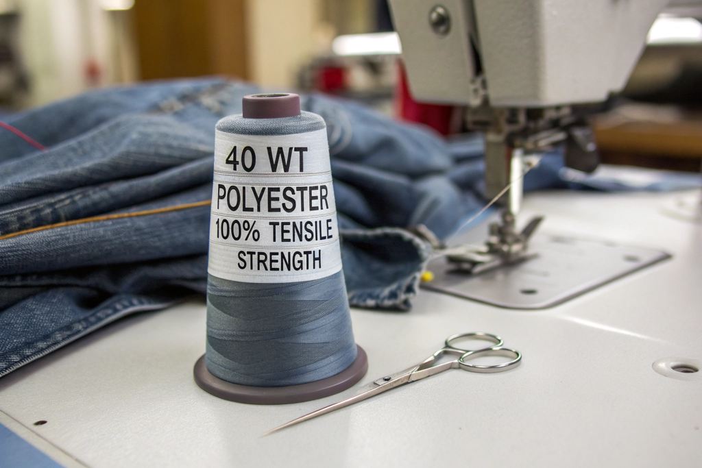
Why Does Thread Weight (40 WT) Matter for Logo Detail?
Thread weight is confusing because the number is Inverse. A higher number means Thinner thread. A lower number means Thicker thread.
- 60 WT: Very fine thread. Used for small lettering (like care labels or tiny chest logos). It breaks easily if the machine tension is too high.
- 40 WT: The Industry Standard. This is the workhorse for 90% of corporate logos and apparel decoration. It provides good coverage and runs reliably.
- 30 WT: Heavy, thick thread. Used for "puff" embroidery or heavy denim logos. Makes a bold statement.
If you specify a Tiny Serif Font for a chest logo (say, 0.25 inches tall) but the factory uses standard 40 WT thread, the inside of the letters 'e' and 'a' will fill in. It will look like a blob. You need 60 WT thread for that level of detail.
The Conversation I Have Every Week:
Client: "I want this intricate logo on the left chest. Width: 2 inches."
Me: "Okay, but this text is too small for standard thread. It will bleed together."
Client: "Can't you just make the needle smaller?"
Me: "The needle is already small. The thread is the limitation. We need to either simplify the logo (remove the small text) or increase the logo size to 3 inches wide."
We print a lot of workwear for a US uniform company. Their logo has a small, detailed wrench icon. We had to switch their spec from standard 40 WT Polyester to a Fine Denier 60 WT Poly to get the wrench teeth to look crisp. The thread cost was the same, but the digitizing file (the instructions for the machine) had to be completely re-done with fewer stitches to prevent the fine thread from cutting the fabric. This is a deep dive into the technical side: understanding embroidery thread weight and choosing the right needle size. And for a visual comparison, this chart showing how different thread weights look when stitched out is excellent.
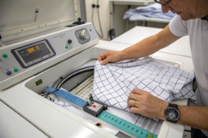
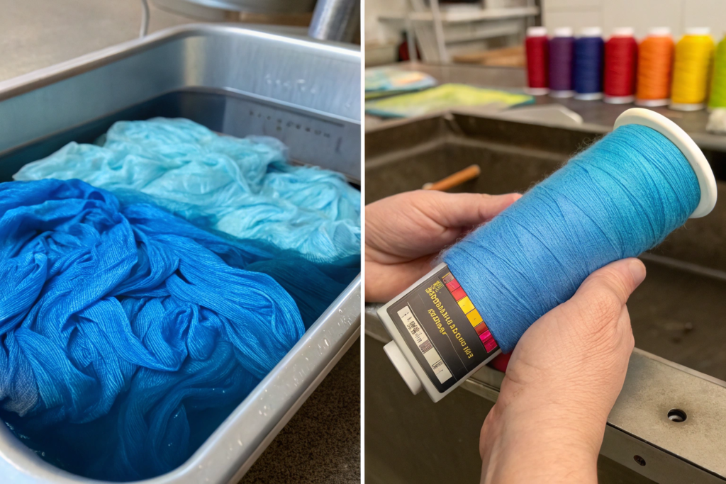
How to Test Embroidery Thread for Colorfastness to Bleeding?
This is the nightmare scenario. You embroider a beautiful Red Logo on a White Cotton T-Shirt. You ship it. The customer washes it in warm water. The red dye from the cheap polyester thread Bleeds into the white fabric. The white t-shirt is now a pink t-shirt with a red logo. That's a 100% return rate.
Polyester thread is Solution-Dyed. This means the color pigment is mixed into the liquid plastic before it's extruded into a filament. It should Never Bleed. It's colorfast to chlorine bleach, even. Rayon/Viscose Thread is different. It's a natural fiber that is dyed after the filament is made. It Can Bleed. Especially dark colors like Navy, Burgundy, and Black on light fabrics.
The Wet Crock Test (Do This Before Bulk Production):
- Embroider a 2-inch square block of the thread on a swatch of the actual production fabric.
- Wet a white cotton cloth with Warm Water (not cold, not hot—warm).
- Rub the White Cloth Vigorously against the embroidered block for 10 seconds.
- Look at the White Cloth.
- No Color Transfer: Good. Use it.
- Faint Color Transfer: Risky. I would reject for white/light garments.
- Obvious Red/Pink Smear: Do Not Use. It will ruin the garment.
I had a European client who was using a cheap unbranded red thread for a "Made in Italy" label on cream linen. The thread bled during the first press test. We switched them to Madeira Polyneon #40. Problem solved. It cost $0.05 more per garment. This is the standard test method: AATCC Test Method 8 for colorfastness to crocking (rubbing) of textiles. And for a specific look at embroidery issues, this guide to preventing thread bleeding and dye migration in embroidered garments is a must-read.
How to Manage Thread Inventory and Lot Consistency?
Okay, you've done the hard work. You approved the physical strike-off. The color is perfect. The quality is perfect. You place a bulk order for 5,000 units. Three months later, you do a re-order of 5,000 units. The fabric from Shanghai Fumao matches the first batch perfectly because we track our dye lot numbers obsessively. But the logo? It's slightly "off." It's a tiny bit greener than the first run. Now you have two batches of inventory in your warehouse that don't match. You can't ship them to the same store.
This is the Lot Variation Trap. And it's the most overlooked detail in custom apparel. You manage the fabric lot. You manage the zipper lot. But nobody manages the Thread Lot.
Why Should You Request Thread Lot Reservation for Bulk Orders?
Dyeing thread is a chemical process. Just like dyeing fabric, there are tiny variations between batches. A Cone of "Navy 1982" made in January might be a hair redder than a Cone of "Navy 1982" made in June. The difference is invisible to the eye on the cone, but when it's stitched next to last season's logo, a sharp-eyed customer might notice.
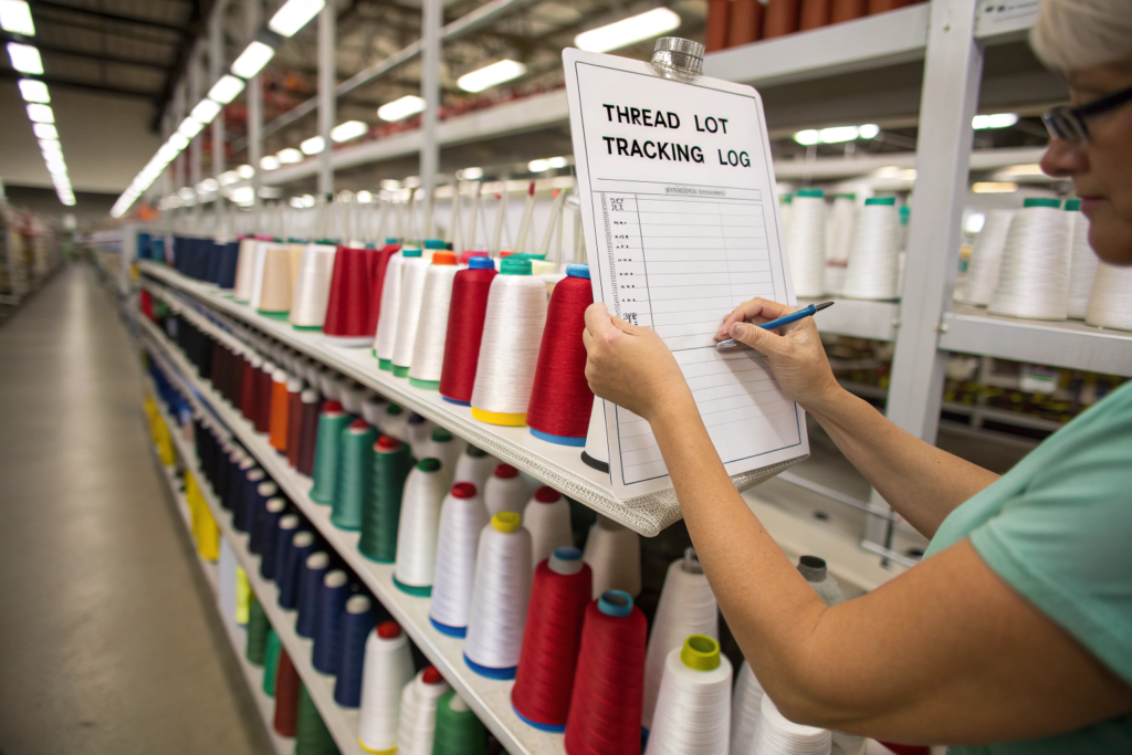
The Solution: Lot Reservation.
When you place a bulk order for 5,000 units with Shanghai Fumao, we do more than just order 5,000 meters of fabric. We calculate the Thread Consumption.
- Formula: Average logo stitch count (e.g., 8,000 stitches) x Number of Units (5,000) = 40,000,000 stitches.
- Cones Needed: About 40 cones (depending on thread weight).
We then ask our thread supplier to Reserve 40 Cones from the Same Dye Lot. They put them in a box with a "Hold for Fumao PO#12345" sticker. If we run short and need 5 more cones, we know to request specifically from that same Lot Number.
I had a client who skipped this. They did a re-order and just bought "Navy Thread" off the shelf at their local US distributor. The new thread was from a different lot. The logo on the new hoodies looked slightly more "Royal Blue." The client was a retailer and their customer noticed the inconsistency online. They had to issue a disclaimer. For the sake of a phone call to the thread supplier, you can avoid this. This is a good overview of the issue: why dye lot consistency matters for professional embroidery results. And for a practical tip, this advice on how to buy thread in bulk and manage inventory for contract embroiderers is very useful.
How to Store Thread to Prevent Color Fading Before Use?
Thread is sensitive to UV Light and Humidity. If you (or your contractor) store the thread cones on a windowsill where the sun hits them every afternoon, the top layers of thread will Fade or Yellow. You'll start a job with a bright white logo, and by the time you reach the bottom of the cone, the thread is a dingy cream color.
I've walked into embroidery shops in LA that look like saunas. The thread is stored in open racks right next to the steaming presses. That heat and moisture degrades the tensile strength of the polyester and makes it Brittle. Brittle thread snaps. Snapping thread causes machine downtime.
The Storage Protocol:
- Keep Thread Covered: Store cones in Closed Cabinets or Plastic Tubs. If you must use open racks, put a Cloth Cover over the front.
- Control Humidity: Keep the shop between 40% and 60% Relative Humidity. If the air is too dry, static builds up and thread sticks to itself. If it's too wet, thread rots.
- First In, First Out (FIFO): Use older cones first. The plasticizers in the polyester can slowly evaporate over years, making the thread slightly stiffer.
We store all thread for Shanghai Fumao's custom programs in a climate-controlled, dark stockroom. It's a small detail, but when you're running 20 heads of embroidery at 1,000 stitches per minute, a broken thread stops the whole machine. Time is money. This resource covers the technical specs: best practices for storing embroidery thread to prevent UV fading and brittleness. And for a more home-studio perspective, this guide to organizing and storing sewing thread for longevity has some good common-sense tips.
Conclusion
Matching thread to fabric is an exercise in managing expectations and controlling physics. You're not just picking a pretty color. You're accounting for the way light bounces off a solid plastic filament versus a fuzzy cotton weave. You're factoring in the visual trickery of heathered yarns. And you're building a system—using Pantone TCX, physical thread cards, and lot reservations—to ensure that the logo on garment 5,000 looks exactly like the logo on garment number 1.
Don't leave this to the last minute. Don't email a JPEG of the fabric and hope for the best. Send a physical swatch. Ask for a strike-off. Understand that "Black on Black" requires a matte finish or a charcoal thread to actually look black. At Shanghai Fumao, we manage this for our clients because we've seen the $45,000 chargeback that happens when you get it wrong. We know the specific thread codes that work on our dyed fabrics, and we have the inventory systems to keep it consistent season after season.
If you're planning a custom embroidery project and you want to make sure the logo looks like it belongs on the fabric—not like it was ironed on as an afterthought—we can help. We coordinate the fabric dye lot with the thread lot and the embroidery file. It's a turnkey solution. Reach out to our Business Director, Elaine, at elaine@fumaoclothing.com. Let's make sure your logo threads the needle perfectly.