Here’s a nightmare scenario I’ve lived through more times than I care to admit. You spend weeks perfecting a bomber jacket in a woven nylon shell and matching knit rib trim. The lab dips look flawless on your desk. Then bulk production lands, and under the boutique lighting, the sleeve looks navy blue while the collar rib looks washed-out purple. Your entire collection looks like a factory seconds sale. The panic sets in because you’ve already booked the photoshoot and the influencer seeding is live. I had a Los Angeles streetwear client call me in tears last March over exactly this—a "matching" black set that looked like two different brands.
The brutal truth is that a Pantone code is not a magic spell. It’s a paper standard viewed under a D65 lightbox. Fabric doesn’t read paper. Knits and wovens are fundamentally different physical structures—one is a snag-prone sponge of loops, the other is a tight grid of interlaced threads. Light hits them differently, dye absorbs differently, and your eye perceives the color differently. If you treat them the same in your tech pack specs, you’re building a quality claim disaster into your supply chain before the first yarn is even spun.
But you can control this. At Shanghai Fumao, we don’t just "match the Pantone." We match the visual end result across two completely different textile architectures. I’m going to show you the optical physics behind why your knit trim looks darker than your woven body, and exactly how we tweak the dye recipe to trick the human eye into seeing a perfect union.
Why Do Knit Fabrics Absorb Dye Differently Than Wovens?
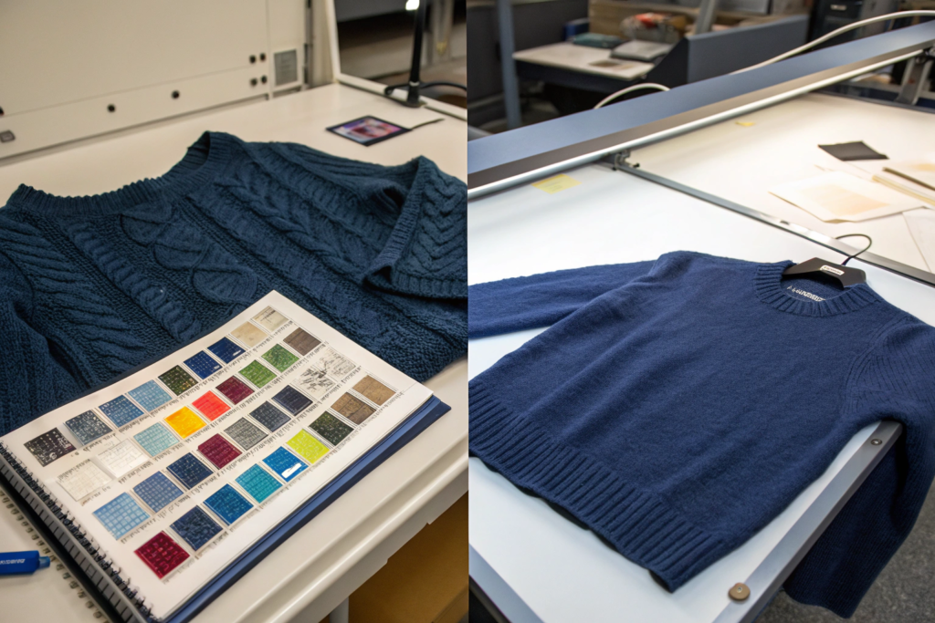
You need to think of knit fabric as a sponge and woven fabric as a mirror. It sounds overly simple, but that mental model will save you thousands of dollars in rejected shipments. A knit is constructed by interlocking loops of yarn. Those loops create a three-dimensional surface full of tiny air pockets and shadows. When light hits a dyed knit, a lot of it gets trapped in those crevices. The light bounces around inside the microscopic architecture of the fabric and eventually gets absorbed. What reflects back to your eye is less intense, so the color looks richer but darker.
A woven is completely different. It’s a grid of warp and weft yarns lying flat and tight against each other. The surface is much smoother, especially if it’s a plain weave or a satin face. Light hits the surface and bounces off directly, like a handball against a concrete wall. More light reflects, so the color appears lighter and sometimes more vibrant. This is why your woven shell fabric will almost always look paler than a knit rib trim dyed in the exact same dye bath. We’ll get into the fix for this, but first you need to understand the raw material factor that complicates it even further.
How Does Yarn Twist and Loop Structure Affect Pantone Perception?
Let’s get technical for a minute, but I’ll keep it practical. The twist level of a yarn changes everything about color. In a knit, we typically use a lower-twist yarn because we want softness and bulk. Low twist means the individual cotton fibers are loosely bound. The surface of that yarn is hairy and fuzzy under a microscope. That fuzz scatters light in every direction. The visual result is a flatter, more matte finish that reads as a darker tone to the human eye.
A woven fabric, particularly a crisp poplin for a dress shirt, uses a high-twist yarn. The fibers are tightly compressed, creating a smoother, more cylindrical yarn surface. It reflects light more efficiently. Add in the loop structure of the knit—specifically, if you’re working with a single jersey, it has a technical face and a technical back that behave differently. The face side of a single jersey knit has vertical columns of "V" shapes that act like tiny funnels for light, absorbing it. The woven, with its over-under grid, doesn’t have these funnels.
I saw this vividly with a sportswear client from Germany developing a cotton-modal blend polo shirt. The body was a pique knit, the collar was a woven twill tape. We used the exact same dye recipe for both. The pique body looked a full shade darker than the collar. We didn’t change the recipe; we changed the surface of the fabric. For the woven collar, we actually de-twisted the yarn slightly and brushed the surface to introduce some fuzz—essentially making the woven act more like a knit optically. The color matched. It’s a counter-intuitive trick, but it works.
- For a deep dive into how yarn twist factors influence fabric luster and dye uptake, check the technical educational resources on the Cotton Incorporated textile knowledge portal.
- To see micro-imaging of knit loop structures and their light scattering properties, explore the microscopy gallery on the Textile Research Journal’s open-access archive.
What Role Does Stenter Finishing Play in Leveling Color Across Textures?
The stenter frame is where we undo the optical damage caused by different textures. It’s a massive oven that dries and sets the fabric width, but we use it as a color correction tool. Here’s how we manipulate it at Shanghai Fumao to bridge the gap between a knit and a woven.
For a woven fabric that looks too pale next to its matching knit trim, we can’t just add more dye—that would ruin the shade. Instead, we adjust the surface reflectivity. We apply a matte finishing agent in the stenter’s chemical pad. Think of it as spraying a matte clear coat on a glossy painting. The matte agent contains microscopic silica particles that roughen the surface of the woven just enough to scatter light. The woven instantly looks darker and more saturated, moving closer to the knit’s deep tone.
Conversely, if a knit rib trim looks too dark and dull against a vibrant satin woven, we might run it through the stenter with a high-silicone softener and pass it over a friction calendar roller. The silicone coats the fuzzy fibers, making them slick and reflective. The calendar roller physically irons down the surface loops, creating a flatter, more light-reflective face. The knit then appears lighter and more lustrous. It’s a physical manipulation of surface geometry, not a chemical change to the dye. I had our finishing department run a trial last summer for a lingerie client. The black stretch woven satin shell and the black power mesh knit lining looked like two different shades of black straight out of the dye bath. We calender-finished the power mesh three times, progressively ironing the surface. By the third pass, the mesh was reflecting enough light to match the satin’s sheen, and the black tones unified perfectly.
- Learn about the chemical effects of matte finishing agents on textile surfaces from the material science archives on the Fibre2Fashion finishing technology page.
- Understand how friction calendering alters knit fabric surface geometry via the machinery insights on the Andritz textile finishing solutions blog.
How Do You Specify a Pantone Code for a Multi-Texture Garment?
Sending a tech pack to a Chinese mill with just a Pantone number and the word "match" is like telling a chef to "make it taste good" without giving them a recipe or even a cuisine type. It’s a recipe for a frustrating sampling loop. We need a structured specification that acknowledges the material difference upfront. Otherwise, our dyeing team will assume you want a chemical match—the same dye recipe in both fabrics—which we’ve just established will look wrong to the human eye.
I’ve developed a standard protocol for our major clients that eliminates the back-and-forth. It involves specifying a "visual match" standard rather than a "formula match" standard, and it requires you to send us a physical hierarchy of references. Let me walk you through the exact language and samples I need on my desk to get you a first-shot approval.
Why Must You Submit a "Master Standard" Swatch for Knit and Woven Separately?
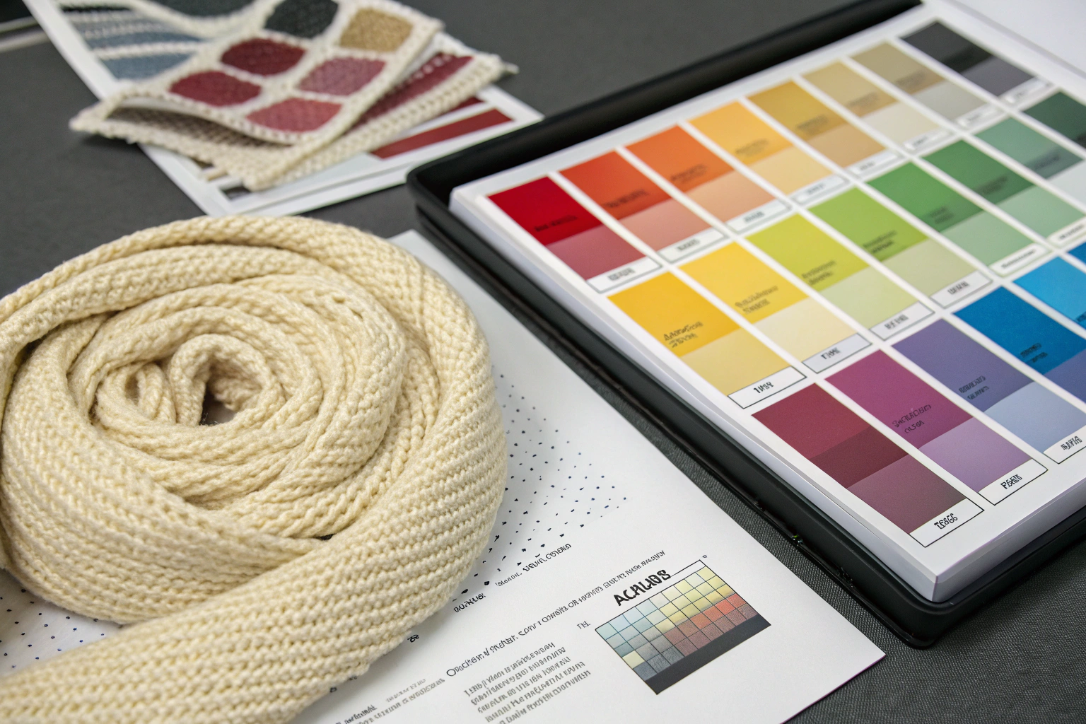
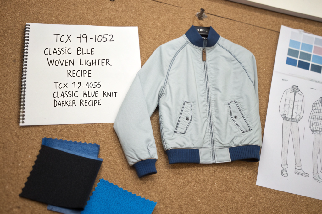
You can’t have one Pantone chip ruling over two different fabric structures. It doesn’t work. You need to establish a "master standard"—a physical fabric swatch that we both agree represents the final correct color for each specific texture. This is the legal reference sample, and it overrides the paper Pantone chip when there’s a dispute.
Here’s our internal rule at the mill. For a color-critical project, I ask the client to cut a swatch from their reference garment—maybe a competitor’s jacket they’re trying to match, or a previous season’s bestseller. They cut a 4-inch square from the woven body and a 4-inch square from the knit collar. They mount these on a card, sign it, and courier it to us. This becomes the "master standard." We don’t aim for the Pantone book; we aim for the signed swatches.
But the paper Pantone code still matters. We use it as a starting coordinate. I tell my lab technicians: "The woven master standard is slightly lighter and yellower than the paper TCX 19-4024 Dress Blue. Adjust the recipe to match the master, not the paper." This head-on approach slashes our lab dip turnaround time by 40% because it removes the ambiguity. I remember working with a French luxury house on a burgundy wool coat. Their trim was a knit merino, the body a woven cashmere blend. They sent us two swatches—one for the body, one for the trim—and said, "Make them look identical." We matched both swatches, not some abstract Pantone chip. The result was a commercial success with zero returns for color mismatch.
- Understand the global standard for visual color assessment of textile samples from the AATCC Evaluation Procedure 9 on the AATCC international testing standards hub.
- For guidance on creating and documenting physical color standards, read the best practices on the Pantone corporate color management resource center.
When Should We Use a Spectrophotometer Reading Instead of a Visual Lab Dip?
The human eye is a terrible judge of absolute color, but it’s fantastic at spotting a mismatch between two adjacent fabrics. A spectrophotometer doesn’t get tired, doesn’t have a bias toward blue or yellow, and doesn’t care about the office lighting. It gives us cold, hard mathematics: a reflectance curve and a Delta E value.
We use a spectrophotometer at two critical checkpoints. First, during lab dip development. After we visually match your master standard, we scan both our lab dip and your original swatch. The machine calculates the Delta E. For high-end fashion, we target a Delta E below 1.0 on the CMC 2:1 scale. If the machine says the Delta E is 1.8, even if my head dyer thinks it looks perfect, we go back and adjust the recipe. The machine catches metamerism—that’s the phenomenon where two colors look identical under our factory LED lights but completely different in the department store’s fluorescent lights or in natural daylight. A spectrophotometer can measure the reflectance curve across the full visible spectrum and predict metamerism before we even ship the fabric.
Second, we use it for bulk production lot control. We scan every single finished roll on the inspection table. We upload the LAB* values to a cloud dashboard that you can access. You don’t need to trust my word that the color is consistent; you can see the data points clustered tightly around your standard. This is how we provide real quality assurance for a global client who can’t physically be in our Keqiao mill to inspect every roll.
- Learn about the CMC color tolerance formula and how Delta E is calculated on the Datacolor industrial color measurement education blog.
- Explore the concept of metamerism in textile color matching via the X-Rite color science and appearance knowledge library.
How to Adjust Your Dye Recipe for a Visual Match Across Textures
Alright, now we’re in the guts of the dye kitchen. This is where we translate the optical problem into a chemical solution. Remember, the goal is not to make the knit and woven chemically identical. The goal is to make them visually identical. This almost always means we run two different dye recipes for the same Pantone code. I call this "compensatory dyeing," and it’s a core competency of our technical team at Shanghai Fumao.
The principle is simple: if the knit structure naturally makes color look darker and cooler in tone, we must dye the knit with a lighter, warmer recipe so that the final visual result matches the woven. Conversely, if the woven looks pale and flat, we might dye it slightly heavier and cooler. This takes experience and a deep knowledge of fiber behavior. Let me break down the specific compensations we make for synthetic activewear and for natural fibers like cotton.
What Dye Strength Compensation Is Needed for Polyester Activewear?
Polyester knit mesh and woven polyester taffeta are the classic mismatch nightmare in sportswear. The knit mesh, used for tank tops and linings, is a holey structure with massive surface area but low density. The woven taffeta, used for a windbreaker shell, is a dense, flat, glossy surface. If you dye both with a 2% concentration of disperse dye, the mesh will look three shades darker than the taffeta. It looks almost black while the woven looks pale.
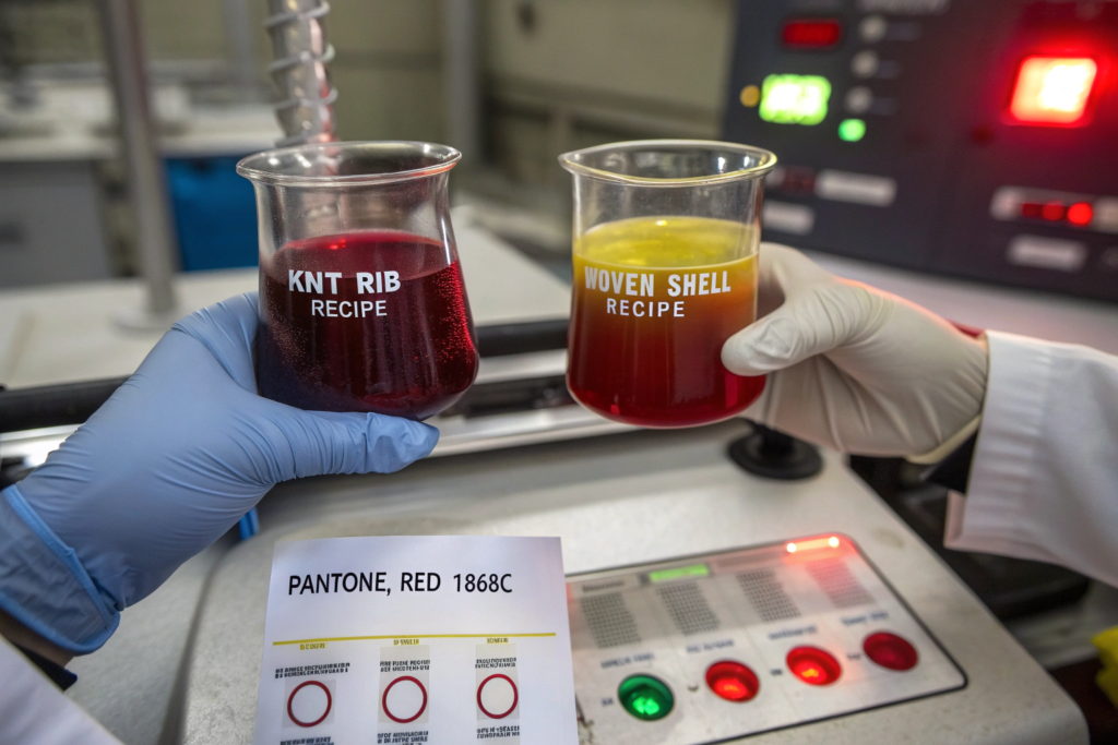
We compensate by adjusting the dye strength percentage in the recipe. For a standard medium blue Pantone on a woven polyester shell, we might use a 1.8% disperse dye concentration. For the matching knit mesh trim, we’d drop the concentration to 0.7% or even 0.5%. We’re literally putting less dye into the knit because we know the knit’s structure will amplify the visual darkness. This requires precise lab dip trials. Our dyeing manager keeps a physical "compensation library"—a set of standard swatches showing a woven at 2% dye and its matching knit at varying lower percentages, documenting exactly which ratio works for which fabric weight and loop size.
Temperature also plays a role. Polyester is dyed at high temperatures—130 degrees Celsius under high pressure. The knit mesh, with its open structure, heats up faster and the dye molecules strike into the fiber more aggressively. We might lower the peak dyeing temperature for the knit by 5 degrees or reduce the hold time at peak temperature to slow down the dye uptake. This prevents the knit from "over-dyeing" and becoming too dark before the woven even reaches full saturation.
- For technical data on disperse dye concentration and polyester dyeing rates, consult the dye application manuals available on the Archroma color management resource center.
- Learn about the effect of fabric density on dye uptake in high-temperature dyeing from the research archives on the AATCC Journal of Textile Science.
Can You Use Different Substrates for Trim to Close the Color Gap?
Sometimes the smartest solution isn’t a chemical tweak—it’s a sourcing tweak. If your woven shell is a 100% nylon faille and your knit trim is a 100% cotton rib, you’re setting yourself up for a matching nightmare. These fibers have completely different dye affinities. Nylon takes acid dyes. Cotton takes reactive dyes. The color gamut available to each dye class is slightly different, and certain deep, cool tones are fundamentally impossible to match precisely across these two fiber types.
We advise our clients to "platform" their substrates when color unity is critical. That means you use the same fiber type for both the body and the trim, even if the fabric structures are different. For example, a nylon woven shell paired with a nylon knit rib, both dyed in the same acid dye bath. Or a cotton woven shell with a cotton knit rib, both using reactive dyes. The dye molecule bonds chemically to the same fiber type in both fabrics, giving you a massive head start on achieving a visual match.
I convinced a workwear brand in the UK to do exactly this last year. They were making a utility jacket with a polyester-cotton woven body and a 100% cotton rib collar. The color was a military olive green. We could never get the green to sit right—the collar always looked either too yellow or too blue compared to the body. We proposed replacing the cotton rib with a poly-cotton rib that matched the body’s fiber composition. The brand agreed, we ran the trial, and the color matched on the first submission. The trim felt slightly different in hand, but the visual color unity was so superior that the brand accepted the change and made it a permanent specification.
- Understand the fundamental differences between acid dyes for nylon and reactive dyes for cotton on the Textile School dye classes educational page.
- Explore the concept of unified fiber platforms for color-critical apparel design via the case studies on the Material Exchange digital sourcing blog.
How to Execute a Color Unification Audit Before Shipping
You’ve done the lab dips, you’ve compensated the recipes, and the pre-production samples look beautiful. Now the bulk fabric is starting to roll off the machines. This is the moment of truth. If you don’t have a rigorous audit step right here, right now, you’re gambling with the entire production order. A mismatch caught during the cutting table inspection is a negotiation about a discount. A mismatch caught on the retail floor is a return, a bad review, and a damaged brand.
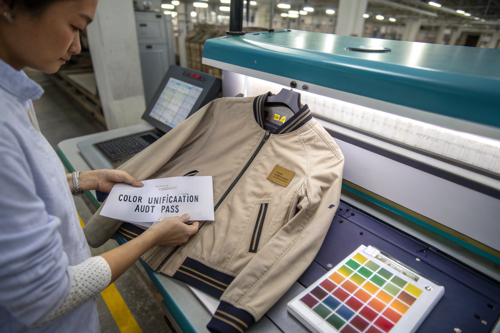
At Shanghai Fumao, we don’t ship a multi-texture garment order without a formal "color unification audit." This is a specific inspection protocol that goes beyond our standard AQL 2.5 fabric check. It’s a side-by-side, human-plus-machine verification that the woven body roll and the knit trim roll actually look like they belong to the same garment.
How Do We Simulate Retail Floor Lighting to Catch Metamerism?
Metamerism is the invisible gremlin of color matching. Two fabrics that look perfectly unified under our 6500K factory LED ceiling lights can look like a clown costume under the warm 3000K halogen spotlights of a high-end boutique. The spectral reflectance curves of the dyes are different, even if the visual color appears the same under one light source. The only way to catch this is to physically test the fabrics together under multiple lighting conditions before they leave the mill.
We have a VeriVide color assessment cabinet in our inspection room. It’s a booth with five standard light sources: D65 artificial daylight, TL84 cool white fluorescent (common in big box retail), CWF cool white fluorescent (common in U.S. department stores), UV light to check for optical brighteners, and an incandescent "A" lamp for home lighting. During a color unification audit, our QC technician takes the woven body fabric and the knit trim fabric and places them side by side, touching, with the seam edge aligned, exactly as they will appear on the finished garment. They view this pair under all five light sources in the VeriVide cabinet. If the pair matches under D65 but shows a visible break under TL84, we flag it as a metameric failure. The entire batch goes on hold, and we go back to the dye kitchen to reformulate. We don’t ship metameric fabric—period.
I recall a near-miss with a bridal wear brand from Australia. Their woven satin bodice and knit stretch illusion tulle matched beautifully under our D65 daylight simulator. But bridal shops use warm, soft lighting. Under the incandescent "A" lamp in our VeriVide cabinet, the tulle trim turned visibly pink compared to the ivory satin. We caught it in the audit. We had to add a tiny amount of blue toner to the tulle’s dye recipe to neutralize the pink shift under warm light. The delay cost us a week, but the alternative was a line of wedding dresses that looked two-toned on the most important day of a customer’s life.
- Learn how VeriVide color assessment cabinets standardize visual color inspection from the technical specifications on the VeriVide industrial color control website.
- Understand the science of metamerism and why fabrics change color under different light sources via the educational resources on the X-Rite color theory blog.
What Is a "Seam Alignment Check" and Why Does It Finalize Approval?
The human eye is a contrast-detection machine. It’s most sensitive to a color break right at a seam. A subtle shade difference that you might overlook on a large open area of fabric becomes screamingly obvious when the two textures are stitched together with a clean, tight seam line. That’s why our final audit step is a physical seam alignment check.
We take a coupon of the woven shell fabric and the knit trim fabric and actually sew them together on a single-needle lockstitch machine, exactly replicating the garment construction seam. We then inspect this sewn seam under the D65 light source. We’re looking for any visible "line" where the color appears to break. If the seam disappears optically—if you squint and the two fabrics blend into one continuous surface—we sign off the batch. If the seam is visible, if we can see where the knit starts and the woven ends because of a color difference, we fail the batch, even if the spectrophotometer Delta E reading is technically within tolerance.
This seam alignment check is our golden rule because it simulates the customer’s experience. The customer doesn’t look at a body fabric and a trim fabric in isolation; they look at the finished garment with the seam connecting them. We’ve had cases where the individual roll LAB* readings were both within spec, but the seam alignment check revealed a subtle cool-warm contrast that was visually unacceptable. It’s the ultimate reality check. We won’t ship until that seam vanishes under the D65 lamp.
- For guidance on conducting effective visual seam assessments in quality control, explore the practical inspection guides on the AsiaInspection textile QC resources page.
- Read about how the human eye perceives color differences at boundaries from the color perception research summaries on the Munsell Color science blog.
Conclusion
Matching a Pantone code across a knit and a woven isn’t a simple recipe-following exercise. It’s a problem of optical physics and dye kitchen chemistry working together—or more often, fighting against each other. We’ve walked through the reality: a knit’s looped sponge structure drinks in light and looks darker, while a woven’s flat grid reflects it and looks lighter. We’ve seen that specifying a single Pantone number in a tech pack without a physical master standard for each texture is a guarantee of disappointment.
The solution lives in the details. It’s in the compensatory dye recipe that puts less colorant into the knit. It’s in the stenter finishing pass that roughens a glossy woven surface to match a matte knit. It’s in the color unification audit under five different light sources, with a seam alignment check that replicates the customer’s real-world experience. The brands that succeed in delivering a cohesive, premium garment aren’t the ones with the most expensive fabric; they’re the ones with the most rigorous, physics-informed color management process.
You don’t need to become a color scientist to execute this. You need a supply partner who already has the spectrophotometers, the VeriVide cabinets, and the two decades of compensatory dyeing knowledge baked into their daily operations. That’s what we’ve built at Shanghai Fumao. If you’re developing a multi-texture garment and the color unity is keeping you up at night, send the tech pack to our Business Director Elaine at elaine@fumaoclothing.com. She’ll have our dye lab prepare a physical color unification report with master standards, compensated lab dips, and a seam alignment mockup. Let’s make sure your collection hits the racks looking like one cohesive vision, not a fabric science experiment gone wrong.