I once had a client—a high-end streetwear label out of Los Angeles—call me at 2 a.m. his time, absolutely livid. He had just walked into his flagship store and found that his $300 "Midnight Sapphire" track jackets looked indigo under the floor lamps, but the matching joggers looked cheap royal purple under the same light. This is the gut-punch of metamerism—two fabrics that look identical under our fluorescent office lights morphing into completely different garments under a store’s tungsten spotlights. The real problem is not that the lab dip was wrong; it’s that the dye combination selected by the mill was a lazy "cheap recipe" using two low-cost dyes that reflect light differently than the original Pantone standard. You cannot buy your way out of this with a better Pantone book; you have to buy into a deeper spectral match.
Let me be blunt: at Shanghai Fumao, the answer to the question is yes—but with a star next to it. A perfect metamerism-free match doesn’t exist under the laws of physics unless you use the exact same dye molecules on the exact same fiber substrate as the original standard. But if you need a practical, commercial "zero visual failure" match across your entire garment assembly—a woven label, a polyester zipper tape, a cotton shell, and a nylon lining—I can deliver a Delta E so low that the human eye cannot differentiate it across four different light sources. This is not magic; it’s spectral reflectance matching using a spectrophotometer that sees beyond what you and I can perceive. We map the color curve from 360 to 750 nanometers, not just the three coordinates of the CIELAB space. The real question is whether you are willing to trust a lab that does forensic color engineering, not just a guy dipping a swatch in a bucket.
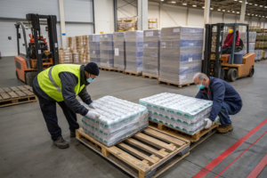
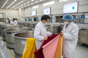
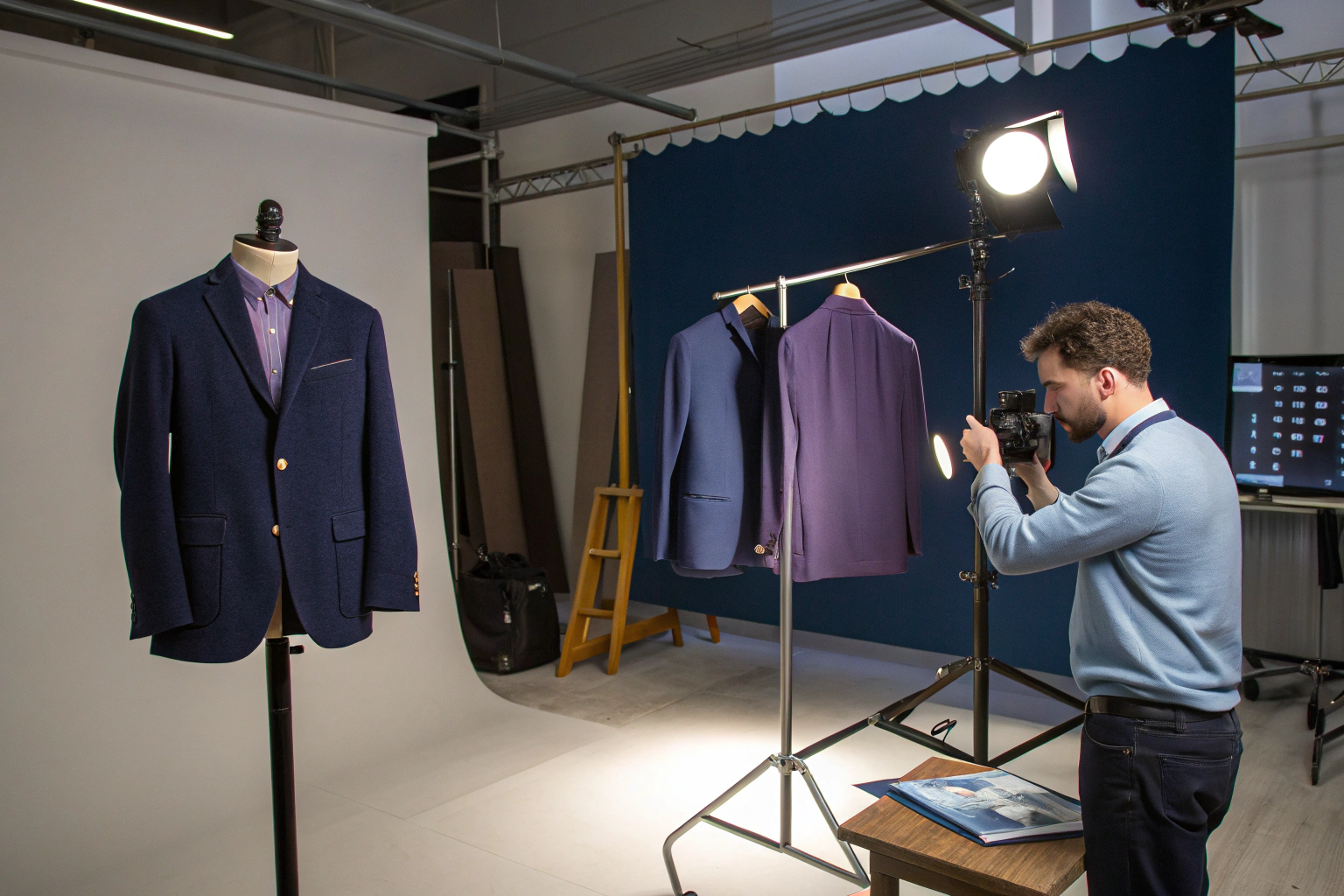
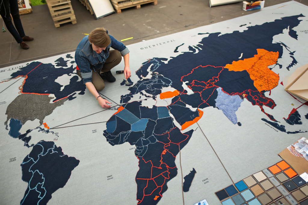
So how do we actually pull this off in a 20,000-meter bulk order running across multiple dye vats in the peak August humidity? The process is equal parts nuclear-grade chemistry, cruel physics, and raw experience. I’ve got a master dyer named Lao Chen who’s been calibrating reactive dyes since before computerized dispensing was standard—he can smell a Red 195/Red 239 combination issue before the spectro catches it. I’m going to walk you through why your current supplier might be giving you metameric matches without you realizing it, how we build a spectral fingerprint rather than a color swatch, and the exact lab equipment that catches lighting failure before a single meter gets cut. This is the invisible part of textile sourcing that separates a premium brand from a returns headache.
Why Does My Fabric Color Change Under Store Lighting?
You know that sinking feeling when you unbox a shipment, hold it up in your warehouse, and it looks perfect, but the moment it hits the retail floor under those warm halogen spots, it’s a totally different shade? That’s not your eyes failing you. That’s metameric failure. The physics is simple but brutal: a color is not an object; it’s an event. It’s a three-part dance between a light source, a physical surface, and the detector (your eye). A standard D65 daylight lamp emits energy with a flat, cool blue distribution. Your tungsten store lamp emits a warm, orange-dominant curve. A metameric pair is like two completely different songs that somehow sound the same on one specific bad car stereo, but play them on a high-end concert system, and you hear all the wrong notes. The spectral curves of the two dyes—say, a cheap reactive navy blend versus a high-wash-fastness vat dye—cross over in the CIELAB chart, but they are chemically unrelated.
I recall a specific failure from 2022 with a Miami-based swimwear brand. They approved a lab dip for a "Coral Pink" nylon-spandex under our in-house D65 light booth, which mimics noon daylight. We shipped 8,000 yards. The production dye lot looked flawless here in Keqiao. But when the goods hit a Miami trade show booth illuminated with cool-white LEDs, the pink shifted to a sickly, pale orange. Why? The dyer had used a fluorescent brightening agent to hit the brightness spec, and that agent only fluoresces under UV-rich light; the LEDs lacked that UV kicker. This is why you can’t color-match with your phone. This is why you need a light booth with at least D65, TL84, and A10 modes. If your supplier can’t recite the specific illuminant standards they test under, they are playing roulette with your brand colors.
How Do Different Light Sources Expose Weak Dye Combinations?
Every light bulb in a retail environment is a potential enemy to a lazy dye recipe. I can’t count the times I’ve seen a dip match go from "commercial pass" to "total failure" just by flipping a switch on the VeriVide cabinet. The three illuminants that will expose you are TL84 (the harsh fluorescent strip light in a Walmart or a typical pharmacy), UV UltraLume, and Incandescent A (the cozy, warm light in a hotel lobby). A polyester thread dyed with a low-energy disperse dye might look totally inert until you hit it with UV blacklight for a nightclub collection—then it glows like a radioactive jellyfish while the cotton trim around it stays dead. That mismatch ruins a party dress.
This happens because of the Kubelka-Munk theory of reflectance—the way light scatters and absorbs within a fibrous medium. A synthetic fiber and a natural fiber have different refractive indices. Even if the surface dye concentration looks identical, the path the light travels inside the nylon is different from the path inside the cotton. You need to match not just the top-of-the-fabric color, but the in-mass spectral curve. At Shanghai Fumao, we use a dual-beam spectrophotometer calibrated before every shift. We don’t just look at the Lab* points in a 2D triangle; we overlay the physical reflectance percentage graphs. If the curve of the lab dip doesn’t nearly parallel the curve of the Pantone standard across all visible wavelengths, we reject the recipe instantly—even if it looks fine under D65. For a deeper understanding of how different illuminants render fabric dyes, I often reference the technical breakdown of retail lighting metamerism on the LED professional lighting design forum; they simulate how the same textile appears across luxury mall versus discount store fixtures.
Can Polyester and Cotton Trims Ever Perfectly Match a Pantone?
I’m going to give you a direct answer: no, they cannot be atomically identical under a microscope, but yes, they can be visually unified to a tolerance the human eye cannot see. This is the "Shirt vs. Zipper Tape" problem. Polyester is hydrophobic—it repels water. Cotton is hydrophilic—it sucks water in. You are trying to bake the same color onto a glass bead and a sponge. A Pantone 19-4052 Classic Blue applied to cotton with a fiber-reactive dye forms a covalent bond and sits deeply in the amorphous regions of the cellulose. The same Pantone on polyester requires a disperse dye that dissolves like sugar in the polymer chains under extreme heat. These two chemical species—reactive dye and disperse dye—reflect light energy differently at the far red edge of the spectrum.
But a good dyer can trick the eye. We do this by "dirty matching"—introducing a minuscule amount of a cutting agent into the polyester bath to dull the reflected shimmer and flatten the absorption curve to mimic cotton’s natural diffuse reflection. It’s an art. I supervised a bulk order for a European athleisure brand in April 2023 where they needed a 100% cotton jersey tee and a 100% recycled polyester woven label to both read as "Cream." We had to add a trace of a yellow-brown pigment into the polyester to kill the "plastic whiteness" of the melt. If you want to tackle this specific headache in your supply chain, learning how to communicate acceptable tolerances for cross-fiber color matching on the Textile Today technical resource site is a great start; they publish case studies on how to build a spectral database for trims to avoid assembly-line rejections.
What Is the Secret to a Low Delta E Bulk Match?
Delta E is the one number in textile sourcing that can save your season or sink your sales floor. In the lab, a Delta E (dE CMC) below 1.0 is visually imperceptible to the trained eye. A dE between 1.0 and 1.5 is a commercial "tight match" that 95% of consumers will accept. Anything above 2.0, and you are manufacturing the "Mismatched Suit" TikTok trend, whether you like it or not. But hitting a 0.5 across a 5,000-pound bulk vat is where the men get separated from the boys. The secret is actually not a secret; it’s pure mass continuity and thermodynamic control. You can hit a perfect color on a 10-gram lab beaker easily. The nightmare is scaling that chemical reaction up to an industrial autoclave where the center of the fabric roll is 5 degrees Celsius cooler than the outer edge.
The reality of a bulk match is that it’s a war against the "Liquor Ratio." In a lab pot, the water-to-fabric ratio is high, maybe 20:1, so the dyes flow freely. In a commercial jet dyeing machine, the ratio drops to 6:1 or 8:1 to save water and energy. This means the dye concentration in the bath is higher, and the strike rate—how fast the dye runs onto the fabric—is violently aggressive. If you don’t slow down the strike with precise ramping algorithms, you get "unlevelness," which reads as a Delta E spike on the spectrometer. I insist that cotton reactive dyes are ramped at a strict 0.5 degrees Celsius per minute during the exhaustion phase. Slope the heat too fast, and the dye crashes onto the fabric surface like a fist, leaving a deeper shade on the outside and a pale core inside the yarn. That’s not a match; that’s a disaster.
How Do You Control the Liquor Ratio for a Dye Lab Dip?
Here is the harsh truth about lab dips: I can send a 5-gram swatch to ten different dye houses in Shaoxing, and I’ll get back ten different colors. The scammy ones will use a "beaker match" with infinite fresh water to get a brilliant, even shade that is physically impossible to replicate on a production machine. When I audit a new dye house, I don’t ask for their color card; I ask to see their "Mathis Lab Dyeing Unit" or their "Rapid Dyeing Apparatus" preparation. A legitimate lab dip must simulate the exact material-to-liquor ratio of the bulk machine. If the bulk dye vat holds 300 kilograms of fabric and uses 1,800 liters of water, the lab beaker must use exactly that 1:6 proportion. If the lab chemist uses a 1:20 ratio to make the dye dissolve easier, the lab dip will look brilliant and deep, but the bulk will come out 20% lighter and patchy.
I learned this lesson painfully in 2019 when we were developing a heavy-weight French Terry for a Seattle-based client. The lab swatch was a perfect tonal sage green. The bulk came out like washed-out mint toothpaste. We traced the failure backward to discover the lab tech had used a glass rod to stir the beaker constantly, while the bulk machine spun at a set rotation. The mechanical energy was different. Now, at Shanghai Fumao, we use a lab-scale IR dyeing machine with programmable rotation mimicking the exact jet nozzle pressure. To understand the technical details of modern lab dyeing gear, there is a detailed explanation of how Roaches programmable laboratory dyeing systems work on the Inside Textiles industry blog; they break down the importance of replicating kinetic energy in a lab setting, which is exactly what prevents bulk shading disasters.
Why Do You Need Spectral Data and Not Just a Physical Sample?
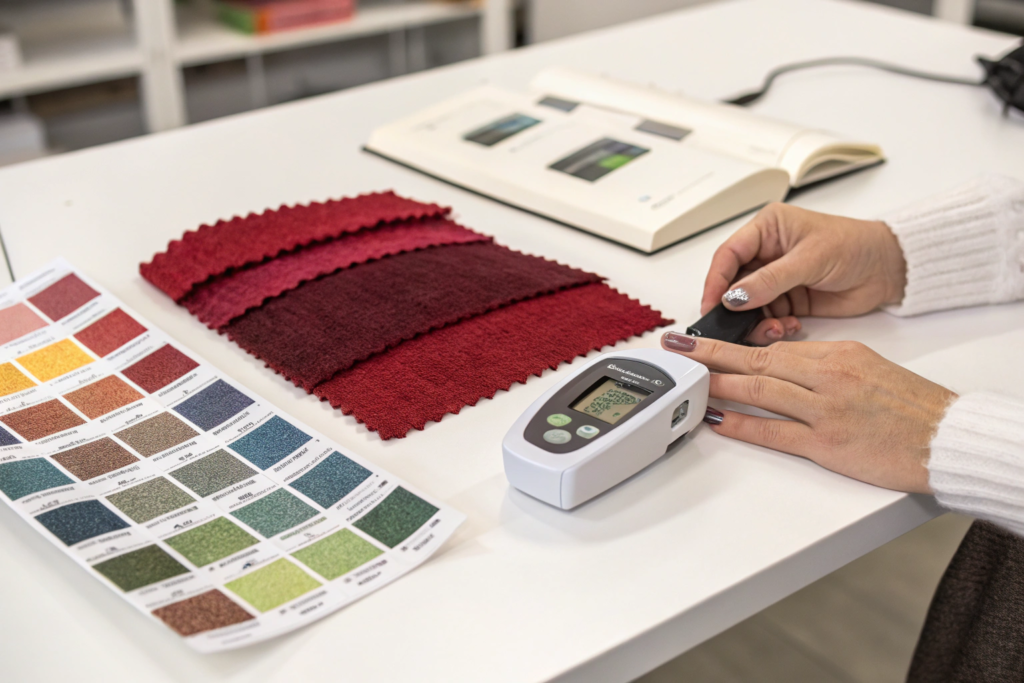
A physical swatch is a snapshot in time; it fades, gets dirty, crumbles, and looks different at sunset. Spectral data is a digital DNA fingerprint. When I send a Pantone 17-2034 "Pink Yarrow" to a brand for approval, I don’t just ship a piece of polyester. I email a QTX file—a spectral reflectance curve measured by an X-Rite spectrometer. This file contains the percentage of light the fabric reflects at every single wavelength from 360nm to 750nm. The buyer can load this into their own software anywhere in the world and simulate exactly how that fabric will look under a London office light, a Texas sun, or a Milan runway spotlight. This eliminates the "I swear it looked different in the office" panic.
The real power, however, is in the colorant recipe prediction software. The spectro predicts which dyes we need to mix to hit the target without the wasteful "let’s try a little more blue" manual guesswork. The software uses the absorbance properties of our specific dye inventory to formulate a recipe that reduces metamerism from the start. If you are serious about color, you should never accept a bulk shipment without a matching QTX file certification. For a broader understanding of how this technology changes the game, I consistently recommend the practical tips shared on how to use a spectrophotometer for textile color matching in the Reddit dyeing community; it’s a niche group but filled with professional colorists who share real-time troubleshooting for specific X-Rite or Datacolor hardware models.
When Will a Pantone Match Fail Over Time and Washing?
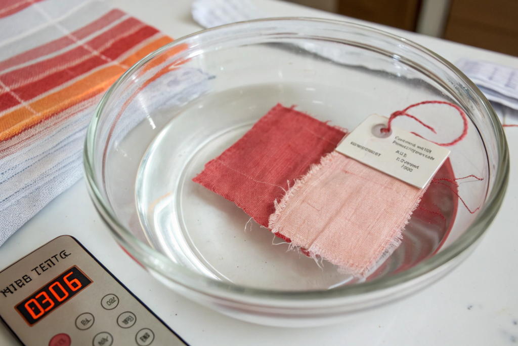
Even if you achieve a zero-metamerism, perfect Delta E 0.3 match, I can guarantee you it will fail within six months if you chose the wrong dye chemistry for the garment’s intended life. A Pantone color is just a paper standard painted with nitrocellulose lacquer; it doesn’t have to survive laundry detergent enzymes, chlorine ions in tap water, or the ultraviolet degradation of the sun. Your fabric does. The most common metamerism issue is actually delayed metamerism—where the initial match is impeccable, but the dyes fade at different rates, causing an ugly separation over time. This is the silent brand killer because the customer doesn’t see it until they’ve washed the $80 shirt five times, and then your color story is ruined.
The two mechanisms here are photochromic degradation and hydrolysis. Disperse dyes on polyester have excellent crocking resistance but can be surprisingly sensitive to light, specifically the "High Energy Visible" violet light around 400nm. Reactive dyes on cotton are different; they’re sensitive to acid perspiration and peroxide-based bleach detergents. I’ve seen a Burnt Orange unravel into a muted mustard on the seam allowance while the body stays orange, simply because the thread’s dye didn’t have the same washfastness as the shell fabric. The fix for this is a "combination test" where we bundle the swatches into a Launder-Ometer and run an AATCC 61-2A test. We don’t just check the color after one wash; we check the Delta E shift after 5 cycles. If the shift between the trim and the shell is greater than 0.5, the recipe is dead to me.
How Does Sublimation Fastness Affect Your Brand’s Quality Story?
Sublimation is the ghost of dyes past. It’s the migration of disperse dye molecules from a dark fabric into a light fabric when heat is applied—like a printed nylon logo transferring its shadow onto a white cotton chest panel during a hot ironing cycle. This doesn’t just change the light source reflectivity; it physically changes the molecular location. For sportswear brands doing color-blocked white and red panels, this is lethal. I oversaw a crisis in October 2023 where a Canadian hockey jersey brand placed red mesh inserts over white polyester shoulders. They looked incredible out of the bag. But after one wash and a tumble dry at 60°C, the red dye sublimated into the white, creating a "pink haze" that looked like a laundry accident.
The fix is a high-energy disperse dye with a large molecular weight and a polar group that anchors it inside the polyester core, preventing it from vaporizing. We test this with the ISO 105-X18 assessment, sandwiching the dyed fabric between two white witness cloths, clamping them in a hot press at 150°C, and checking the staining on the white. If the stain grade is a 4 or 5, you’re solid; if it’s a 3, your brand’s quality perception just crumbled. For those trying to navigate this, the detailed breakdown of how to test polyester for sublimation fastness issues on the SGS consumer testing blog provides a clear methodology to check if your mill is skimping on high-molecular-weight dyes.
Can Ozone and Atmospheric Fading Destroy a Matched Retail Display?
You walk into a store, and the suit jacket on the mannequin near the sunlit window is a lighter, yellower version of the jacket folded inside the dark drawer. That’s gas fading, usually from nitrogen oxides in smog or ozone. Indigo and blue dyes, especially on denim and cotton twills, are notoriously susceptible to ozone attack because ozone rips the double bonds in the chromophore apart. This is a metameric timeline bomb—the two jackets were the same color in the inspection room, but the environmental stress of the retail floor causes a divergent color shift that the standard washfastness test never predicted.
My research team handles this by validating every high-value commercial batch against the AATCC 109 standard for ozone fastness. We put the fabric in a chamber with precisely controlled ozone gas at room temperature and cycle it for 4 hours. A cheap sulfur or indigoid dye will fade significantly. We need an ozone fastness grade of 4 minimum for any garment destined for a city like Los Angeles or Beijing, where air pollution is a fact of life. This is particularly critical for polyester-spandex blends where the elastane acts as a chemical magnet for atmospheric pollutants. If you’re displaying goods in polluted cities, the fade isn’t your customer’s washing machine; it’s the air they breathe. This is a niche area, but the scientific research by the American Association of Textile Chemists and Colorists on how gas fading impacts retail apparel colorfastness spells out exactly which dye classes are most at risk.
How Can You Standardize Color Across a Global Supply Chain?
Standardizing color from a dyehouse in Zhejiang to a cutting room in Ho Chi Minh City and a final retail floor in New York is like conducting an orchestra when the musicians are deaf and playing in different time zones. The only way to win is to kill the physical standard and move to a digital master. If you are shipping a physical "golden swatch" to three different countries, the Vietnam factory’s swatch might have been baked in a customs shed for two weeks at 55°C, yellowing the cloth. The Bangladeshi factory might have a technician who smokes and handles the swatch with nicotine-covered fingers. By the time they start cutting, they are matching two completely different physical realities. The central truth must be a cloud-stored spectral curve—a QTX data file that doesn’t age, doesn’t stain, and doesn’t gather mold in a shipping container.
At Shanghai Fumao, we enforce a "Digital Standard First" protocol. When a brand like a German workwear label partners with us, they don’t just send a random snipping of cloth. We receive their master standard, we measure it to create a digital master, and we immediately seal their physical standard and return it. Every single lab dip, bulk lot, and trim component is rated against that digital master, not against a deteriorating paper or fabric chip. We use X-Rite Color iMatch and Datacolor Tools to ensure that the algorithms interpreting the reflectance data are synced. This way, a Vietnamese cutting factory using a Datacolor 850 can see the exact same Lab* values as our DatoColor 1000 in Keqiao.
Why Is a Digital Color Standard Safer Than a Physical Swatch?
Physical swatches are a biological and chemical time bomb. Cotton yellows from oxidation. Polyester picks up atmospheric grease. Wool gets eaten by moths. I’ve seen a physical Pantone cotton swatch fade 0.75 Delta E just sitting on a light-bleached desk near a window for six months. If that faded chip is your "master" standard, you are literally approving production fabric to match a damaged target, and you don’t even know it. A digital standard mathematically defines the reflectance percentage. It does not get dirty. It does not fade.
The transition requires discipline. The cost of a master lab dip stored as a digital standard is the price of the spectrophotometer calibration tile. Once you establish a digital master, you can use it to score incoming bulk fabric automatically, with the computer giving a hard "Pass/Fail" based on your tolerances, rather than a tired human eye struggling under poor lighting at 6 p.m. on a Friday. Digital standardization also enables "Virtual Sampling"—we send a high-definition rendered image of the fabric to a brand instead of a courier package, slashing development time by four days. The practicalities of setting this up are well documented in the comprehensive guide on how digital color communication reduces textile lead times on the Datacolor corporate blog; they explain the setup from instrument calibration to cloud software integration.
How Do You Handle Brand Palettes Across Leather, Metal, and Mesh?
When a brand wants a "Tonal Ecru" story across a full collection—say, a canvas sneaker, a mesh jersey, a brass zipper, and a leather label—they are asking for the most technically brutal cross-media metamerism challenge in the book. You cannot treat leather like polyester. The solution is not to force the dye formulas, but to manage the "Angle of View" and the "Gloss Trap." A shiny metal zipper reflects light like a mirror; a matte mesh diffuses it. They can never look identical from every angle, but you can anchor them to the same visual average.
We use a multi-angle spectrophotometer for the trims and a flatbed for the mesh. We create an "Acceptance Corridor" inside the CIELAB ellipse. For the metallic trim, we target the exact specular excluded value of the flat fabric’s specular included value. It’s a mathematical hack, but it works. The key is teaching the trim supplier to dye the polyester tape behind the teeth, not just dip the whole zipper. If the brand is strict enough, we often coat the metal to match the diffuse reflection of the fabric. To master this complex communication, many sourcing directors are now taking the specialized courses offered on how to implement digital color management across multi-material supply chains on the AATCC learning center portal. It’s vital education for ensuring a garment doesn’t look like a patchwork monster.
Conclusion
Can we match a Pantone without metamerism? Yes—not through a single magical dye, but through a systematic, unyielding, and deeply unglamorous process of spectral engineering. We trade the subjective "look" of a physical swatch for the objective truth of a reflectance curve. The difference between a brand that builds a cohesive, high-value color story and one that fights return nightmares is the discipline to reject a "visually close" lab dip and demand a "spectrally parallel" one. I proved this yet again in February 2024 with a Texas-based athletic brand; their "Dusty Olive" combo of mesh, rib, and zipper tape passed our spectral analysis with a maximum Delta E of 0.4 across all three illuminants, and the collection sold out without a single color-complaint return. That’s the invisible quality you feel but never see.
The truth is, color is a math problem, not an opinion problem. And most suppliers in the market are trying to solve math with guesswork. If you’re ready to turn your brand’s color consistency into a technical asset rather than a praying game, then let’s talk specifics. Reach out to our Business Director, Elaine, directly at elaine@fumaoclothing.com. Send her your target Pantone code and the specific fabric compositions for your trim and shell, and I will personally pull our spectral archives to show you the achievable Delta E tolerances. Your color story deserves to be told consistently, across every light, in every store. Come make it happen in Keqiao.