About five years ago, a new client—a luxury sleepwear brand from London—sent us their seasonal color palette. Six colors. Each one specified with a Pantone TCX code and a one-word mood descriptor. "Dusk." "Cedar." "Foam." Beautiful names. Beautiful screen colors. Our dyeing manager, Mr. Chen, looked at the codes, looked at me, and said something I’ll never forget: "They want Pantone 19-4052 Classic Blue. But they want it on 22-momme silk charmeuse. And they want it to pass ISO 105-C06 washing fastness at grade 4. This is not a color code. This is a chemistry problem." He was right. Three weeks and eleven lab dips later, we finally hit the color. The brand’s designer was thrilled. She never knew that Classic Blue on silk requires a completely different dye combination than Classic Blue on cotton, or that the same Pantone code looks different under D65 laboratory lighting than it does in a London bedroom at dusk. She just knew the eleventh sample finally looked right.
Translating a Pantone code into a realistic fabric dye recipe requires solving for four interdependent variables: fiber chemistry, dye class compatibility, metamerism risk, and production scalability. The Pantone code specifies a color target under a defined light source. It does not specify how to achieve that color on a specific textile substrate. Cotton uses reactive dyes. Polyester uses disperse dyes. Nylon uses acid dyes. Silk can use acid or reactive dyes depending on the fastness requirements. Each dye class has a different color gamut—the range of colors it can physically produce—and some Pantone colors simply fall outside the gamut of certain dye-fiber combinations. A brilliant, saturated Pantone purple that looks stunning on a polyester athletic mesh may be physically impossible to match on a cotton jersey because the reactive dye gamut doesn’t extend that far into that particular shade. The translation is not a formula. It’s a negotiation between the designer’s intent, the laws of chemistry, and the constraints of production.
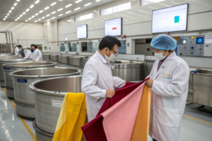
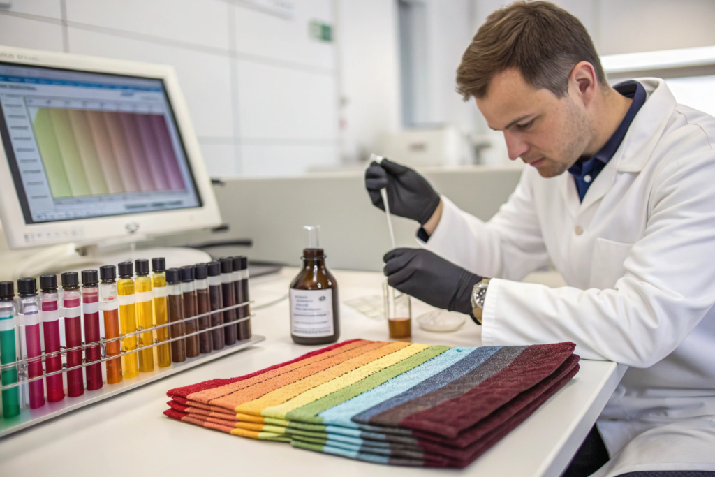
At Shanghai Fumao, our CNAS-certified lab runs approximately 200 lab dips per week during peak season. Each one is an attempt to translate a color code into a reproducible recipe. I’ve seen the process from every angle—the designer’s frustration, the dyer’s pragmatism, the QC manager’s insistence on data. This article is my guide to how that translation actually works, and how you can work with your dyeing partner to get the color you want without the eleven rounds of samples.
Why Does the Same Pantone Code Look Different on Cotton vs. Polyester?
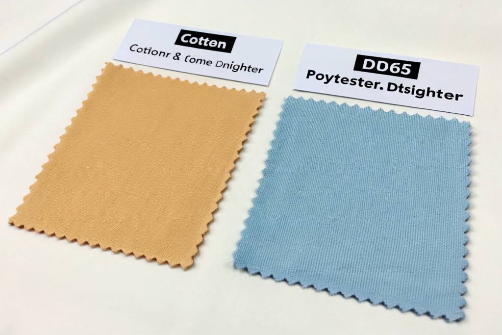
The Pantone code does not change. The light source does not change. But the fabric changes, and when the fabric changes, the color changes with it. This is not a dyeing error. It is physics. The same dye molecules, deposited on two different fiber substrates, will produce two different visual colors because the fibers themselves interact with light differently. Cotton fibers have a irregular, convoluted surface with a natural creamy base color that shifts the perceived hue toward the warm end of the spectrum. Polyester fibers are smooth, cylindrical, and optically transparent, with a pure white base that reflects more light back through the dye layer, creating a brighter, more saturated appearance. The exact same quantity of dye produces a different visual result on each substrate because the substrate is part of the optical system.
The technical term for this phenomenon is "substrate influence," and it’s the reason Pantone maintains separate textile code systems. Pantone TCX codes are calibrated for a specific cotton poplin substrate. Pantone TPG codes are calibrated for paper. When a designer picks a color from a TCX swatch book, they are looking at a color printed or dyed on a specific cotton fabric. If they then ask a mill to match that color on polyester, the mill’s lab has to perform a "substrate translation"—effectively compensating for the optical differences between the cotton reference and the polyester target. This is not a simple adjustment. Some colors translate easily across substrates. Others, particularly dark navies, deep purples, and certain teal shades, shift so dramatically that an exact cross-substrate match is physically impossible. In those cases, the designer has to choose which is more important: matching the Pantone code exactly on the intended substrate, or maintaining color consistency across multiple substrates in a single collection.
What Is the Technical Difference Between Pantone TCX and TPG for Fabric Matching?
Pantone TCX and TPG are not interchangeable, and using the wrong one can cost you weeks of development time and hundreds of dollars in wasted lab dips. TCX stands for "Textile Cotton eXtended." The TCX swatch books contain fabric swatches—actual dyed cotton poplin—mounted on cards. Each swatch is a physical textile sample, which means the color you see accounts for the surface texture, luster, and optical properties of cotton. When a dyer tries to match a TCX standard, they are comparing a fabric to a fabric, which is the correct way to do textile color matching. TPG stands for "Textile Paper Guide." The TPG books contain colors printed on paper, not on fabric. The pigments and binders used in paper printing are fundamentally different from the dyes used on textiles. The surface is flat and uniform, with none of the texture or luster of woven cotton. A color that looks perfectly matched against a TPG paper swatch under D65 light can look noticeably different against a TCX fabric swatch under the same light, because the paper and fabric reflect light differently.
I had a buyer from a U.S. activewear brand send us TPG codes for a polyester-spandex performance knit in 2023. Our lab chief called me after the third failed lab dip. "The TPG target is physically impossible on this substrate," he said. "The paper has a blue-white optical brightener that doesn’t exist in the polyester. The color she wants only exists on that specific paper under that specific light." We asked the buyer to send us a physical TCX swatch or a reference sample of fabric in the desired color. She sent a swatch from a competitor’s legging. We matched it in two dips. The problem was never the dyer’s skill. It was the mismatch between the color standard format and the production substrate. If you are developing fabric, always, always specify TCX codes. If your designer only has TPG codes, understand that they are a starting point, not a specification. For a comprehensive breakdown of the technical differences, this color management guide on Pantone TCX versus TPG in textile color communication explains the measurement geometry differences and how each standard is calibrated.
How Does the "Base Color" of Raw Cotton Affect Your Final Pastel Shade?
Raw cotton is not white. This is a fact that surprises every designer the first time they try to dye a pastel shade on a 100% cotton fabric and get back a lab dip that looks slightly yellowed or muddy. Raw cotton has a natural base color that ranges from a warm cream to a yellowish beige, depending on the variety, the growing conditions, and the ginning process. When you dye a dark shade—navy, black, burgundy—the dye concentration is high enough that the base color of the cotton is completely masked. You can’t see it. When you dye a light pastel—a pale pink at 0.5% dye concentration, or a sky blue at 0.3%—the dye is barely enough to tint the fiber, and the natural cream color of the cotton shows through. The result is a pastel that looks "dirty" compared to the Pantone chip, which was printed on an optically whitened, blue-white paper or a chemically bleached cotton base.
The solution is pre-bleaching. For pastel shades on cotton, the greige fabric must be bleached—either with hydrogen peroxide in a separate pre-treatment step or with an optical brightening agent in the finishing bath—before dyeing. The bleaching removes the natural pigments and creates a neutral white base that won’t shift the pastel color. At Shanghai Fumao, our standard pre-treatment for pastel cotton dyeing is a hydrogen peroxide bleach at 95°C for 45 minutes, followed by a thorough rinse and neutralization. This gives a base whiteness of approximately 80-85 CIE whiteness index. For the palest pastels—a barely-there pink or a whisper of lavender—we sometimes add an optical brightening agent in the finishing step to push the base whiteness above 90, which matches the brightness of the Pantone TCX cotton reference. The extra step adds about $0.15 per meter to the dyeing cost and adds one day to the process. Skipping it saves money and produces a pastel that the buyer will reject. For a deeper technical explanation, this textile pre-treatment guide on achieving a neutral white base for pastel cotton dyeing provides the chemistry and process parameters for different cotton qualities.
How Do Dyers Build a Recipe from a Digital Color Code?
The process of building a dye recipe from a Pantone code is not guesswork. It is a systematic, measurement-driven workflow that has been refined over decades and is now accelerated by spectrophotometer technology and color matching software. But the software does not replace the dyer’s expertise. It gives the dyer a starting point, and the dyer’s knowledge of fiber behavior, dye compatibility, and production variables turns that starting point into an accurate, reproducible recipe.
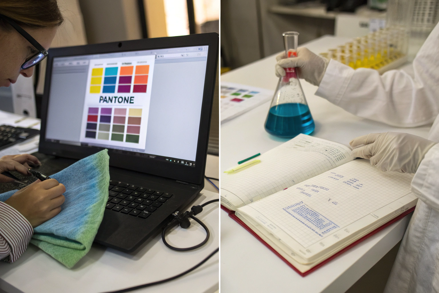
The workflow begins with the spectrophotometer. The target color—whether it’s a Pantone TCX swatch, a physical fabric sample, or a digital LAB value—is measured by the spectrophotometer, which records the percentage of light reflected at each wavelength across the visible spectrum, typically 400-700 nanometers at 10-nanometer intervals. This reflectance curve is the color’s fingerprint. It is objective, numerical, and independent of human perception. The spectrophotometer also measures the reflectance curve of the undyed substrate—the specific greige fabric that will be dyed in production. This step is critical because, as I explained earlier, the substrate color affects the final color. The color matching software then accesses a database of dye calibrations. Each dye in the mill’s inventory has been characterized at multiple concentrations on the specific substrate, and its reflectance properties have been stored. The software calculates, using Kubelka-Munk theory or a similar optical model, which combination of dyes at which concentrations will produce a reflectance curve that most closely matches the target. The output is a predicted recipe: for example, "0.42% Reactive Red 195, 0.18% Reactive Yellow 145, 0.07% Reactive Blue 221, on weight of fabric, with 60 g/L salt and 15 g/L soda ash."
What Data Does a Spectrophotometer Actually Measure to Match a Color?
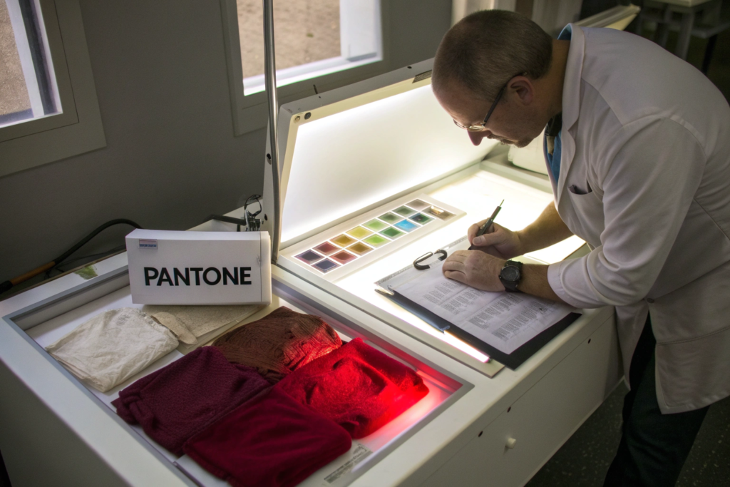
A spectrophotometer measures reflectance—the percentage of incident light that bounces off the sample at each wavelength in the visible spectrum. For a Pantone match, the instrument typically uses a D65 light source, which simulates natural daylight with a correlated color temperature of 6500 Kelvin, and a 10-degree observer angle, which represents the average human field of view. The measurement geometry is usually d/8°—diffuse illumination with an 8-degree viewing angle, including the specular component. This setup is specified in the Pantone Textile Color System and is the industry standard for textile color measurement.
The raw output is a table of about 31 numbers: reflectance percentage at 400nm, 410nm, 420nm, and so on up to 700nm. These numbers define a curve. A bright red fabric will have low reflectance in the blue and green regions—400-550nm—and high reflectance in the red region—600-700nm. A navy blue will have low reflectance everywhere except a small peak in the blue region. The spectrophotometer software converts this reflectance curve into CIELAB coordinates: L (lightness, 0-100), a (red-green axis), b* (yellow-blue axis). These three numbers mathematically define the color’s position in a three-dimensional color space. The distance between two points in this space is Delta E—the numerical measure of color difference. Most commercial color matching uses the CMC (2:1) or CIEDE2000 Delta E formula, which weights the differences to match human visual perception. A Delta E of less than 1.0 means the colors are indistinguishable to the average observer. A Delta E of 1.0-2.0 means a trained colorist can see a difference but a consumer probably cannot. Above 2.0, the difference is visible to most people. At Shanghai Fumao, our standard for lab dip approval is a Delta E CMC (2:1) of less than 1.0, measured under D65/10° conditions. If the dip measures 1.2, it goes back for adjustment, even if it "looks fine" to the naked eye. Because "looks fine" under our fluorescent lab lights might look completely wrong in a retail store’s halogen spotlights. For a deeper understanding of the measurement science, this colorimetry resource on spectrophotometer geometry and Delta E calculations for textile color matching explains the different illuminant and observer combinations and when each is appropriate.
Why Is the "Kubelka-Munk" Equation Still the Foundation of Digital Color Matching?
The Kubelka-Munk equation, developed in 1931 by Paul Kubelka and Franz Munk, is the mathematical model that relates the reflectance of a dyed fabric to the concentration of dye in the fiber. It is old. It makes simplifying assumptions that are not perfectly true in the real world—it assumes the fabric is an infinitely thick, homogeneous layer, which a woven textile certainly is not. And yet, after 90 years, it remains the foundation of virtually every commercial color matching software system. The reason is not nostalgia. It’s because the Kubelka-Munk model works well enough for practical textile dyeing, and more complex models—radiative transfer theory, Monte Carlo simulations—require computational power and input data that most dyehouses cannot afford.
The equation states that K/S = (1-R)² / 2R, where R is the reflectance at a given wavelength, K is the absorption coefficient, and S is the scattering coefficient. For a mixture of dyes, the K/S values are assumed to be additive: (K/S)_mixture = (K/S)_substrate + c₁·k₁ + c₂·k₂ + c₃·k₃, where c is the dye concentration and k is the unit absorption coefficient of each dye. This additivity assumption is the key to recipe prediction. If you know the K/S curve of each individual dye at a known concentration, you can mathematically predict the K/S curve of any combination. And from the predicted K/S curve, you can calculate the predicted reflectance curve, and from that, the CIELAB coordinates. The model has known failure modes. It struggles with very dark shades—reflectance below 5%—because small measurement errors in R produce large errors in K/S. It struggles with fluorescent dyes and optical brighteners because they emit light as well as absorb it, violating the model’s assumptions. And it struggles with very sheer fabrics because they are not "infinitely thick" relative to the measuring beam. A skilled dyer knows when the Kubelka-Munk prediction will be reliable and when it needs to be adjusted based on experience. The software provides the starting recipe. The dyer provides the judgment. For a readable explanation of the mathematics and its limitations, this color science guide on Kubelka-Munk theory for textile dyers bridges the gap between the physics and the practical application on the dyehouse floor.
What Are the Three Most Common Reasons a Lab Dip Fails the First Time?
I’ve reviewed thousands of failed lab dips in my career, and the failures almost always fall into one of three categories. The first round pass rate in our lab is about 65%. That means 35% of first dips come back from the spectrophotometer with a Delta E above 1.0. That 35% is not a sign of incompetence. It’s a sign that the initial recipe prediction, based purely on the software’s mathematical model, didn’t account for a real-world variable that the dyer needs to adjust. The three most common variables are dye compatibility error, concentration prediction error, and substrate preparation error. Each has a distinct signature in the reflectance data, and an experienced dyer can diagnose the problem from the shape of the reflectance curve mismatch and correct it in the second dip.
Dye compatibility error occurs when the software selects a combination of dyes that are not truly compatible with each other. Dyes of the same class can have different exhaustion rates, different fixation rates, and different sensitivity to temperature and pH. If the software specifies a fast-exhausting red and a slow-exhausting blue, the red will go onto the fabric first, and the blue will struggle to find available dye sites. The result is a lab dip that is off in hue and may also be unlevel—the color varies across the fabric surface. Concentration prediction error is the most straightforward failure. The Kubelka-Munk additivity assumption is slightly inaccurate for the specific dye combination and substrate, so the predicted concentrations produce a color that’s close but outside tolerance. This is corrected by a linear adjustment in the software. Substrate preparation error is the most frustrating for buyers because it has nothing to do with the dye. The greige fabric wasn’t properly scoured or bleached, leaving residual oils, waxes, or natural pigments that interfered with dye uptake. The lab dip looks dull, uneven, or shifted in hue, and the fix is to re-scour or re-bleach the substrate, not to adjust the dye recipe.
How Can "Metamerism" Make a Color Match Perfectly in the Lab but Fail in a Store?
Metamerism is the phenomenon where two colors match under one light source but not under another. It is the single most common cause of color disputes between brands and suppliers, and it’s almost impossible to eliminate entirely—you can only manage it. The technical definition is that two samples are metameric if they have different reflectance curves but produce the same CIELAB coordinates under a specific illuminant. In plain English: the colors look the same under D65 lab lighting, but look different under the warm LED spots in a retail store, or the cool fluorescent tubes in an office, or the yellowish incandescent bulbs in a customer’s bedroom.
Metamerism happens because the dye combination used to match the Pantone standard is not spectrally identical to the dyes used to create the original Pantone swatch. The Pantone standard might have been produced with a specific set of dyes that produce a certain reflectance curve. Your mill, using different dyes on a different substrate, produces a different reflectance curve that happens to cross the standard’s curve at the wavelengths that matter under D65. Change the light source, and the crossing points shift. The two colors, which were numerically identical under D65, diverge. The fix is to specify metamerism control in your color standards. At Shanghai Fumao, when a brand requires a metamerism-resistant match, we measure the Delta E between the standard and the lab dip under three illuminants: D65 (daylight), TL84 (store fluorescent), and A (incandescent). If the Delta E under any illuminant exceeds 1.5, even if the D65 match is perfect, we adjust the dye combination to bring the reflectance curves closer together across the full spectrum. This sometimes means using a slightly more expensive dye combination that has better spectral match to the standard. The cost difference might be $0.10-0.30 per meter. The alternative is a color that matches perfectly in the lab and fails at the retail counter. For a practical guide to managing this risk, this color control resource on metamerism in textile dyeing and how to specify multi-illuminant matching provides test protocols and contract language for color approval.
Why Does Water Quality in the Dye Bath Change Your Final Pantone Shade?
Water is the primary solvent in textile dyeing, and its chemical composition directly affects dye uptake, color yield, and shade reproducibility. If the water contains high levels of calcium and magnesium ions—what we call "hard water"—those ions react with reactive dyes, reducing their solubility and causing them to precipitate onto the fabric surface rather than penetrating and bonding within the fiber. The result is a weaker, duller shade, because the dye is sitting on the surface where it will wash off rather than being fixed inside the fiber. Hard water can shift a shade by as much as 5-10% in depth and noticeably alter the hue, particularly for turquoise and other bright blues that are especially sensitive to metal ions.
Water pH is equally critical. Reactive dye fixation to cellulose requires an alkaline environment—typically pH 10.5-11.0, achieved with soda ash. If the incoming water is naturally acidic—pH 6.0-6.5—and the dyer doesn’t compensate with additional alkali, the fixation reaction will be incomplete, and the color yield will drop. If the water is naturally alkaline, the fixation may start too early in the dyeing cycle, before the dye has evenly penetrated the fabric, causing unlevel dyeing. Dissolved iron and copper in the water are particularly destructive. Iron at concentrations as low as 0.1 parts per million can dull the shade and shift the hue of certain dyes. Copper can react with the dye molecules to form complexes with completely different colors. At Shanghai Fumao, our dyeing partner facilities treat all process water through a reverse osmosis system that reduces total dissolved solids to below 50 ppm and hardness to near zero. The water that enters the dye bath is chemically consistent regardless of the season or the municipal supply quality. This is an investment that smaller dyehouses often skip, and it’s one of the reasons their lab dip reproducibility is poor. For an in-depth technical resource, this textile wet processing guide on water quality parameters for reactive dyeing provides the chemical specifications and test methods that any dyehouse should meet.
How Can You Speed Up the Lab Dip Approval Process Without Sacrificing Accuracy?
The traditional lab dip approval process is a time sink. The mill dyes a sample, couriers it to the brand, the brand’s designer reviews it, emails comments, the mill adjusts, couriers again. Each round takes five to seven working days, most of which is transit time. For a six-color palette, if the average color takes three rounds to approve, that’s eighteen individual courier shipments and roughly twelve to fifteen weeks of elapsed time. For a brand trying to hit a seasonal delivery window, that timeline is a crisis waiting to happen.
Three strategies can compress this timeline dramatically without sacrificing accuracy, and I’ve implemented all of them at Shanghai Fumao with measurable results. First, digital color approval. Send the spectrophotometer data file, not the physical sample. Second, batch submissions. Send multiple variations of the same color in a single shipment, covering the likely adjustment range, so the designer can approve one or provide a precise correction in one round. Third, on-site approval. Put your designer or a trusted color consultant physically in the dyehouse for two concentrated days of evaluation and adjustment. These strategies are not mutually exclusive. The fastest brands use all three, and they cut their color approval timelines from twelve weeks to four.
Can You Trust a Digital Lab Dip Photo for Initial Color Approval?
The short answer is no, you cannot trust an uncalibrated photo. I have seen too many approvals go wrong because a designer approved a color based on a smartphone photo taken under office fluorescent lights and displayed on an uncalibrated laptop screen. The photo had zero color management. The screen had zero color management. The approval was based on a fiction.
But you can trust a digital submission if it includes a spectrophotometer measurement file and is viewed on a calibrated monitor under controlled conditions. The workflow works like this. The dyehouse measures the lab dip on a spectrophotometer and exports a QTX or MIF file containing the reflectance data. The brand’s designer opens this file in color evaluation software or a PantoneLIVE portal on a monitor that has been hardware-calibrated to a known white point and luminance. The software simulates the color appearance under D65, TL84, and A illuminants. The designer can see the Delta E values and can view a simulation of the color that is far more accurate than any photograph. If the Delta E is below 1.0 and the visual simulation looks correct, the designer approves the lab dip digitally, and the physical sample follows for final confirmation. This workflow eliminates the 5-7 day courier delay on the first round. A U.S. activewear brand we work with adopted digital approval for their initial lab dip rounds in 2023. Their average rounds-to-approval dropped from 3.2 to 2.1, and their total color approval timeline dropped from ten weeks to five. The physical sample still ships for final sign-off before bulk, but the digital pre-approval eliminates the worst of the back-and-forth. For a practical implementation guide, this color management resource on setting up a digital textile color approval workflow provides hardware calibration recommendations and software options that work with standard spectrophotometer outputs.
What Information Should You Always Include in a Lab Dip Request to a Mill?
A complete lab dip request is a document that answers every question the dyer will have before they start work. An incomplete request generates phone calls, emails, and delays. The most important information to include is the target color specification—Pantone TCX code, a physical reference swatch if you have one, and the Delta E tolerance you require—the substrate specification, including the exact fabric quality, weight, and construction that the lab dip should be dyed on, the light sources for evaluation, specifying which illuminants the color must match under, and the fastness requirements, specifying which wash, light, and rub fastness tests the approved color must pass.
A good lab dip request also includes the end-use of the fabric, because that affects the dye selection. A color for swimwear lining needs high wet fastness and chlorine resistance, which eliminates certain dye classes. A color for outdoor upholstery needs light fastness of grade 6 or higher, which requires specific high-lightfastness dyes. If the dyer doesn’t know the end-use, they may select dyes that produce a perfect color match in the lab but fail the fastness testing after bulk production. At Shanghai Fumao, our standard lab dip request form has fields for all of these parameters, and we won’t start the lab work until every field is complete. The form takes a designer five minutes to fill out and saves an average of two weeks of clarification back-and-forth. For a ready-to-use template, this textile sourcing guide on how to write a complete lab dip request includes a downloadable form with all the essential fields and explanations of why each one matters.
Conclusion
Translating a Pantone code into a realistic fabric dye recipe is not a simple look-up. It is a technical negotiation between the designer’s visual intent, the chemistry of the fiber, the physics of light, and the constraints of production. The Pantone code defines the target, but the fiber type determines which dye classes can be used, the substrate color shifts the final appearance, the water quality affects the dye uptake, and the light source determines whether the match holds up in the real world. The brands that navigate this process smoothly are the ones that understand the variables, communicate them clearly to their dyeing partners, and use the available technology—spectrophotometer data, digital approvals, multi-illuminant evaluation—to accelerate decisions without sacrificing accuracy.
At Shanghai Fumao, our dyeing laboratory handles thousands of Pantone matches every year, across cotton, polyester, nylon, viscose, silk, and blends. We’ve invested in the spectrophotometers, the reverse-osmosis water treatment, the calibrated lightboxes, and—most importantly—the experienced dyers who know when to trust the software and when to trust their eyes. If you’re developing a new color palette and you want a dyeing partner who treats color matching as a science, not a guessing game, reach out to Elaine, our Business Director, at elaine@fumaoclothing.com. Send her your Pantone codes and your fabric specifications. She’ll send you back a timeline, a lab dip request form, and—if you’re ready—a set of first-round dips that take you as close to the target as the laws of chemistry allow.