I’m going to say something that might get me in trouble with designers. The fabric that feels best in your hand is often the fabric that looks worst on a website. I’ve seen it happen a hundred times. A designer falls in love with a swatch. It’s soft. It’s drapey. It’s beautiful. They make a sample. They put it on a model. They shoot it with a professional photographer. And the photos come back looking… flat. Dead. Lifeless. The texture is gone. The color is off. It looks like a cheap polyester knockoff of itself.
And then the emails start. "Why isn’t this selling?" The fabric is the problem. It’s not Photogenic .
In the world of e-commerce The Image Is The Product . The customer cannot touch the fabric. They cannot see how it moves in 3D space. They can only judge it by a 2D image on their phone screen. If the fabric doesn’t capture light correctly if it washes out if it creates moiré patterns it will die on the product page.
At Shanghai Fumao we’ve learned that e-commerce brands need a specific subset of fabrics. They need fabrics with Visual Texture and Light Absorbency . In this article I’m going to break down the specific fabric qualities that translate well to digital photography and the ones you should avoid at all costs. This is the difference between a 2% conversion rate and a 4% conversion rate.
Why Do Some Fabrics Look Flat in E-Commerce Photography
The enemy of good e-commerce photography is Specular Highlight . That’s the technical term for a shiny blown-out white spot where the light reflects directly into the camera lens.
Fabrics are like mirrors. Some are Perfect Mirrors . Some are Broken Mirrors .
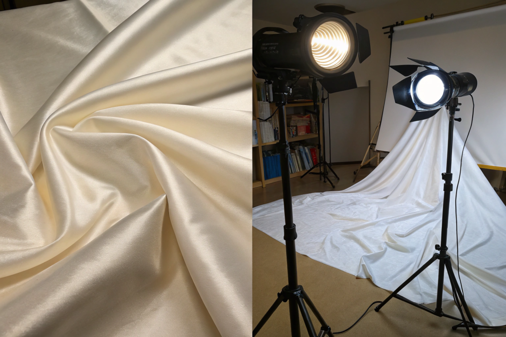
Perfect Mirror Fabrics : High-shine Satin Charmeuse Cire Nylon Patent Leather . These fabrics reflect light in a Single Direction . If the angle of the light equals the angle of the camera you get a White Blob . The rest of the fabric looks Dark and Muddy . The camera sensor cannot handle the contrast. It either blows out the highlights or crushes the shadows. The result is a photo that looks like a cheap flash photo from 2005.
Broken Mirror Fabrics : Matte Crepe Slubby Linen Brushed Cotton Textured Wool . These fabrics have a Rough Surface . They scatter light in All Directions . This is called Diffuse Reflection . When light hits a slubby linen it bounces off in a thousand different angles. The camera sees a Soft Even Glow . It sees the Texture . It sees the Depth .
This is why luxury brands shoot their cashmere sweaters and linen suits in Natural Diffused Light . The fabric does half the work for them. It eats the light and gives back a soft richness.
How Does Light Reflectance Differ Between Matte and Shiny Weaves
Let’s get a little technical because understanding this will save you thousands in photography reshoots.
Shiny Weaves (Satin Sateen): These are made with Long Floats . The weft yarn skips over 4 or 5 warp yarns before tucking under. This creates a Flat Smooth Surface . Light bounces off like a still pond.
Matte Weaves (Plain Twill Crepe): These have Short Floats or Highly Twisted Yarns . The surface is Irregular . Light bounces off like a choppy ocean.
Here is a simple test you can do in your studio. Hold the fabric under a single light source. Move your head side to side.
- Shiny Fabric: The bright spot Follows Your Eye . It’s a moving glare.
- Matte Fabric: The brightness stays Consistent . There is no moving glare.
For e-commerce Avoid Moving Glare . It makes the garment look cheap and distracts from the fit and silhouette.
At Shanghai Fumao we recommend Sandwashed Charmeuse instead of High-Shine Charmeuse for e-commerce. The sandwashing breaks up the surface just enough to kill the specular highlight while retaining the beautiful drape.
What Is the Moiré Effect and Which Fabrics Trigger It
This is the nightmare of every e-commerce art director. You shoot a beautiful Herringbone Suit or a Fine Stripe Shirt . You upload the photos. And there it is. A Swirling Rainbow Pattern that isn’t on the actual fabric. It looks like a psychedelic glitch.
That’s Moiré . It happens when the Grid of the Fabric Pattern clashes with the Grid of the Camera Sensor .
Fabrics Most Likely to Moiré:
- Pin Dot Patterns: Tiny repetitive dots.
- Fine Stripes: Especially high-contrast (white/black).
- Herringbone and Houndstooth: The V-shapes create an interference pattern.
- Tight Corduroy: The wales act like a lens grating.
How to Fix It:
- Shoot Slightly Out of Focus: It sounds crazy but a tiny bit of softness kills moiré.
- Change Distance: Step back or zoom in. Moiré is distance-dependent.
- Use a Anti-Aliasing Filter** on your lens.
- Choose Larger Scale Patterns** . A bold 1-inch stripe is safer than a 1/8-inch pinstripe.
If you are sourcing fabric specifically for e-commerce and you are not a professional photo retoucher Avoid Fine Regular Geometric Patterns . Choose Irregular Organic Patterns (floral paisley abstract) which almost never moiré.
How to Choose Colors That Remain True on Digital Screens
There is a color you see in real life. There is a color your camera sees. And there is a color the customer’s phone screen displays. These are Three Different Colors .
Some colors survive this translation better than others. Some colors are Digitally Fragile .
The Safest Colors for E-Commerce:
- Deep Jewel Tones: Navy Burgundy Forest Green Eggplant. These colors have enough Saturation to survive compression algorithms. They look rich even on a cheap LCD screen.
- Mid-Tone Earth Tones: Terracotta Olive Rust Sand. These colors are Forgiving . If the white balance is slightly off they still read correctly.
- Heathered Colors: The mix of fibers creates Visual Depth that photographs beautifully.
The Most Dangerous Colors for E-Commerce:
- Neon and Fluorescent: These colors exist outside the RGB Color Gamut . Your camera cannot capture them. Your screen cannot display them. They will look Dull and Muddy in photos. The customer will be disappointed when they see it in person.
- Pure Optic White: White is a White Balance Nightmare . It reflects the color of the room. It turns blue under studio lights or yellow under warm lights. It loses all detail and looks like a Blown-Out Hole .
- Very Pale Pastels: Baby Pink Mint Green Sky Blue. These colors require Perfect Exposure . If the photo is 1/3 stop overexposed the color disappears completely and looks White .
Why Are Jewel Tones and Earth Tones More Forgiving on Camera
This is a function of Color Saturation and Dynamic Range .
A camera sensor has a limited Dynamic Range (the range from darkest shadow to brightest highlight). If you have a very Light color next to a very Dark color the camera struggles.
Jewel Tones (Navy Burgundy) sit in the Middle of the Histogram . They are dark enough to show shadows and texture but not so dark that they "crush to black." They have high Color Saturation which means they retain their hue even when compressed into a small JPEG file.
Earth Tones (Terracotta Olive) have a lot of Red and Yellow Undertones . These wavelengths of light are captured well by standard digital sensors. They also evoke a natural organic feel that aligns well with current minimalist aesthetics.
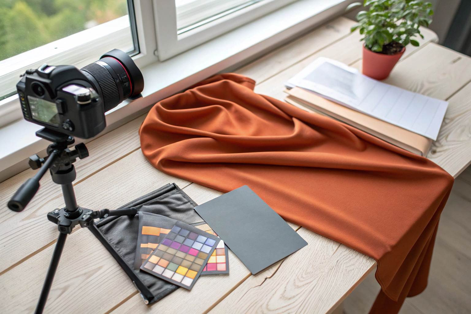
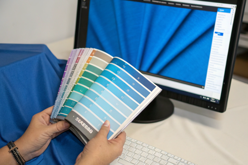
How to Use a Gray Card to Calibrate Fabric Color Accuracy
If you are serious about e-commerce you must invest in a Gray Card . It’s a piece of plastic or cardboard that is Exactly 18% Gray . It costs $15.
Here is the workflow:
- Place the fabric on the set.
- Have the model hold the Gray Card in the Same Light as the fabric.
- Take a test shot.
- In post-production use the White Balance Eye-Dropper Tool and click on the Gray Card.
This one step corrects the color cast of the lights and the tint of the camera sensor. It ensures that the "Navy Blue" fabric on your website looks like "Navy Blue" not "Purple" or "Black."
At Shanghai Fumao we provide Calibrated Color Swatches to our e-commerce clients. We measure the fabric color with a Spectrophotometer and provide the LAB Color Values . You can give these numbers to your retoucher and they can match the color mathematically.
What Fabric Textures Create Depth in Flat Lay Photography
Flat lay photography is the backbone of e-commerce. The garment on a white background. No model. No movement. Just the product.
In this context Texture is Everything . Without a model to show drape and movement the fabric itself must provide the Visual Interest . A smooth flat fabric looks like a paper cutout. A textured fabric looks like a Real Object .
Best Textures for Flat Lay Depth:
- Slub Yarns: The random thick and thin sections create a beautiful Organic Shadow Pattern . Linen and Dupioni Silk are kings of slub.
- Corduroy and Rib Knits: The vertical ridges create Linear Shadows that give the garment structure and a sense of direction. Side lighting across the wales is essential.
- Brushed Finishes (Peach Skin Flannel): The fine micro-fuzz catches the light and creates a Soft Halo Glow . It looks incredibly cozy and expensive.
- Crepe and Seersucker: The puckered surface creates a Micro-Shadow Network . It never looks flat.
Textures to Avoid in Flat Lay:
- Ultra-Smooth Polyester Satin: Looks like a plastic bag.
- Fine Gauge Jersey: Looks like a featureless blob. It needs a model to show the drape.
How Does Slub Yarn Create Organic Shadow and Visual Interest
Slub is a spinning defect where the yarn gets thicker in random spots. It used to be considered a flaw. Now it’s a premium feature.
When you side-light a slubby fabric the Thick Sections cast a Slightly Darker Shadow than the thin sections. This creates a Subtle Stripe Effect that isn’t actually dyed into the fabric. It’s a Structural Shadow .
This gives the fabric a Handmade Artisanal Vibe . It photographs like a Painterly Texture . It’s the reason why Linen always looks more interesting in photos than Cotton Poplin even if they are the same color.
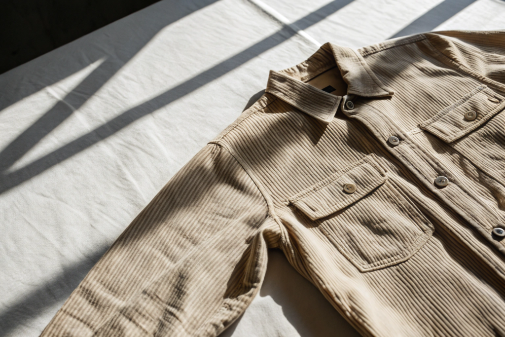
Why Is Corduroy a Favorite for E-Commerce Detail Shots
Corduroy is the most Photogenic Fabric ever invented. I’m convinced of it.
It’s because of the Wales . The vertical ribs act like a Venetian Blind . When you light it from the side the light skips across the tops of the ribs and leaves the valleys in deep shadow. You get 100% Contrast .
This makes the fabric look Incredibly Three-Dimensional even on a white background. You can almost feel the ridges through the screen. It’s a Tactile Illusion .
For e-commerce detail shots corduroy is a cheat code. Zoom in on the collar or the cuff. The wale texture fills the frame with rich detail. It signals "Quality Construction" immediately.
How to Test Fabric for E-Commerce Before Bulk Production
You don’t need a $50,000 photo studio to test fabric. You need an iPhone and a Window .
Because here’s the truth. Your customer is looking at your website on an iPhone. Not a calibrated Eizo monitor. You need to test the fabric on the Lowest Common Denominator Device .
Here is my 5-Minute E-Commerce Fabric Test :
Step 1: The Window Test.
Take the swatch to a north-facing window (soft even light). Hold it up. Take a photo with your phone Without Filters .
- Does it look Rich or Flat ?
- Is there a Glare Spot ?
- Can you see the Weave Texture ?
Step 2: The Crush Test.
Scrunch the fabric in your hand for 30 seconds. Let go. Smooth it out with your hand (no iron). Take another photo.
- Does it look like a Rumpled Mess or Artfully Lived-In ?
- (Hint: Linen looks great rumpled. Polyester looks terrible.)
Step 3: The Scroll Test.
Look at the photo on your phone. Now pinch-zoom in as far as it will go. This is what a customer sees when they "View Detail."
- Is the zoomed-in view Interesting (Slubs Weave)?
- Or is it a Blurry Pixelated Mess ?
If a fabric passes these three tests it will likely perform well online. If it fails go back to the drawing board.

How to Simulate Studio Lighting with a Simple Window Test
Studio strobes are just Artificial Sunlight . A large window on an overcast day is Better Than Studio Light for testing e-commerce fabrics.
Why? Because it’s Diffused . It wraps around the fabric. It reveals texture without creating harsh specular highlights.
If the fabric looks Dull and Lifeless in soft window light it will look Dead under studio strobes. Window light is the great equalizer. It doesn’t lie.
What Are the Best Questions to Ask Your Mill About Visual Performance
When you’re sourcing fabric don’t just ask about GSM and Shrinkage . Ask about Visual Specs .
Here are three questions I love to hear from smart e-commerce clients:
- "Is this fabric optically brightened?" Optic whiteners can make a fabric look Blue or Purple in flash photography. I prefer Non-Optical White for e-commerce.
- "Does this fabric have a mechanical or chemical softener?" Chemical softeners can leave a Greasy Residue that catches light and looks shiny. Mechanical softeners (sanding brushing) create a Matte Texture that photographs better.
- "Can you send me a video of the fabric moving?" A still photo hides drape. A 10-second iPhone video of the fabric being swished shows the Fluidity and Weight . This is the secret to selling silk and rayon online.
Conclusion
Sourcing fabrics that photograph well for e-commerce requires a shift in priorities. You must value Matte Over Shine Texture Over Smoothness and Saturation Over Paleness . The fabric that wins in the handfeel test doesn’t always win in the conversion rate test. You need fabrics that diffuse light that hold a shadow and that translate the tactile experience into a visual one.
The best e-commerce fabrics are the ones that do the heavy lifting for your photographer. They forgive slight exposure errors. They create their own depth. They look expensive even when compressed into a tiny JPEG on a social media feed.
At Shanghai Fumao we work with many direct-to-consumer brands and we’ve curated a specific range of E-Commerce Optimized Fabrics . These are bases with matte finishes slub textures and rich saturated colors that we know perform well on camera. We’re happy to share this knowledge and help you avoid the heartbreak of a beautiful garment that just won’t sell online.
If you’re developing an e-commerce focused collection and want to see our range of photogenic fabrics please reach out to our Business Director Elaine. She can send you a digital lookbook with video swatches so you can see exactly how the fabric moves and catches the light.
Contact Elaine at: elaine@fumaoclothing.com