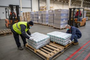
Here’s a $40,000 mistake I watched a brand make last year. They skipped the sample stage. Not delayed it—skipped it entirely. A Los Angeles streetwear startup fell in love with a digital rendering of a "vintage wash" French terry. The JPEG looked incredible on their moodboard. They wired a 70% deposit for 3,000 meters straight to bulk production. The fabric arrived, and it was a disaster. The "vintage wash" wasn’t a soft lived-in drape; it was a stiff, chemical-crusted board that cracked when you bent it. Their Instagram launch turned into a refund nightmare. The manufacturer shrugged and said, "You approved the spec sheet." The spec sheet was just numbers. Numbers don’t tell you how a fabric feels against the inside of a wrist, how it sounds when it rustles, or how it smells when you iron it. That startup folded six months later.
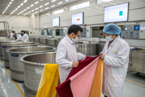
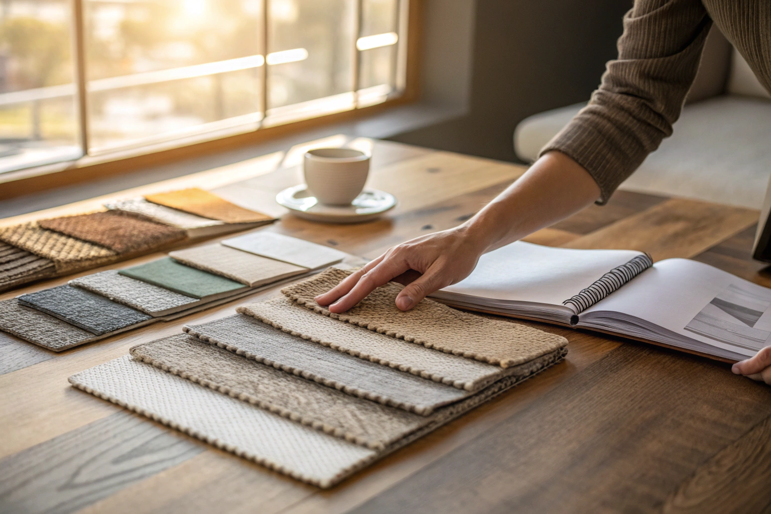
A physical fabric sample is your insurance policy against digital lies. At Shanghai Fumao, I don’t care if you order a $5 swatch or a $500 custom lab dip. I will never let you commit to a container load of fabric without holding the physical evidence in your hand. A sample is not a cost; it’s forensic due diligence. It answers the questions a PDF never can. Does the green undertone clash with your existing zipper tape? Does the pile crush when you run a fingernail across it? Will the spandex recovery survive a weekend in your own washing machine at home? These are the unspoken truths of garment manufacturing. The Chinese supply chain can produce magic, but only if you do the unglamorous work of touching the raw material first. I’m going to break down exactly what samples to request, how to read them like a veteran QC inspector, and how this small upfront investment saves your brand’s reputation.
What Types of Fabric Samples Do You Really Need to Order Before Bulk Cutting
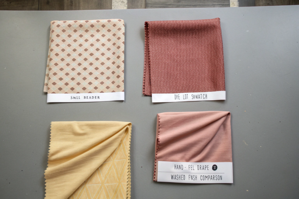
Not all samples are created equal. I see new designers make the same mistake every single week. They request a "fabric sample," and we send them a stock header. They feel it, they love it, they order 2,000 meters, and then they scream when the bulk arrives looking slightly different. Why? Because a "header" is just a pretty little snipping cut from a random roll in the warehouse. It represents the general family of the fabric, not the specific generation. You need a specific sample hierarchy to build a proper case file. I teach all my clients the "Three-Tier Sampling Protocol." Think of it like dating, then getting engaged, then getting married. You don’t marry a swatch you met on a website.
Here is the breakdown of what you actually need to demand from your supplier, especially if you are importing from China. First, the Handfeel/Swatch Stock Sample. This is the free or low-cost "feeler." It tells you the weight, the drape, and the basic color. But it doesn’t tell you anything about the commercial run. Second, the Lab Dip or Strike-Off. This is the custom sample. This is where you submit your specific Pantone, and the dye house boils a small pot. 80% of the problems happen here because colors shift between a "dip" and a "bulk" due to liquor ratio differences. Third, and this is the one most people skip to save $50, the Pre-Production (PP) Sample. This is a 3-5 meter cut taken directly from the finished bulk roll before the entire 2,000 meters get packed. You approve the PP sample via video call, and only then do we fire up the cutting blades. Skipping the PP sample to save one week is how you end up with 2 kilometers of slightly skewed plaid on your warehouse floor. The entire textile industry runs on this physical hierarchy, and I strongly suggest you follow a reliable three-stage fabric sampling process before importing custom apparel textiles from Asian mills before you even think about cutting.
Why Does My Custom Indigo Dye Lot Swatch Look Green Under Store Lighting?
This is the "Metamerism Monster." I fight this demon every day. A client from a Japanese denim brand visited our dye house last autumn. He held the custom 12-ounce indigo slub against his original vintage Levi’s reference. Under the D65 daylight lamp in our color-matching cabinet, it was a perfect match. Then, our QC guy flicked the switch to TL84—standard American mall fluorescent lighting. The indigo shifted violently to a muddy teal-green. The client went pale. That’s metamerism. It’s when two colors match under one light source but look completely different under another. It happens because our base dyes use a different spectral reflectance curve than the vintage reference, even though the human eye aligns them in daylight.
You cannot avoid metamerism by staring at the swatch. You need a light booth that mimics specific store environments. I demand that clients specify their "primary selling environment." Is it outdoor flea markets (D65), a luxury boutique with warm halogen spots (A-Light), or a Target aisle (TL84)? Once we know the target, we adjust the recipe. We might swap a reddish navy base for a greener one to stabilize the spectral curve. For deep dives, you must look at the spectrophotometric analysis of metameric failure in custom indigo blue denim samples. Also, a quick field test you can do: take the swatch and your original Pantone chip and view them under a passing car’s headlight at night. Headlights are brutal. They expose hidden undertones faster than any lab machine. If they match under HID headlights, you’re usually safe.
Is a Digital Print Strike-Off Enough to Approve a Repeat Artwork Pattern?
Absolutely not. And I’ll tell you why: paper lies. A digital strike-off printed on a small A4 paper or even a tiny piece of fabric from a Mimaki printer looks sharp and saturated because the ink sits on top of the fibers like a crust. In bulk production, we use rotary or flatbed screens where the dye penetrates the fiber core. The line definition blurs by 0.2 to 0.5 millimeters. If your design has tiny 1mm dots (stipple effect), a digital sample shows crisp dots. The bulk will come out as a muddy smear. I almost lost a French silk scarf account because her peacock feather design had a 2-pixel line weight that simulated beautifully digitally but disappeared entirely in acid-dye bulk.
You must ask for a "Production Simulation Strike-Off." This means we engrave a small nickel screen with your exact repeat size and run it on a manual flatbed press using the actual bulk dyes. It costs about $80 to set up one screen, but it reveals the "ink bleed" truth. The critical metric is "ink spread." You can study the pixel-to-fiber ink bleed ratio between digital textile proofs and production rotary screen strike-offs. I tell clients: look at the back of the printed sample. If the strike-off doesn’t show a specific degree of "fiber penetration" on the reverse side, you are looking at an ink-jet simulation, not a real bulk print. Also, check the seam integrity. Rub the printed area hard against a piece of white cotton ten times. If the color transfers, the fixation is incomplete, and the first time a customer washes it, your parrot print becomes a faded pigeon.
How to Test Fabric Shrinkage and Hand-Feel at Your Kitchen Table
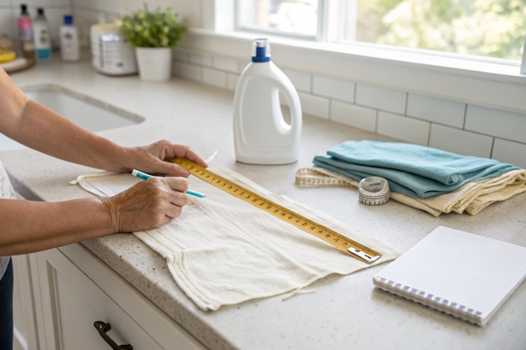
You don’t need a $50,000 lab to catch a catastrophic fabric failure. Your laundry room is actually a pretty good torture chamber. I encourage my startup clients to be paranoid. The factory testing report I send you—I stand by it. But you should verify it yourself. Your washing machine, your detergent, your dryer settings. Those are the exact conditions your customer will use. A lab tests under ISO standards with a specific phosphate-free reference detergent. Your customer uses Tide pods and hot water, and they over-dry the hell out of a cotton hoodie. The lab result says "3% shrinkage." Your home test says "8% and it looks like a crop top." If I’m your supplier, I want you to discover that mismatch on a $2 swatch, not a $20,000 shipping container.
Here’s a specific field test for shrinkage that doesn’t require selling a kidney. Take a fabric square, exactly 50cm by 50cm. Draw a 30cm x 30cm perfect square inside it using a Sharpie and a rigid ruler. Don’t trust the selvedge or the cut edge; those are distorted. Mark a "W" for warp (length) and "F" for weft (width). Now, throw it in your home washer with a hot cycle and a heavy cotton towel (the towel creates more abrasion). Dry it on HOT. Iron it flat—don’t stretch it; just press it. Measure the box again. If your 30cm warp line is now 28.5cm, you have exactly 5% shrinkage. That means a standard 100cm waistband becomes 95cm. Your "Medium" just turned into a "Child’s Large." You don’t need to wait for a lab report. Do this tonight. It grounds your spec sheet in brutal domestic reality. I always suggest looking up the classic at-home decatising shrinkage testing method for cotton jersey swatches using a domestic washing machine while you’re waiting for your first delivery.
How Many Washes Before I Can Trust the Durability of a Printed Swatch?
The first wash only removes the loose dye and starch. It’s a liar. The real story starts at wash five. I call it the "Revelation Threshold." Print pastes, especially thick white pigment prints, are like an armor shell on the surface. They look perfect for the first three washes. Then, the resin binder starts to microfracture from the mechanical action. By wash cycle number seven, the "crackle" effect appears. If you are selling vintage-style band merch, maybe cracking is a vibe. If you are selling luxury minimalist baby onesies, it’s a chargeback.
I tell every brand to do a "10-Wash Stress Test" on a swatch before they approve bulk. Just cut the swatch into four squares. Sew a square onto an old pair of jeans. The jeans act as an agitator; they rub against the print just like a spinning drum does. Do one hot wash, one cold wash, and then hot again. Actually check out the simulated accelerated 10-cycle home laundering protocol to verify pigment print crack resistance on swatches. By wash 8 or 9, if the print looks fuzzy and the base color is peeking through like a worn-out billiard table, reject it. I don’t care if the lab says the crocking test passed. Visual print integrity is a subjective quality that labs can’t score perfectly. You have to see it. You are the final judge of whether the garment looks "thrifted vintage" or just "garbage."
Can I Use a Smartphone Macro Lens to Spot Cellulose Impurities?
Stop laughing, this is high-tech low-budget QC. Modern smartphones have a macro mode that’s sharper than a 10x jeweler’s loupe from 1995. I tell my remote designers to flip their phone over and put the lens directly on the swatch. Observe the slub texture of linen or the openness of a cotton percale. What are you hunting? "Dead cotton." These are tiny immature fiber clusters that didn’t take the dye. Under a macro lens, they look like little white spider nests or spots, especially on dark colors like navy or black. If you see a constellation of these white undyed neps on a luxury gabardine swatch, the fabric is trash. It was picked from a drought-stressed crop.
You can also spot "vein impurities" in viscose. If the wood pulp wasn’t fully dissolved, you’ll see tiny translucent hard slivers. Under the fingertip they feel like a micro-scratch. Under the macro lens, they look like tiny shards of glass embedded in the yarn. I once had a client scan a swatch with his iPhone 14 Pro, zoom in, and email me a screenshot of a black speck on a white Egyptian cotton shirting. We reviewed the bale under our Uster tester. It wasn’t a seed fragment; it was a tiny piece of plastic packaging contamination from the ginning stage. He saved maybe 500 shirts from ending up in a landfill or, worse, on a 1-star review with a close-up picture. So study the spotting fabric impurities in organic cotton swatches using digital macro photography identification techniques and don’t trust the squint.
How Does the Sourcing of Custom Lab Dips Save Your Bulk Production Timeline
Time doesn’t start when the loom runs; time starts when the color is locked. I’ve seen a 7-day delay in lab dips cause a 3-week delay in bulk production. Why? Because the dye house scheduling window is brutal. You linger on the lab dip an extra week, thinking you’re being "thoughtful." But you don’t see the conveyor belt behind the wall. You lost your slot in the dyeing queue. Suddenly, your fabric gets pushed behind a 10,000-meter order of black polyester. Your "Quick Turn" becomes a "We’ll squeeze you in next month." The custom lab dip isn’t just a color exercise; it’s your reservation ticket. When I sign off on a final "D" lab dip, I immediately punch in the timeline for the bulk starching and frame steaming. By sending your dip request early, you align the dye pantry’s chemical purchases with your batch. If I know I need "Reactive Blue 221" for your order, I buy it now before the global price spikes.
But here is the part where you need to give me good feedback. The worst words a dyer can hear are, "Make it pop more." That means absolutely nothing. "Pop" is a feeling, not a spectral data point. When you look at a lab dip against a Pantone in your office at 2 PM under a cloudy sky, you’re seeing a different color than I saw at midnight under Chinese inspection lamps. Your feedback must follow a specific formula. "Target: Pantone 19-4052 Classic Blue. Dip A: Too red by 10%, too dark by half a shade. Steep the dye bath 5 minutes less and reduce red concentrate by 15%." That’s useful. That’s actionable. We log that data and adjust the recipe card to decimal precision. This is the exact reason a proper laboratory dye dispensing and recipe correction procedure to accelerate bulk textile dye lab dip approval matters for your launch schedule. If you can learn to speak "Delta E" instead of "Pop," I can shave 10 days off your go-to-market calendar.

What Is the ‘Liquor Ratio’ and How Does a Small Sample Pot Skew the Bulk Shade?
This is the hidden physics trap. In the lab, we dye your 20-gram swatch in a small steel beaker with maybe 200ml of water. The liquor ratio (water to fabric) is 10:1. It’s a comfortable bath. The dye molecules have plenty of room to swim and attach evenly. Now, we take that same percentage recipe and dump it into a 500-kilogram jet dye machine where the ratio is maybe 5:1 or 6:1. The bath is cramped. The chemistry gets aggressive. The exhaustion rate (how fast the dye grabs the fiber) skyrockets. Colors that looked soft and tonal in the beaker come out heavier, deeper, and sometimes muddier in bulk.
We adjust for this using "additive correction factors." We don’t just send you the lab formula; we send you the "bulk adjusted formula." The key item you need to ask for is the effect of liquor ratio discrepancy between lab dip beakers and industrial jet dye machines on final fabric color. Usually, for pale pastels, we have to lower the dye concentration for bulk because the low ratio forces the dye onto the fiber too aggressively. For dark navies, we often need to add extra salt to force the dye to exhaust properly without wasting dye molecules down the drain. If a small lab doesn’t apply this conversion math, their "matched" lab dip is scientifically irrelevant to the bulk output. I fire chemists who just blindly scale up without the ratio adjustment.
How to Read a Spectrophotometer Report Without a PhD in Chemistry?
You see a graph with a line and some numbers like "L 45.2, a 18.7, b -5.1." You just want a terracotta jacket, right? Here is the cheat sheet. Focus only on the D65/10 degree values. That’s daylight. Ignore the rest for your initial check. L is Lightness. 0 is black, 100 is white. If your target is 45 and the sample is 42, it’s too dark. a is red-green axis. Positive is red, negative is green. If your target is 18.7 and the sample is 22.1, it’s too red (too warm). b is yellow-blue axis. Positive is yellow, negative is blue. A shift of 1.0 units on the B axis is visible to the naked eye.
Now, look for the single magic number: Delta E (dE CMC 2:1). This is a mathematical calculation of the total color distance between your target and the sample. The industry standard for "commercially acceptable" is typically a dE CMC of 1.0 or less for fashion colors. For denim, maybe 1.5 is okay. For a "brand critical" red (like Coca-Cola red), the demand is below 0.8. If you scan a piece of swatch data and see a dE of 2.5, you don’t need a chemistry degree to know it’s a fail. Your eye will see the difference. The machine just confirms why you don’t like it. You can learn the basics of reading CIE Lab Delta E value reports for non-scientists approving fabric color standards in about ten minutes. It’s a lot easier than guessing while squinting.
What Are the Hidden Seasonal Risks When Ordering Holiday Fabric Swatches Late
The calendar is a circle, not a line. And Chinese holidays are the sharp teeth on that wheel. If you wait too long to pull your sample trigger, you don’t just miss the Christmas run; you miss the factory’s ability to care. I recall a German Christmas market retailer one year. They decided in early November they wanted a "luxurious red velvet" for stockings. They requested samples after Halloween. By the time we mailed the hand-feel swatches, it was November 10th. They approved the lab dip on November 25th. We told them: "The jacquard loom queue closed two weeks ago. We can ship this for next Christmas." They begged. They screamed. I could not awaken a machine that was already fully loaded. The sample delay killed their season. A $10 "Rush FedEx" sample in September could have saved a $300,000 product line.
The hidden risk is specifically the "before/after window" of the Chinese New Year (CNY). Let’s look at the real texture calendar. You want a specific "Rose Gold Lurex Metallic" for a 2026 Spring Party dress. It’s a custom yarn blend. If you request the sample after December 15th of the preceding year, the spinning mill is already winding down. They are not taking new sampling orders. They are just processing the backlog before they shut the lights off for February. Your sample request sits in an inbox until mid-February. Yarn delivery happens in March. Your sample arrives in April. You approve in May. Bulk delivery in June? Too late. The party already happened. When people scramble looking for seasonal Chinese holiday production deadlines for winter fabric sample ordering and bulk bulk cut-off dates, they usually miss the critical detail that sampling stops before production stops. You need to have your lab dips finalized before the peak season even starts, otherwise, we’re fighting for resources with brands who planned ahead. You want a swatch book of Christmas velvets in your hand by September 1st.
Why Does Metallic Yarn Tarnish During Delayed Sample Shipping Transit?
Metallic yarn (Lurex) is a princess material. It throws a tantrum with moisture. If a courier leaves a box of metallic-coated swatches in a cargo hold that cycles through condensation (freezing altitudes, hot tarmacs), the microscopic aluminum coat begins to oxidize. When you open the envelope two weeks later, your "Brilliant Gold" looks like a brownish dull penny. You reject the swatch. But it wasn’t the factory’s dyeing; it was the transit time and packaging. It’s a false negative.
We prevent this with "active desiccant packaging" for any sample containing a metallic film. I pack sealed silica beads inside the polybag with the swatch. More importantly, we use an acid-free black tissue paper. Cheap tissue paper can sometimes contain sulfur, which accelerates silver tarnishing. If you are requesting swatches of festive lamé or metallic-fleck coating, don’t choose the slow boat. Pay for the air courier (DHL or FedEx) to minimize the time the package sits in a humid airport cage. I also do a "tape test" on a section of the swatch before I send it. I check the actual metallic yarn oxidation prevention packaging methods for exporting seasonal lurex swatches via courier. I pull off the tape to see if the foil separates. If it’s intact in the humid Keqiao warehouse, I’m 90% sure it will survive the trip to a dry New York office.
How Can an Out-of-Season Swatch Book Predict the Next Year’s Textile Trend?
Sampling late seasons isn’t just about risk—it’s about buying a data crystal ball. This is a trick for the really high-end brands. I call it "Ghost Season Trunk Shows." For example, in the brutal heat of August, when everyone is sweating and nobody wants to think about wool, I have a climate-controlled swatch library. A smart creative director will visit in August not to buy, but to feel. They will touch the heavy 500 GSM alpaca blends when there is no pressure. They have a clear head. No "Christmas panic adrenaline" distorting their aesthetic taste.
There is a secret cycle to this. You should request "experimental swatches" exactly 18 months before the delivery window. These are not commercial fabrics yet; they are tests. A factory will often show a weird yarn blend or a new finishing treatment to a trusted buyer long before it’s a market trend. I showed a 50% hemp/50% recycled wool coating to a UK eco-brand last August. It was just a slubby, hairy prototype. No one else had seen it. They touched it, loved the scratchy sustainable roughness, and built their Winter 2026 collection around that single swatch. They bet on it early. They avoided the trend-follower price war. They used the swatch as a seed, not just a safety check. You should always analyze how to use early-access prototype fabric sample libraries for long-term textile design trend forecasting and development. Because the sample in your hand today is the container load of your profit tomorrow.
Conclusion
A fabric sample is the smallest physical object with the heaviest financial consequence in the entire fashion supply chain. It’s a 50-gram piece of cloth that decides whether 500 kilograms of finished garments become a bestseller or a write-off. I’ve been in this Keqiao trading office long enough to know that the brands who obsess over the sample stage—who wash it, who stretch it, who photograph it under car headlights at 11 PM—are the ones who bank real profit. The ones who trust the digital simulation and skip the physical proof are the ones who end up selling their "Reformation-level" designs at a flea market for cost.
At Shanghai Fumao, we don’t charge you an arm and a leg for a swatch because we know our future bulk order is hidden inside that little envelope. The lab dip that matches on the first try, the strike-off that reveals the ink bleed early, the shrinkage test that forces a pre-shrink conversation—these are not delays. They are accelerators. They make the bulk production silent. Smooth engines instead of a screaming fire drill.
Don’t let a stock photo decide your fabric’s fate. If you are ready to map out your next collection’s tactility, or if you have a specific Pantone you need to see on organic bamboo jersey, let’s get the physical evidence in your hands first. Reach out directly to our Business Director Elaine at elaine@fumaoclothing.com. Ask for a "Custom Discovery Pack" specific to your end-use, whether that’s children’s sleepwear or high-abrasion tactical gear. We will cut the swatches, seal the reports, and send you a box that smells like a dye house—in a good way. Touch it. Destroy it. Then, let’s build it.