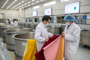
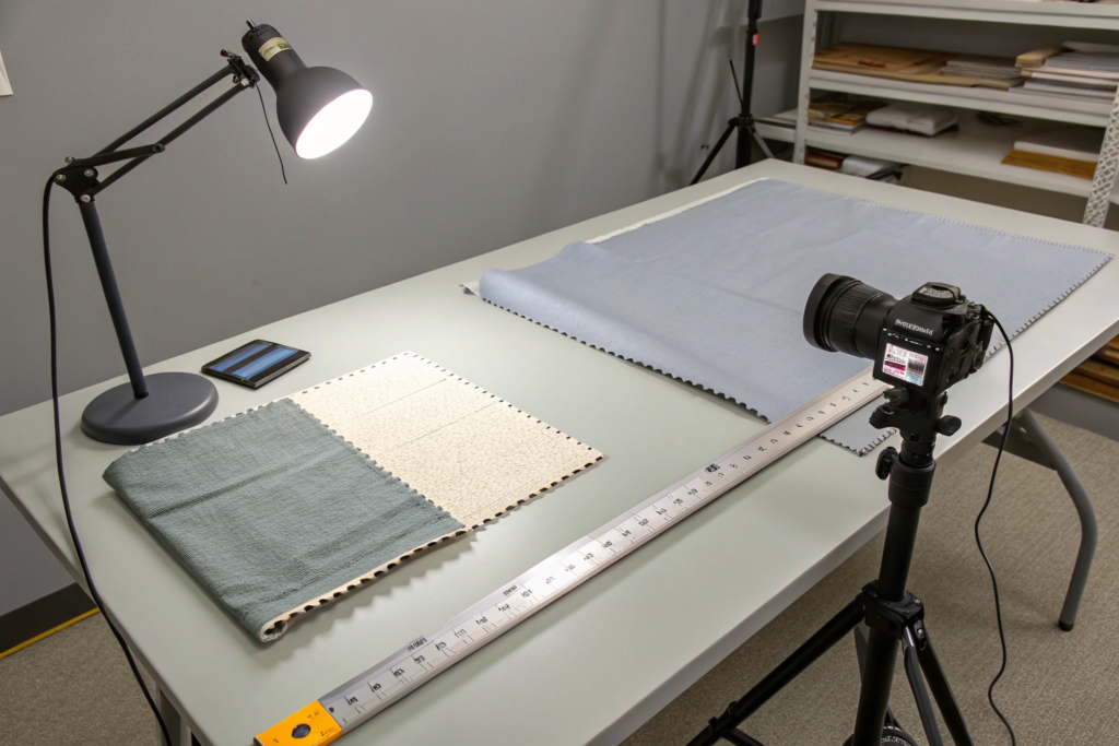
You’ve just signed off on a gorgeous "Sandstone Beige" lab dip. It took three rounds of submits to get the tone just right. The bulk fabric arrives eight weeks later. You cut open the first roll. It’s not Sandstone Beige. It’s "Creamsicle Orange." Your heart races. You check the next roll. It’s slightly lighter than the first. And the third roll has a dark line running right down the middle of the selvedge. You have 10,000 units of a best-selling chino pant scheduled to hit stores in six weeks. Now you have a logistical nightmare of epic proportions. This isn’t just a delay. This is a brand integrity crisis. Your customers expect the pants they see online to match the pants they bought six months ago. Color inconsistency erodes trust faster than almost any other quality defect because it’s immediately visible and impossible to hide.
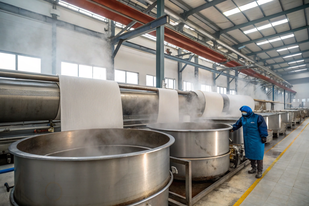
At Shanghai Fumao, we achieve consistent color from the first yard of bulk to the last—and from dye lot to dye lot separated by months—by eliminating human subjectivity wherever possible and replacing it with calibrated instrumentation and rigorous process control. It’s not magic. It’s a combination of digital color communication, strict dye kitchen automation, and a relentless commitment to lab-to-bulk correlation. We use spectrophotometers to read color as mathematical data points in the CIELAB color space, measuring Delta E values against a master standard that lives in a climate-controlled vault. But the machine is only half the story. The real secret lies in how we manage the wet processing: the pH of the water, the ramp rate of the steam temperature, and the tension on the fabric as it enters the dryer. We control the variables so tightly that the final color variation across an entire 5,000-yard batch is typically less than what the human eye can even perceive.
Now, you might be thinking: "Okay, that sounds expensive and complicated. I just want my fabric to match the Pantone chip." I get it. And I’m going to break down exactly how we make that happen without blowing up your cost sheet. This article pulls back the curtain on our dye house operations in Keqiao—the same processes we use for ZARA-level fast fashion and for boutique designers doing small-batch runs of 100 yards. You’ll learn why your previous supplier’s colors were all over the map, what questions to ask before placing your next PO, and the specific data reports you should demand with every shipment. Because when it comes to color, trust is built in the details.
What Causes Color Variation in Large Fabric Production Runs?
Most buyers assume color variation is just about the dye recipe. They think, "The dyer put in the wrong amount of blue." That’s rarely the issue. The real causes are far more subtle and happen at the molecular level inside the fiber. Understanding these root causes is the first step to preventing them. When you are dealing with 1,000 pounds of fabric in a single batch, small inconsistencies that are invisible in a lab beaker get amplified into massive, visible shade bands across the roll.
There are four primary villains in the story of inconsistent bulk color. First is Fiber Maturity and Origin. Cotton from Xinjiang dyes differently than cotton from Australia. The cellulose walls have different thicknesses. Second is Water Chemistry. The mineral content in Keqiao’s tap water changes slightly between the rainy season and the dry season. Iron or calcium ions can shift a shade toward the yellow or red spectrum if not properly sequestered. Third is Temperature Gradient. Inside the dyeing machine, the liquor might be 130°C near the heating coils but only 128°C at the far end of the kier. That two-degree difference changes the rate at which the dye molecules strike the fiber. Fourth is Fabric Tension and Cooling. As the hot fabric comes off the stenter frame, if the cooling drums aren’t perfectly level, the fabric density changes, which alters how light reflects off the surface.
At Shanghai Fumao, we don’t treat these as surprises. We treat them as expected variables to be neutralized. We have a saying in the dye house: "Control the substrate, or the substrate controls you." This means we pre-test every single lot of greige fabric for absorbency and pH before it ever touches dye water. If the greige isn’t consistent, the dye job won’t be either. For a deeper dive into the science of fiber preparation, this resource on how to properly prepare cotton fabric for reactive dyeing to ensure level color absorption is a standard reference we use for training our junior technicians.
The other massive variable—and this is one most brands never think about—is Residual Chemistry from Previous Lots. A dye machine that just ran a batch of navy blue will leave a tiny, invisible film of blue dye on the stainless steel walls. If the next batch is a pale pink, that pink will be "dirtied" by the blue residue. It’s called Cross-Contamination. We combat this with a rigorous Boil-Out Protocol. Between dark and light colors, we run the machine with a strong reducing agent and caustic soda for 45 minutes to strip every last molecule of stray dye. This takes time and costs money in chemicals and water treatment. Many cheap mills skip this step to push through more volume. That’s why their light pastels always look muddy. This is the kind of operational discipline you pay for when you work with a supplier who values long-term partnerships over squeezing every last yard out of the machine.
Why Do Lab Dips Match Perfectly While Bulk Lots Look Completely Different?
This is the single most frustrating experience for any apparel buyer. The little swatch you taped into your tech pack is flawless. The 2,000 yards in the warehouse looks like a distant cousin. The reason is physics. Specifically, the physics of Liquor Ratio and Heating Curve Replication.
Let me explain in plain English. A lab dip is made in a tiny beaker with maybe 10 grams of fabric and 200 milliliters of water. The dye machine in the lab is a glorified microwave. It heats up in 30 seconds. A bulk production machine holds 500 kilograms of fabric and 5,000 liters of water. It takes 20 minutes to reach the target temperature. The dye molecules react differently to a slow, gentle heat-up than to a rapid, aggressive one. If the lab technician doesn’t adjust the recipe to account for this slower Strike Rate, the bulk will always be slightly lighter or "off-tone."
At Shanghai Fumao, we bridge this gap using a Pilot Dyeing Machine. This is a miniature version of the big production machine. It holds 5 kilos of fabric. It heats up at the exact same slow rate as the bulk machine. Before we approve any lab dip for bulk production, we "scale it up" in the Pilot Machine. We call this the Pre-Bulk Verification. Only when the 5-kilo sample matches the 10-gram sample under the spectrophotometer (with a dE < 0.8) do we release the recipe to the production floor.
Here’s a real example. November 2025, a Melbourne-based womenswear brand approved a specific dusty blue lab dip for a Tencel twill. It was a tricky color—lots of grey undertones. The lab recipe used a High Exhaustion Reactive Dye that struck the fiber very fast. In the lab beaker, it was perfect. In our pilot machine, it was 1.2 shades too light and slightly too blue. Our colorist, Ms. Zhang, added 8% more yellow and 3% more black to the formula specifically for the bulk profile. The final bulk production matched the original lab dip with a dE of 0.9. Without that pilot step, 3,000 yards of beautiful Tencel would have been wrong. The client would have either rejected the shipment or demanded a 20% discount. For more on this critical step, this technical article on how to scale up textile dye recipes from lab dip to bulk production accurately explains the mathematical modeling involved.
Can a Different Batch of Yarn Ruin My Color Consistency Even with the Same Dye?
Absolutely. In fact, yarn substitution is the most common cause of "side-to-center" shading and "selvedge-to-selvedge" variation in woven fabrics. You can use the exact same dye recipe, the exact same water, and the exact same machine, but if the Yarn Twist or Yarn Blend Ratio is off by even a tiny fraction, the fabric will look like a different color entirely.
Think of it like painting a wall. If you paint a smooth, primed wall with a roller, the color looks rich and even. If you paint a rough, textured wall with the exact same paint, it looks lighter and more matte. Light scatters off the peaks and valleys. Fabric works the same way. A tightly twisted yarn (high TPI – Twists Per Inch) has a smooth, compact surface. It reflects light back directly, making the color look Darker and Richer. A loosely twisted yarn (low TPI) has a fuzzy, open surface. It traps light, making the exact same dye look Lighter and Flatter.
At Shanghai Fumao, our weaving mill and dye house are integrated. That is a massive advantage. Before we dye a single yard, we check the Lot Number of the Yarn. If we see that the weft yarn for Batch B came from a different spinning mill than Batch A, we sound the alarm. We immediately run a Handloom Swatch—a tiny piece of woven greige using the new yarn—and do a quick dye test. We compare it to the master standard.
Here’s a war story from March 2025. We were running 8,000 yards of a popular 30/1 Cotton Slub Jersey for a Canadian athleisure client. The first 4,000 yards (Dye Lot 1) were perfect "Heather Grey." The second 4,000 yards (Dye Lot 2) came out looking 1.5 shades darker, almost a "Charcoal." Panic stations. We retested the dye recipe. Exact match. We retested the water. Fine. The culprit? The slub yarn used in Lot 2 had a Base Cotton Count of 28/1 instead of 30/1. It was ever so slightly thicker. That tiny difference in diameter changed the surface area of the fabric, which changed the light reflectance, which changed the perceived color depth. We had to strip the second batch and re-dye it with 15% less dye to visually match Lot 1. Now, we lock the yarn spec down in the contract. For a broader look at this issue, this forum thread on how yarn twist and fiber blend affect final fabric color consistency captures the practical headaches this causes for knitters and dyers.
What Role Does Lab-to-Bulk Correlation Play in Color Matching?
You might hear the term "Lab-to-Bulk Correlation" thrown around and think it’s just mill jargon for "we tried our best." It’s actually a formal, documented quality system. It’s the process of proving that the color you see on a 2-inch swatch will be identical to the color on 5,000 yards of finished fabric. Without a rigorous correlation program, you are essentially gambling that the dye house can scale a recipe without error. And as I explained earlier, the physics of heating a beaker versus heating a jet dyeing machine are completely different worlds.
At Shanghai Fumao, Lab-to-Bulk Correlation isn’t a one-time calibration. It’s a Living Database. We have logged thousands of dye cycles, correlating the lab’s predicted reflectance curve with the actual bulk result measured by the spectrophotometer. For every color family—Navy, Red, Beige, Olive—we have a Correction Factor. For example, our data shows that medium-depth turquoise shades using specific blue reactive dyes consistently bulk 5% greener than the lab dip predicts due to the longer reduction time in the bulk machine. Knowing this, our colorist automatically shifts the lab formula 5% toward the red side before we even run the pilot sample. That is the power of data.
This system allows us to achieve what we call "First Time Right" dyeing on over 90% of our repeat colors. For new, custom colors, we hit within commercial tolerance on the first bulk attempt 85% of the time. The industry average for non-integrated mills is closer to 60%. The remaining 15% of the time, we catch the variance in the pilot machine before it ever gets to the full 1,000-kilo batch. That saves you, the buyer, about 7-10 days of re-dyeing lead time. And in fashion, time is the one thing you can’t buy back.
The heart of this system is the Color Kitchen Automation. We don’t have a guy with a ladle scooping powder out of a barrel. That’s how you get "Sunday Night" color (when the weekend shift guy guesses). We use a Computer-Controlled Dispensing System. The colorist calls up the recipe. The machine reads the barcode on the bucket. It opens the correct valve and dispenses the exact gram weight of liquid dye into the mixing tank. The precision is +/- 0.1 gram. This eliminates human error in the weighing process. Combined with the spectrophotometer feedback loop, it creates a closed-loop system. For a deeper understanding of how these systems integrate, this article on how automated color kitchens and dispensing systems improve textile dyeing accuracy provides a good industry overview.
How Do You Ensure the First Bulk Dye Lot Matches the Second One Six Months Later?
This is the holy grail of apparel production. Anyone can match a color today. Matching a color you produced in October 2025 when you re-order in April 2026 is the true test of a world-class dye house. Brands build their identity on core colors. If the "Navy Blazer" from Season 1 doesn’t match the "Navy Blazer" from Season 3, the brand looks sloppy and the customer loses confidence.
We achieve this through Master Standard Archiving and Physical Recalibration. Here’s the Fumao protocol in a nutshell:
- The Digital Standard: Every approved color gets a unique Fumao Color Code. The spectral reflectance curve is saved permanently on our secure server. That’s the digital DNA of the color.
- The Physical Standard: We cut three swatches from the actual bulk-approved roll of the first production run. One goes to the client. One goes into our Climate-Controlled Vault (dark, 21°C, 50% RH). One goes to the lab bench.
- The Vault Check: Every 6 months, we pull the physical standard from the vault and re-measure it on the spectrophotometer. Fabric ages. Dyes can fade ever so slightly, even in the dark. We update the digital file with any micro-shifts. This is crucial for natural fibers like silk and linen.
- The Re-Order Recipe: When a repeat order comes in, we don’t just pull up the old dye recipe. That’s a rookie mistake. Dye lots from the chemical supplier vary. Water quality varies. We pull up the Digital Standard and treat it like a new color match. We do a new lab dip in the beaker. We do a new pilot run. We compare it to the physical standard from the vault. Only when the dE is ≤ 1.0 against the vault swatch do we proceed to bulk.
A perfect case study: February 2026, a German workwear brand re-ordered their signature "Olive Green" canvas. The last order was July 2025. The new bulk came out of the machine looking perfect to the naked eye. The spectrophotometer, however, flagged a dE of 1.4 against the vault standard. It was slightly yellower. The reason? The dye supplier had reformulated their "Olive TR" dye component. Our colorist added a tiny kicker of blue (0.02% owf) to the bath to neutralize the yellow shift. The final dE dropped to 0.7. The client couldn’t tell the difference between the old pants and the new pants. That’s the goal. For brands managing their own color standards, this guide on how to properly store and maintain physical fabric color standards for long term use is essential reading.
What Exactly Is a Delta E Tolerance and Why Should I Specify It in My Contract?
Delta E (dE) is the unit of measurement for "color distance." If you don’t specify a dE tolerance in your purchase agreement, you are legally agreeing to accept whatever color the mill ships. And trust me, if there’s a dispute, the mill’s lawyer will point to the lack of a numerical tolerance and say, "The buyer approved the lab dip, and the bulk is a reasonable commercial match."
You must put a number on it.
There are two common dE formulas. dE CMC is better for textiles because it weights the human eye’s sensitivity to lightness and chroma. dE 2000 is a newer, more accurate standard. At Shanghai Fumao, we use dE CMC (2:1) for most apparel.
Here is a practical table to use when drafting your supplier agreements:
| Garment Type / Risk Level | Recommended dE CMC Tolerance | Consequence of Exceeding Tolerance |
|---|---|---|
| Critical Color Matching (Solid Dresses, Suiting) | dE ≤ 1.0 | Mill absorbs cost of re-dyeing or provides 15% discount. |
| Standard Apparel (T-shirts, Chinos) | dE ≤ 1.5 | Mill absorbs cost of re-dyeing. |
| Separates (Tops and Bottoms sold separately) | dE ≤ 1.2 for each component | Critical that the shirt lot and pant lot match if bought together. |
| Trim and Lining | dE ≤ 2.0 (visual match prioritized) | Acceptable as long as there is no obvious contrast under store lighting. |
Here is what this looks like in real life. October 2025, a New York contemporary brand rejected a shipment of silk charmeuse because the "Ivory" looked "dingy" next to the "Bright White" trim. They didn’t have a dE clause. We had met the visual standard for the body fabric alone. It was a painful lesson for them. Now, their tech pack states: "Body Fabric must match Vault Standard with dE CMC ≤ 1.2. Trim color must coordinate with body fabric under D65 light source." This is the kind of specific language that prevents six-figure chargebacks. For a legal perspective, this resource on how to specify color matching tolerances in textile sourcing contracts to avoid disputes is worth the read before your next lawyer review.
How Do Printing and Finishing Processes Impact Final Fabric Color?
Most buyers focus obsessively on the base dye color of the greige or the solid dyed fabric. Then they are shocked when the printed design or the final "soft wash" finish changes everything. Color management doesn’t stop at the dye bath. The processes that happen after dyeing—printing, coating, and mechanical finishing—have just as much influence on the final shade and hand feel. Ignoring this is like baking a perfect cake and then frosting it with salt.
The most common post-dye color shift occurs during Heat Setting. To make synthetic fabrics like polyester or nylon dimensionally stable (so they don’t shrink into a ball when steamed), we run them through a Stenter Frame at around 180-200°C. That high heat can Sublimate some dyes. Sublimation is when a solid dye turns directly into a gas and escapes the fiber. The result? The fabric comes out the other end lighter and yellower than when it went in. We call this Thermal Migration.
At Shanghai Fumao, we compensate for this in the dye recipe. If we know a polyester will lose 5% of its depth during heat setting, we over-dye it by 5% upfront. We call this the "Finish First" approach. We also test the final, finished fabric—not the just-dyed wet fabric—for color approval. This is a non-negotiable step in our lab. The report we send you is for the fabric as it will be cut, not as it came out of the rinse water. Understanding the impact of heat is critical; this article on how to prevent dye migration and color loss during textile heat setting and finishing explains the chemistry behind the problem.
Why Does My Printed Pattern Look Dull Compared to the Digital Mockup?
You’ve been staring at a glowing RGB screen for weeks. The digital print file from your graphic designer looks electric. The colors pop. The contrast is sharp. Then the strike-off arrives from the mill, and it looks like someone turned down the saturation slider by 30%. It’s flat. It’s muted. This is the RGB vs. CMYK trap, but with an added textile twist.
Computer screens use Additive Color (RGB) . They shine light through color to create brightness. Fabric uses Subtractive Color (CMYK) . The ink sits on top of the fabric and absorbs light. It will never, ever glow like a screen. But there’s more to it than that. The Fabric Substrate is the canvas. A bright white, tightly woven polyester will give you the best color brilliance because the white background reflects light back through the ink. A natural, unbleached cotton canvas will absorb ink into the fibers, making the whole print look muddy and vintage (which might be the look you want, but you need to know before you approve the file).
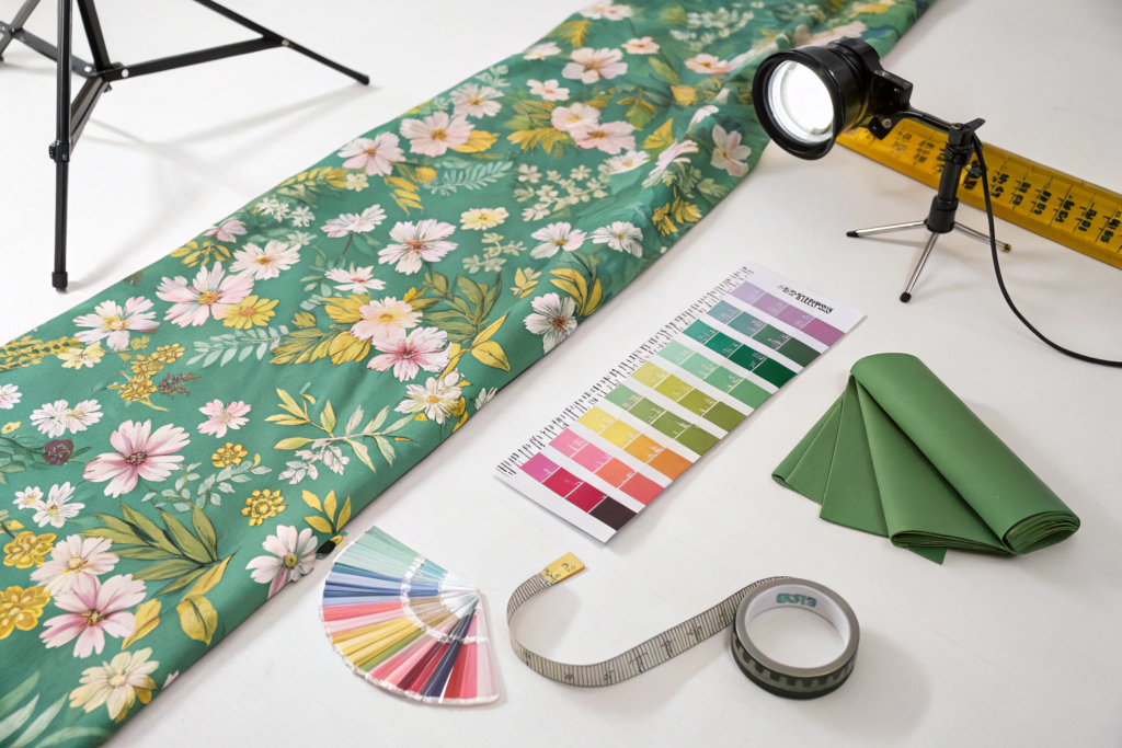
At Shanghai Fumao, we manage expectations by using Production-Ready Color Profiles. We don’t let designers pick colors from an RGB palette. We require them to pick from a Pantone Textile Color Guide (TPG or TCX) . This is a physical book of colors printed on cotton and polyester. What you see in the book is what you get on the fabric. It’s the only reliable visual reference.
Here’s a specific case from September 2025. A London-based scarf designer sent us an AI-generated file with a vibrant "Neon Coral" background. The Pantone equivalent was 16-1546 TPX (Living Coral). On screen, it looked radioactive (in a good way). On our first digital print strike-off on 14mm Silk Twill, it looked like pale salmon. The client was disappointed. The fix? We switched the base fabric to a Silk Satin with Optical Brighteners and we did a Double Pass Print (printing the same area twice with the same ink). The color popped significantly more. It cost 15% more, but the scarves sold out at Liberty London. For designers struggling with this translation, this guide on how to prepare digital art files for accurate color reproduction on fabric printing is a lifesaver.
Can a Softener or Coating Change the Shade of My Fabric?
Yes. And it drives quality managers insane. You nail the Pantone match on the dyed fabric. It’s beautiful. Then you apply a Peach Skin Softener or a Water-Repellent Coating, and suddenly the fabric is half a shade darker or has a weird greenish cast. Why? Because you changed the Refractive Index of the fiber surface.
Think of fiber as a bundle of tiny glass rods. Light hits them, bounces around, and comes back to your eye as color. When you coat those rods with a thin film of silicone or polyurethane, you change the angle at which the light bounces. This is called Wet vs. Dry Color Difference. The fabric in the dye bath (wet) looks one color. The fabric after drying and coating looks slightly different.
We have a massive database at Fumao tracking the Shade Change Effect of our top 20 finishes. Here is a small sample of what we see in the lab:
| Finish Type | Application Method | Typical Shade Shift on Cotton | Typical Shade Shift on Polyester |
|---|---|---|---|
| Hydrophilic Silicone Softener | Pad-Dry-Cure | 5-10% Darker | 2-5% Darker |
| Durable Water Repellent (C6) | Pad-Dry-Cure | N/A | 2-4% Yellower (Thermal cure effect) |
| Enzyme Wash (Bio-Polish) | Exhaustion | 5-8% Lighter (Removes surface dye) | Minimal change |
| Resin (Anti-Crease) | Pad-Dry-Cure | 2-4% Yellower | N/A |
We had a situation in January 2026 with a US outdoor brand. They ordered a "Cinder Grey" nylon ripstop with a DWR finish. We matched the uncoated lab dip perfectly. After applying the DWR finish and curing it in the oven, the fabric turned a distinct "Mushroom Taupe" (yellow shift). The dE jumped from 0.8 to 3.1. The client was ready to reject. We re-ran the batch using a Non-Yellowing C0 DWR (fluorine-free) cured at a lower temperature. The yellowing disappeared. The cost was 8% higher. The client split the difference with us because they recognized the technical challenge. Now, they specify "C0 DWR Only" for all light grey colors. For a technical explanation of this phenomenon, this paper on how textile finishing agents and curing temperature affect final color shade and fastness provides the academic backing for what we see on the factory floor daily.
What Certifications and Testing Equipment Guarantee Color Accuracy?
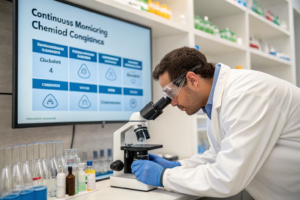
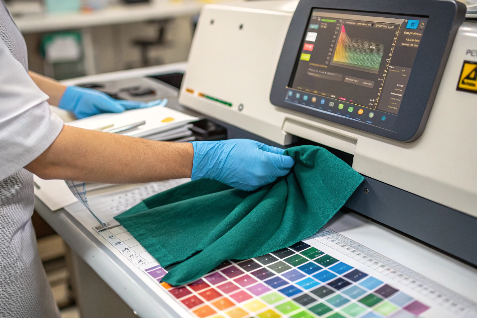
In the end, all the process knowledge in the world means nothing if you can’t verify the result. Color accuracy is not an opinion. It is a measurement. And measurements require calibrated instruments and standardized environments. If a supplier tells you their color is "perfect" but can’t show you a spectrophotometer report from a machine that was calibrated this morning, they are guessing. And guessing with your money.
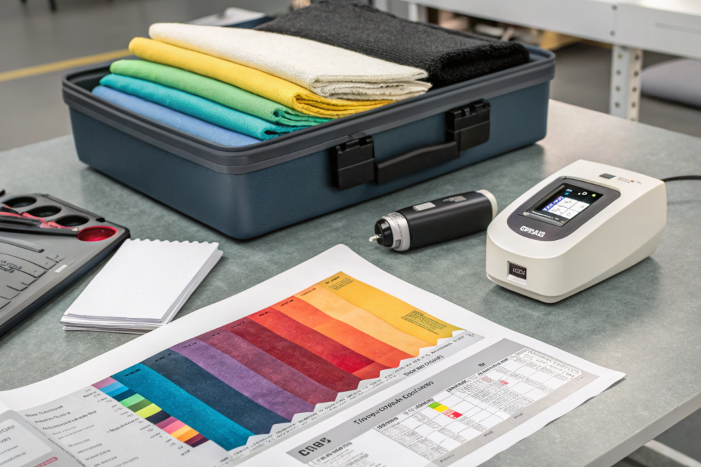
At Shanghai Fumao, our commitment to color accuracy is backed by two pillars: Physical Infrastructure and Third-Party Validation. Our in-house lab is CNAS-Accredited (China National Accreditation Service for Conformity Assessment). This means our test results are recognized internationally under the ILAC-MRA agreement. When we issue a color report, it carries the same weight as a report from SGS or Intertek. This accreditation requires us to participate in Proficiency Testing—where an independent body sends us a "mystery fabric" to test, and we must report the correct color coordinates within a tiny margin of error. We pass these audits every year.
Our primary instrument is the Datacolor 1000 Spectrophotometer. It’s calibrated every 4 hours against a green tile standard. We also maintain a VeriVide Light Booth with D65 (Artificial Daylight), TL84 (Store Lighting), and UV (Ultraviolet) sources. We use this to check for Metamerism—the phenomenon where two colors match under one light but clash under another. A fabric that matches perfectly under our lab’s fluorescent lights but turns purple in the mall’s halogen spotlights is a failed batch. We catch that before it ships to your warehouse. For more on the standards behind these tools, this resource on understanding the role of CNAS and ISO 17025 accreditation in textile testing laboratories explains the global framework we operate within.
How Often Should Spectrophotometers Be Calibrated for Reliable Readings?
This is a question I wish more buyers would ask their suppliers. The answer is: Every 4 to 8 hours, and before every critical measurement series. A spectrophotometer is a sensitive optical instrument. The xenon flash lamp degrades over time. The sensors drift with temperature changes. The black and white calibration tiles get dirty with fingerprints and fabric dust.
If a machine is out of calibration, it might read a true "Navy Blue" as "Black" or "Purple." The technician will then adjust the dye recipe based on faulty data, and the entire bulk batch will be off-shade.
Here is the Fumao Calibration Protocol:
- Daily Start-Up Calibration: Every morning, the lab technician performs a Black Trap and White Tile calibration. The machine self-checks its internal green tile. If the green tile reading is off by more than dE 0.15, we clean the port and re-calibrate. If it’s still off, we call Datacolor service.
- In-Process Check: Every time the technician measures a new batch sample, they first measure the Working Green Standard. This is a piece of fabric we keep in a sealed bag. If the reading on the green standard has drifted since this morning, the machine needs recalibration.
- Monthly Diagnostic: We run a full diagnostic report and clean the integrating sphere (the white globe inside the machine that collects light). This is like changing the oil in your car.
A story to illustrate why this matters: August 2025, one of our junior colorists was approving a bulk lot of "Burgundy" viscose. The machine said it was dE 1.1 (Pass). I walked by and looked at the fabric in the light booth. It looked brown. I made her check the green tile. The reading was off. The white tile had a smudge of blue dye on it from a previous measurement. She cleaned the tile with a lint-free wipe and recalibrated. The new reading on the burgundy was dE 3.4 (Fail). If we had shipped that, it would have been a disaster. This is why you need a human eye and a calibrated machine. For a practical guide on maintaining this equipment, this article on how to properly clean and calibrate a benchtop spectrophotometer for textile color measurement is gold.
Does OEKO-TEX Certification Cover Colorfastness and Shade Consistency?
No. And this is a huge misconception among new brands. OEKO-TEX Standard 100 is a safety certification. It tests for harmful chemicals. It does NOT test for colorfastness to light, colorfastness to washing, or shade consistency between rolls. It only cares if the dye is safe, not if it matches.
If you want certification for color performance, you need to look for AATCC or ISO Test Reports. These are specific, separate tests:
- AATCC 61 (Colorfastness to Laundering): Measures how much color bleeds in the wash.
- AATCC 16 (Colorfastness to Light): Measures fading under UV exposure.
- AATCC 8 (Crocking): Measures color transfer when rubbed dry or wet.
At Shanghai Fumao, we provide these performance reports along with the OEKO-TEX cert. The safety cert tells the EU customs agent the fabric won’t give you cancer. The performance report tells the brand manager the fabric won’t turn the customer’s white couch blue.
Here’s a specific scenario from October 2025. A Swedish kidswear brand asked for our "OEKO-TEX Certificate" as proof of color consistency. We had to gently correct them. We explained: "The OEKO-TEX cert proves the dyes are non-toxic. For color consistency, please refer to the attached Lab Dip Approval Form and the Bulk Spectrophotometer Report showing dE 0.9." They appreciated the education. Now they request both documents in their tech pack. It’s a common point of confusion, and this official page on what OEKO TEX Standard 100 actually tests for versus textile performance standards is the definitive source to clarify it for your own team.
Conclusion
Color consistency is not a happy accident. It’s the result of a disciplined, scientific, and relentless approach to controlling variables that most people never even consider. From the moment the yarn enters our weaving mill in Keqiao to the second the finished roll gets wrapped in plastic for export, we are measuring, calibrating, and verifying. We’ve walked through the common pitfalls—yarn variations, lab-to-bulk scaling errors, thermal migration in finishing, and the critical difference between a safety certification and a performance report. Each one of these points represents a potential failure that can cost you a season’s worth of sales and a chunk of your brand’s hard-earned reputation.
What sets Shanghai Fumao apart isn’t just that we own the machines or that we have been doing this for over 20 years. It’s that we have institutionalized the why behind the how. Our team understands the molecular chemistry of the dye strike and the optical physics of light reflectance. We use this knowledge to create a system where color variation is the exception, not the rule. And when variation does occur—because this is manufacturing, not magic—our systems catch it at the dE 1.4 pilot stage, not the dE 3.5 container stage.
If you are ready to move beyond the anxiety of "will it match?" and into the confidence of knowing your core colors will be consistent season after season, let’s talk specifics. Whether you’re developing a new custom shade for a 500-yard capsule or re-ordering a best-selling core color for the fifth time, our color lab is ready to support you.
For sample submissions, lab dip timelines, or to review our latest colorfastness and certification data, please contact our Business Director, Elaine. She coordinates directly with our dye house manager to ensure your color priorities are communicated clearly from the first email. Reach out to elaine@fumaoclothing.com. Let’s get that perfect shade locked in and keep it locked in for the long haul.