
After twenty years in the textile business here in Keqiao, I can tell you that color approval issues cause more production delays than any other single factor. I've seen shipments held up for weeks because of color disputes that proper Pantone matching and shade band systems could have prevented. The truth is, managing color doesn't have to be a guessing game—it's a scientific process that, when implemented correctly, saves time, money, and relationships.
Pantone matching provides the color target, while shade bands establish acceptable tolerance ranges for production consistency. Together, they create a comprehensive color management system that eliminates subjective "it looks close enough" judgments and replaces them with measurable, repeatable standards. Implementing this system properly can reduce color-related rejections by over 80% and cut approval time from weeks to days.
I remember one particularly painful incident where a US client rejected 10,000 meters of fabric because the "navy blue" didn't match their sample. The problem? They'd approved a lab dip without shade bands, and our bulk production—while consistent—didn't match their memory of the original shade. That costly lesson taught us the critical importance of systematic color management.
What is the Fundamental Pantone Matching Process?
The Pantone Matching System (PMS) provides a universal color language that ensures everyone—from designer to manufacturer—is speaking the same color vocabulary. But simply selecting a Pantone number isn't enough; the real value comes from understanding how to translate that number into actual dyed fabric under various conditions.
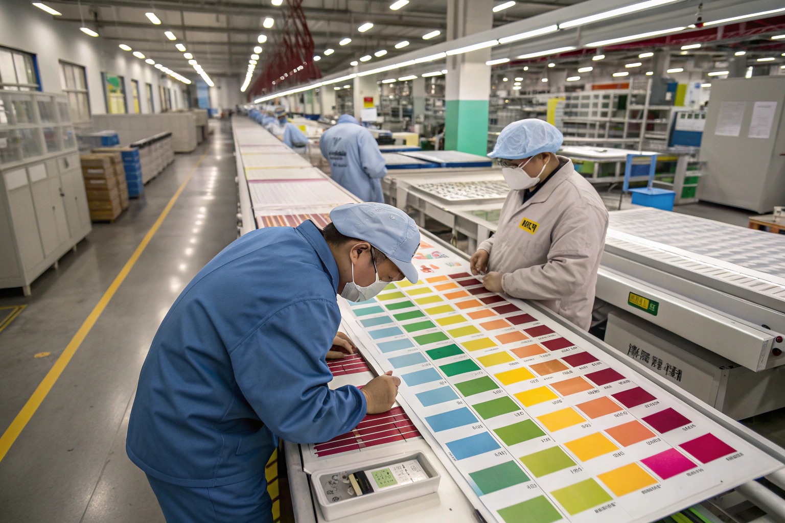
The process begins with color standard establishment, moves through lab dip development, and culminates in production matching. At each stage, lighting conditions, substrate composition, and viewing angles dramatically affect perceived color. That's why we insist on standardized viewing booths and specific light sources for all color evaluations.

How Do You Convert Pantone to Lab Dips Effectively?
The conversion from paper Pantone chip to fabric lab dip is where the technical challenges begin. Paper and fabric absorb dyes differently, and the same dye formula will look different on cotton versus polyester. This is why we create multiple lab dip options—typically 3-5 variations—around your target Pantone shade.
Our standard process involves:
- Base Formula Calculation: Using our database of 10,000+ previous matches to establish starting point
- Shade Variations: Creating lighter, darker, redder, bluer, and greener versions of the target
- Physical Submission: Sending actual fabric swatches (not digital images) for evaluation
- Correction Cycles: Adjusting formulas based on client feedback until achieving match
For a French luxury brand last year, we went through seven correction cycles to achieve their exact signature burgundy. The persistence paid off—they've since standardized that formula across all their production, saving weeks of development time on each new order.
What Equipment is Essential for Accurate Pantone Evaluation?
You cannot manage color properly without the right tools. The bare minimum includes:
- Pantone Fashion, Home + Interiors fan deck (not the graphic design version)
- Standardized light viewing booth with D65, TL84, and UV light sources
- Spectrophotometer for objective color measurement
- Gray scale for staining and color change assessment
The spectrophotometer is particularly crucial—it provides delta E measurements that quantify color difference objectively. We require all our clients to provide delta E tolerance levels with their Pantone standards, typically recommending ≤1.0 for critical matches and ≤2.0 for commercial acceptance.
How Do Shade Bands Establish Production Tolerance?
Shade bands are your safety net against production color variation. They're not about achieving one perfect color—they're about defining what constitutes an acceptable color range for your specific application. Think of them as guardrails that keep your production within commercially viable parameters.
A proper shade band system includes the target shade (Pantone match) plus multiple lighter and darker variations that represent your upper and lower tolerance limits. During production, we continuously compare running fabric against these bands to ensure consistency and catch drift before it becomes unacceptable.
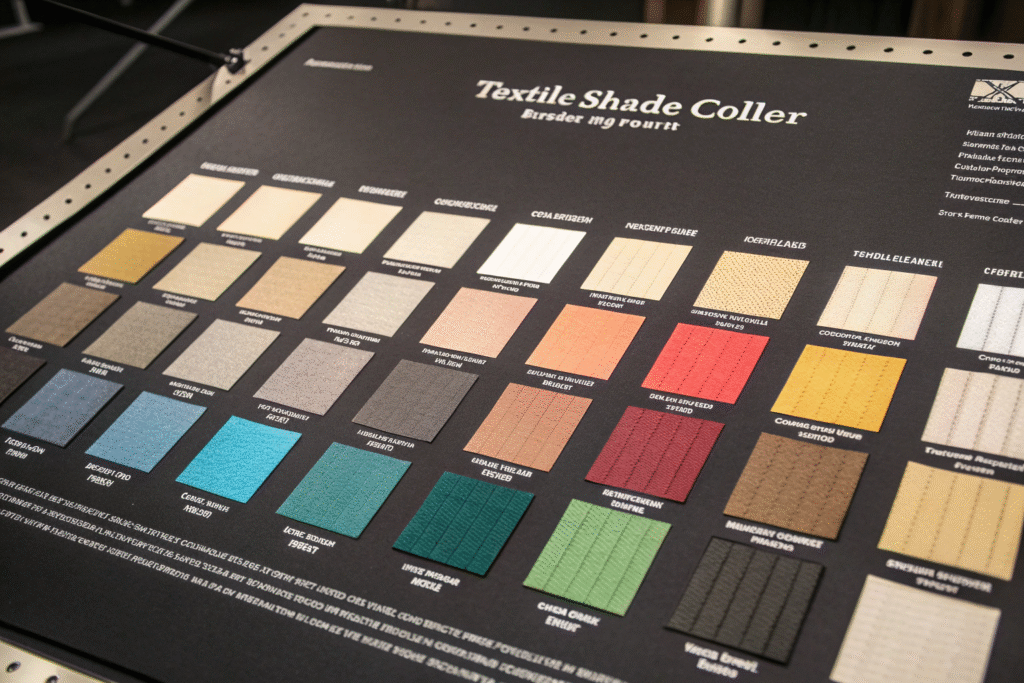
What Constitutes an Effective Shade Band Set?
An effective shade band set must be comprehensive, relevant to your fabric, and practical for production use. We typically recommend 5-7 bands that cover this range:
| Band Position | Delta E from Target | Commercial Significance |
|---|---|---|
| Target | 0.0 | Perfect match |
| +0.5 | 0.5 | Virtually indistinguishable |
| +1.0 | 1.0 | Commercial match |
| +1.5 | 1.5 | Questionable, requires review |
| +2.0 | 2.0 | Typically rejection point |
The "commercial match" range (∆E 1.0-1.5) is where most production operates successfully. Beyond ∆E 2.0, the difference becomes noticeable to most observers under standard lighting conditions.
How Should You Determine Your Tolerance Levels?
Tolerance levels should reflect your product's price point, end use, and customer expectations. Luxury apparel typically requires tighter tolerances (∆E ≤1.0) while basic promotional items can accept wider ranges (∆E ≤2.5).
We developed a customized tolerance system for a sportswear brand that varied by garment section:
- Logo areas: ∆E ≤0.8
- Main body: ∆E ≤1.5
- Lining/trims: ∆E ≤2.0
This nuanced approach recognized that some areas demanded perfection while others had more flexibility, optimizing both quality and production efficiency.
What are Common Color Approval Pitfalls and Solutions?
Even with proper systems in place, color approval processes frequently stumble over the same issues. Recognizing these pitfalls in advance lets you build preventative measures into your workflow.
The most common problems include metamerism (color changes under different light sources), substrate differences, and communication gaps between design teams and manufacturing facilities. Each requires specific strategies to overcome.

How Do You Manage Metamerism and Lighting Issues?
Metamerism occurs when two colors match under one light source but differ under another. This is the hidden killer of color approvals that looks perfect in the office but wrong in the store.
Our solution involves three-step lighting verification:
- Primary Light: D65 (daylight) - the standard for evaluation
- Secondary Light: TL84 (store lighting) - where most garments are viewed
- Tertiary Light: Incandescent - for home wear applications
A German outdoor brand discovered this the hard way when their "forest green" jackets matched perfectly in daylight but turned brownish under store lighting. We redeveloped the dye formula to minimize metamerism, testing under six different light sources until achieving consistency across all conditions.
What Communication Protocols Prevent Misunderstandings?
Color communication breaks down when people use subjective terms like "a bit brighter" or "more vibrant." We've implemented a standardized feedback system that uses specific, actionable terminology:
- "Make lighter/darker" with percentage guidance (e.g., "make 10% lighter")
- "Cleaner/duller" for saturation adjustments
- "Redder/greener/bluer/yellower" for hue shifts
- Reference to specific Pantone variations from submitted lab dips
This system reduced color approval cycles from an average of 3.2 rounds to 1.5 rounds for our European clients, saving approximately 10-14 days per development project.
How Do You Implement This System Across Global Supply Chains?
Managing color consistently across multiple factories, countries, and time zones presents unique challenges. The principles remain the same, but the execution requires careful coordination and documentation.
The key is creating a centralized color standard that flows down through all supply chain partners, with regular verification to ensure ongoing compliance. Digital color management systems can help, but physical standards remain essential for final approval.

What Documentation Creates Effective Color Management?
A comprehensive color management package should include:
- Physical Pantone standard with specific designation
- Approved lab dip with spectrophotometer readings
- Shade band set with defined tolerance limits
- Lighting requirements for evaluation
- Approval/rejection criteria in writing
We provide this as a standardized "Color Passport" for each shade, which travels with the production order through every manufacturing stage. This eliminated the "which version should we follow?" confusion that previously caused 25% of our color disputes.
How Can Technology Enhance Traditional Color Management?
While physical evaluation remains essential, digital tools provide valuable support:
- Digital spectrophotometers that connect to cloud databases
- Virtual shade sorting software for production planning
- Digital color standards for initial development
- Online approval platforms with calibrated monitors
We've integrated a digital color system that allows clients to view lab dips on calibrated monitors before physical samples arrive. This doesn't replace physical approval but accelerates the initial screening process, particularly valuable for overseas clients dealing with shipping delays.
What are the Cost and Timeline Implications?
Implementing robust Pantone matching and shade band systems requires upfront investment but delivers substantial long-term savings through reduced rejections, faster approvals, and improved production efficiency.
The typical development timeline with proper color management is 2-3 weeks for initial matching and 1-2 days for production approvals. Without systematic approaches, these processes can stretch to 6-8 weeks and involve multiple rejected production lots.

How Much Does Proper Color Management Cost?
The cost breakdown typically includes:
- Pantone fan deck: $200-400
- Lab dip development: $50-150 per color
- Shade band creation: $100-200 per color set
- Viewing booth: $1,500-3,000
- Spectrophotometer: $2,000-5,000
These investments seem substantial until you calculate the cost of one rejected shipment. A single container of rejected fabric can represent $50,000-100,000 in losses—far exceeding a decade's worth of color management expenses.
What ROI Can You Expect from Systematic Color Management?
Our clients typically achieve:
- 80% reduction in color-related rejections
- 50% decrease in approval cycle time
- 30% reduction in dye recipe costs through formula optimization
- Improved customer satisfaction and repeat orders
An American fast-fashion brand quantified their ROI at 400% in the first year alone, primarily through eliminating two major production rejections that would have missed critical delivery windows.
Conclusion
Effective color management through Pantone matching and shade bands transforms color approval from a subjective art to a measurable science. The system provides clarity, reduces disputes, and ensures consistent quality across production runs. While requiring initial investment in standards, equipment, and processes, the return through saved time, reduced waste, and protected relationships is substantial and rapid.
At Fumao Textiles, we've built our color management system over twenty years and thousands of production runs. Our CNAS-certified lab and experienced color technicians help clients navigate the complexities of global color standards while maintaining competitive pricing and reliable execution. We don't just match colors—we build color management systems that protect your brand and streamline your operations. If you're tired of color approval challenges, contact our Business Director Elaine at elaine@fumaoclothing.com. Let's bring clarity and consistency to your color management process.


24 Responses
Thank you for your sharing. I am worried that I lack creative ideas. It is your article that makes me full of hope. Thank you. But, I have a question, can you help me?
Thank you for your sharing. I am worried that I lack creative ideas. It is your article that makes me full of hope. Thank you. But, I have a question, can you help me?
Can you be more specific about the content of your article? After reading it, I still have some doubts. Hope you can help me.
Thanks for sharing. I read many of your blog posts, cool, your blog is very good.
Your article helped me a lot, is there any more related content? Thanks!
Your point of view caught my eye and was very interesting. Thanks. I have a question for you. https://www.binance.info/en-ZA/register?ref=B4EPR6J0
I don’t think the title of your article matches the content lol. Just kidding, mainly because I had some doubts after reading the article. https://accounts.binance.com/register-person?ref=IXBIAFVY
Your point of view caught my eye and was very interesting. Thanks. I have a question for you. https://www.binance.com/register?ref=IHJUI7TF
Your point of view caught my eye and was very interesting. Thanks. I have a question for you. https://www.binance.com/kz/register?ref=K8NFKJBQ
Your point of view caught my eye and was very interesting. Thanks. I have a question for you.
Can you be more specific about the content of your article? After reading it, I still have some doubts. Hope you can help me.
Your article helped me a lot, is there any more related content? Thanks!
Your point of view caught my eye and was very interesting. Thanks. I have a question for you.
I don’t think the title of your article matches the content lol. Just kidding, mainly because I had some doubts after reading the article. https://accounts.binance.com/ar-BH/register-person?ref=S5H7X3LP
I don’t think the title of your article matches the content lol. Just kidding, mainly because I had some doubts after reading the article. https://www.binance.com/es/register?ref=RQUR4BEO
Your article helped me a lot, is there any more related content? Thanks! https://accounts.binance.com/pt-BR/register-person?ref=GJY4VW8W
Thanks for sharing. I read many of your blog posts, cool, your blog is very good.
Your point of view caught my eye and was very interesting. Thanks. I have a question for you.
Thanks for sharing. I read many of your blog posts, cool, your blog is very good.
Thank you for your sharing. I am worried that I lack creative ideas. It is your article that makes me full of hope. Thank you. But, I have a question, can you help me?
Can you be more specific about the content of your article? After reading it, I still have some doubts. Hope you can help me.
I don’t think the title of your article matches the content lol. Just kidding, mainly because I had some doubts after reading the article. https://www.binance.com/register?ref=IXBIAFVY
I don’t think the title of your article matches the content lol. Just kidding, mainly because I had some doubts after reading the article.
Your article helped me a lot, is there any more related content? Thanks!