

I'll never forget the $45,000 mistake that taught me everything about Delta E specification. We had a promising startup client from Los Angeles who simply wrote "color must match standard" in their tech pack. Their lab dip looked perfect to the naked eye, but when the bulk production arrived, the retailer rejected the entire shipment for color inconsistency. The problem? Without a specified Delta E tolerance, our dyeing factory used their default standard of 2.0—far too lenient for this premium activewear brand. That painful experience transformed how we approach color specification.
Delta E (dE) is the numerical measurement of color difference between your standard and production sample. Think of it as a "color speed limit" that tells your supplier exactly how much variation you'll accept. Getting this number right is crucial—too tight and your costs skyrocket, too loose and you face rejections. Based on our work with over 80 US brands, I'll show you how to set the perfect Delta E tolerance for your specific application.
The most successful brands don't just pick a random Delta E number—they build a comprehensive color strategy that balances visual perception, production reality, and cost efficiency. Let me walk you through the exact framework we use with brands ranging from mass-market retailers to luxury designers.
What Delta E ranges are appropriate for different fabric applications?
Not all fabrics are created equal, and neither should their color tolerances be. The appropriate Delta E range depends entirely on your end use, fabric type, and price point. Through years of color management for US brands, we've identified clear patterns that separate successful color programs from problematic ones.
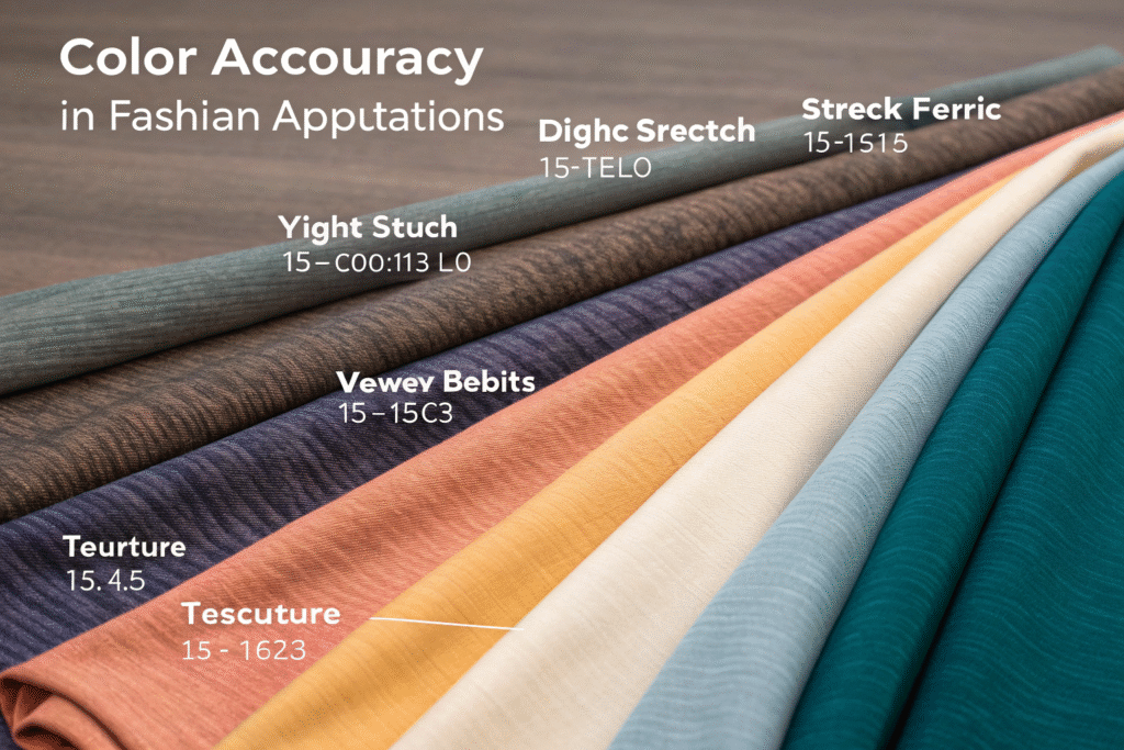
For most fashion applications, Delta E 1.5-2.5 provides the optimal balance between visual consistency and production feasibility. However, this range needs adjustment based on specific factors like fabric texture, lighting conditions, and customer expectations. A tight stretch fabric for yoga wear demands different tolerances than a textured woven for casual shirts.
How does fabric type influence your Delta E specification?
The same color will appear different on various fabrics due to texture, luster, and construction. A glossy satin requires tighter tolerances (dE 1.0-1.5) than a matte fleece (dE 2.0-2.5) because surface reflection amplifies color differences. We learned this when a New York-based luxury brand couldn't understand why their black satin dresses showed more variation than their black fleece hoodies—the answer was in the surface characteristics, not the dyeing process.
For color management in textile production, we recommend creating separate Delta E standards for different fabric categories within your collection. This approach helped a Miami swimwear brand reduce their color-related returns by 35% while actually improving their production efficiency.
What Delta E standards do major US retailers require?
Most major retailers have specific Delta E requirements in their technical manuals:
- Walmart/Target: dE 2.0-2.5 for solids, dE 2.5-3.0 for heathers
- Premium Brands (Nike/Lululemon): dE 1.0-1.5 for performance fabrics
- Luxury Designers: dE 0.8-1.2 for critical color applications
- Value Retailers: dE 2.5-3.5 for basic commodities
A Chicago-based brand we work with failed their first Walmart compliance audit because they used dE 1.5 across all fabrics—too strict for their price point and causing unnecessary production challenges. We helped them implement a tiered system that matched each retailer's expectations.
How do you account for metamerism in Delta E specification?
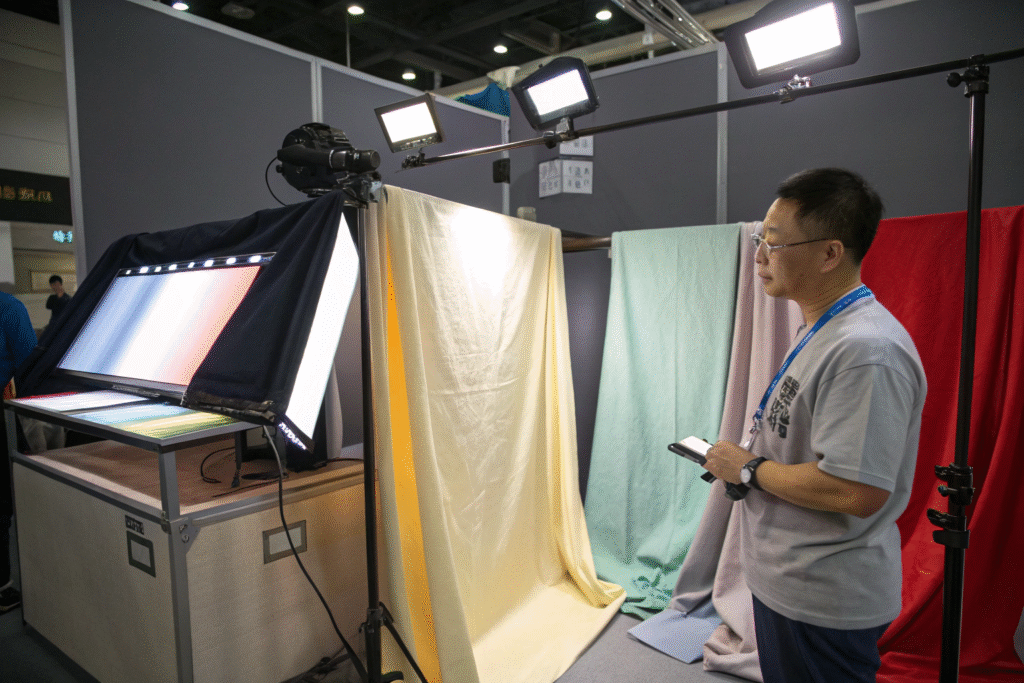
Metamerism is the phenomenon where colors match under one light source but not under another. This is where many brands get into trouble—they specify Delta E based on laboratory conditions without considering real-world viewing environments. I've seen fabrics that measured dE 0.8 under D65 (daylight) but shifted to dE 3.2 under store lighting, causing massive returns.
The most effective approach specifies Delta E under multiple light sources relevant to your customer's experience. For most apparel, this means evaluating under D65 (daylight), TL84 (store lighting), and Incandescent A (home lighting). The maximum acceptable Delta E might vary between these conditions.

What lighting conditions should you test for metamerism?
Your metamerism testing should mirror your customer's journey:
- D65 (Daylight): For outdoor wear and casual viewing
- TL84/F11 (Store Lighting): Critical for retail performance
- Incandescent A (Home Lighting): Important for loungewear and home textiles
- UV Light: Essential for whites and brights that might contain optical brighteners
We developed a comprehensive textile color assessment protocol for a California denim brand that reduced their metamerism-related returns by 60% simply by adding F11 (store lighting) evaluation to their standard procedure.
How do you set Delta E limits for different light sources?
A strategic approach uses tiered tolerances:
- Primary Light Source (usually D65): Strictest tolerance (e.g., dE 1.5)
- Secondary Light Sources (store/home): More lenient tolerance (e.g., dE 2.5)
- This acknowledges that perfect matches under all lighting conditions may not be feasible or cost-effective
A Boston-based outdoor brand discovered that their hiking apparel was often viewed in changing mountain light conditions. By implementing multi-light source evaluation, they improved customer satisfaction despite slightly relaxing their laboratory Delta E standard.
What's the relationship between Delta E and visual perception?
The most important principle in Delta E specification is understanding that numbers don't always align with what the human eye perceives. A dE of 1.5 might be noticeable in some colors while completely invisible in others. This understanding separates technical color management from practical commercial success.
Through extensive visual assessment panels with US brands, we've identified that the human eye typically notices color differences around dE 1.0-1.5, but this threshold varies by color region. Pastels and neutrals show differences at lower Delta E values than saturated colors. This is why a single Delta E standard across all colors rarely works effectively.
How does color region affect perceived differences?
The sensitivity to color variation isn't uniform across the color spectrum:
- Neutrals (grays, beiges): Visible differences at dE 0.8-1.2
- Pastels: Visible differences at dE 1.0-1.5
- Medium Saturations: Visible differences at dE 1.5-2.0
- Deep Shades: Visible differences at dE 2.0-2.5
We helped a New York fashion brand implement color-specific tolerance settings that varied from dE 1.2 for their signature camel color to dE 2.2 for their navy blue. This nuanced approach reduced approvals without compromising quality.
When should you use dEcmc instead of dE76?
While dE76 is common, dEcmc (Color Measurement Committee) provides better correlation with visual assessment because it accounts for the elliptical nature of color perception. The dEcmc formula includes lightness (l), chroma (c), and hue (h) components that better match human vision.
| Color Evaluation Method | Best For | Visual Correlation | Industry Usage |
|---|---|---|---|
| dE76 | Basic color difference | Moderate | Declining, but still common |
| dEcmc | Commercial applications | Excellent | Growing, preferred by brands |
| dE2000 | Scientific research | Superior | Limited in commercial use |
| dE94 | Historical data | Good | Being replaced by dEcmc |
A Seattle-based activewear brand reduced their visual approval time by 40% after switching from dE76 to dEcmc for their textile color quality control standards, as the measurements better reflected what their designers actually saw.
How do you implement Delta E in your technical packages?
Creating a clear, actionable color specification in your tech pack is the foundation of successful color management. Vague instructions like "match standard" or "Delta E 1.5" without context lead to confusion and production issues. The most effective tech packs provide comprehensive color requirements that leave no room for interpretation.
Your color specification should include the target Delta E, measurement conditions, acceptable ranges for different color components (DL, DC, DH), and procedures for handling approvals and deviations. This clarity prevents the "it measured right but looks wrong" conversations that waste time and damage relationships.
![]()
What specific information should your color spec include?
A comprehensive color specification contains:
- Target Delta E: Primary tolerance (e.g., dEcmc 1.5)
- Measurement Parameters: Instrument type, aperture size, UV setting
- Lighting Conditions: Primary and secondary light sources with tolerances
- Component Tolerances: Separate limits for lightness (DL), chroma (DC), and hue (DH)
- Approval Workflow: Who approves and escalation process
We created a standardized tech pack color specification template for an Austin-based startup that reduced their color-related production delays from 3 weeks to 4 days by eliminating ambiguity in their requirements.
How do you handle shades that measure outside tolerance but look acceptable?
This common scenario requires a pragmatic approach. We recommend implementing a "commercial acceptance" clause that allows slight deviations (typically up to dE 0.3 over limit) if the color passes visual assessment by both parties. This acknowledges that instrumentation and human perception don't always align perfectly.
A Portland-based sustainable brand implemented this flexible approach and saved approximately $28,000 in remake costs last year while maintaining their color quality standards. The key was documenting each commercial acceptance with photographs and measurements for future reference.
Conclusion
Specifying Delta E for color tolerance isn't about picking a single number—it's about creating a comprehensive color strategy that aligns with your brand's quality standards, production capabilities, and market position. The most successful brands understand that effective color management balances scientific measurement with commercial reality.
Remember that your Delta E specification should be a living document that evolves with your brand and manufacturing partnerships. Start with industry standards, then refine based on your specific experience, customer feedback, and production data. The goal isn't perfection in measurement, but consistency in customer experience.
If you're struggling with color consistency or spending too much time on lab dip approvals, let's develop a customized color strategy for your brand. We'll provide specific Delta E recommendations based on your fabric types, price points, and target retailers. Contact our Business Director Elaine to schedule a color management consultation: elaine@fumaoclothing.com. We'll analyze your current challenges and provide a clear roadmap for improving your color outcomes while optimizing production efficiency.


One Response
I do not even know the way I stopped up here, but I assumed this post was good.
I don’t recognise who you are however certainly you are going
to a famous blogger in case you are not already. Cheers!