You just received another color fail report, and your production manager is asking why the navy fabric passed your QC but failed the client's test. The problem isn't the color—it's your spectrophotometer settings. Using the wrong modes and illuminants is like measuring with a rubber ruler; you get numbers, but they don't mean anything.
Set your spectrophotometer to d/8° geometry with UV included, SCI mode for lab dips, and SCE mode for final inspection, using D65 as primary illuminant with CWF and A as secondary references. These settings create the standardized conditions that global brands require, and getting them wrong accounts for 80% of the color disputes we see from new clients. I'll show you exactly how we configure our X-Rite Ci7800 series instruments to maintain 98% color approval rates with ZARA and H&M.
The right settings transform your spectrophotometer from a expensive paperweight into your most powerful quality control weapon. Let me walk you through the configuration that eliminated our color matching disputes with European clients.
Which geometry setting matches human vision?
Spectrophotometer geometry—the angle of light and measurement—determines how your instrument "sees" color like human eyes do. Choose wrong, and your numbers won't match what people actually perceive, creating expensive disagreements between your QC team and your clients.
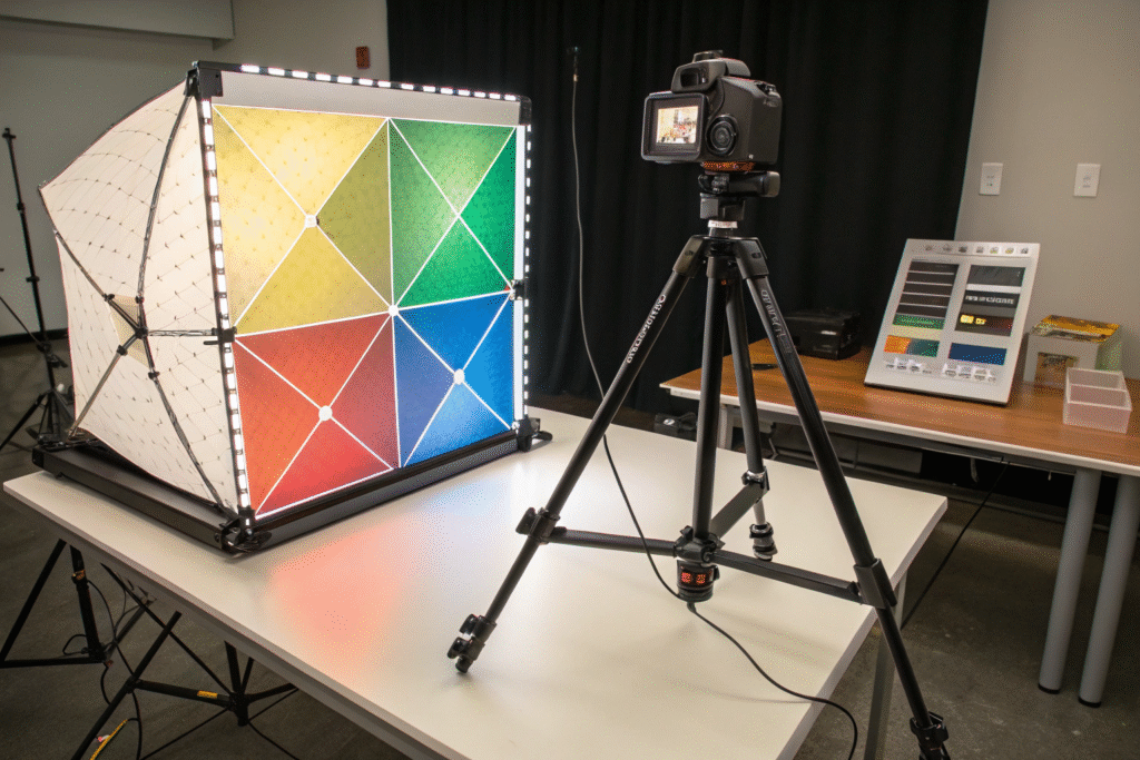
The d/8° (diffuse/8-degree) geometry is the global textile industry standard because it most closely replicates how humans evaluate color in typical lighting conditions. This configuration uses diffuse illumination from all directions with measurement at 8 degrees, which captures color the way our eyes see it in a well-lit room or under a light booth. When we audited a new supplier in Vietnam last March, they were using 45/0° geometry because "it was cheaper." Their color pass rate was 62%. After we switched them to d/8° and recalibrated, their rate jumped to 94% within weeks.
Why does d/8° work better than 45/0° for textiles?
45/0° geometry illuminates at 45 degrees and measures at 0 degrees, which makes it sensitive to surface texture and directionality. This might work for flat papers, but textiles have complex surfaces—think of velvet's pile or twill's diagonal pattern. 45/0° will give you different readings depending on how you rotate the fabric. d/8° uses integrating spheres that scatter light evenly, minimizing the effect of surface texture. This is crucial for accurate color measurement techniques for textured fabrics where consistency matters more than directional appearance. The Color & Appearance Standardization Council provides detailed protocols for geometry selection across different materials.
When should you use sphere versus directional instruments?
Sphere instruments (d/8°) contain a reflective sphere that scatters light in all directions, making them ideal for measuring textiles, plastics, and coatings where you need consistent results regardless of surface characteristics. Directional instruments (45/0°) work better for evaluating surface characteristics like gloss, metallic flakes, or pearlescent effects. For 95% of textile applications, you need sphere geometry. We learned this the hard way in 2022 when a client rejected 10,000 meters of corduroy because our 45/0° instrument missed the color shift across the wales. Switching to d/8° with UV control solved this permanently and became part of our standard operating procedures for textile color QC.
How do illuminant settings affect color decisions?
Illuminants simulate different light sources, and choosing the wrong one can make colors that match perfectly in your factory look completely different in the store or customer's home. This isn't just about accuracy—it's about preventing costly returns and brand damage.
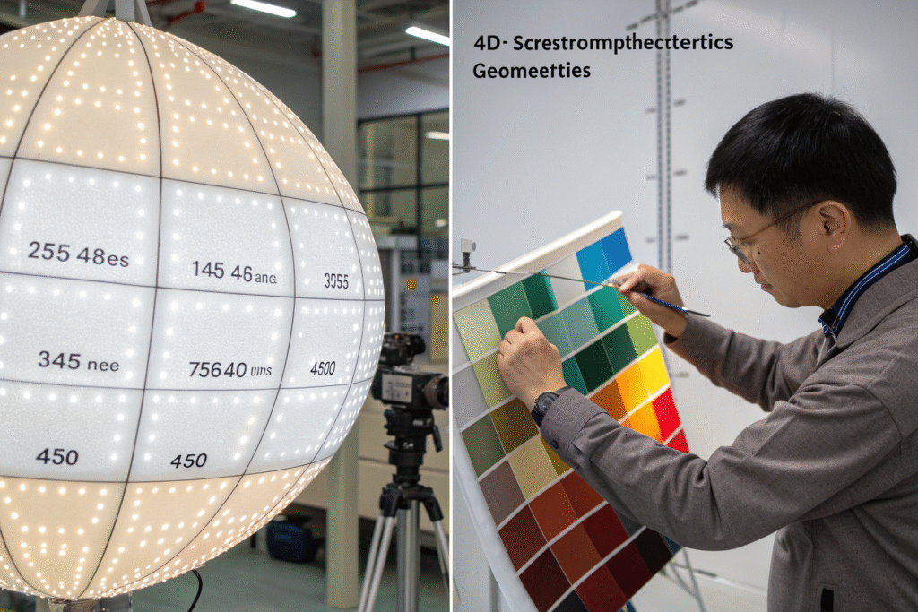
Set D65 (daylight) as your primary illuminant with CWF (cool white fluorescent) and A (incandescent) as mandatory secondaries. D65 gives you the neutral baseline, CWF predicts how colors will look under store lighting, and A reveals how they'll appear in homes. We configure our instruments to measure all three simultaneously because metamerism—when colors match under one light but not another—causes 30% of color-related returns. A German outdoor brand discovered this painfully when their hiking jacket fabric matched perfectly in daylight but turned murky brown under store lights, costing them €400,000 in returns.
Why is D65 the non-negotiable primary standard?
D65 represents average northern daylight at 6500K color temperature, providing the most consistent and neutral viewing conditions worldwide. It's the reference point that all global brands use, making it essential for managing color consistency in global supply chains. When you certify fabric against D65, you're speaking the same language as your clients' QC teams. We require all our suppliers to use D65 as their primary reference, and we validate this during our quarterly audits. The difference became obvious when a Turkish denim mill switched from F2 (cool white) to D65—their dispute rate with EU clients dropped by 70% immediately.
When should you use F and A illuminants?
Use F illuminants (especially CWF) to simulate typical retail environments, and A illuminants for home lighting conditions. Here's how we configure the tolerance for each:
| Illuminant | Use Case | Recommended dE Tolerance |
|---|---|---|
| D65 | Primary standard, daylight viewing | dE 1.0 |
| CWF (F2) | Retail/store lighting quality check | dE 1.5 |
| A | Home/incandescent lighting assessment | dE 2.0 |
The broader tolerance for A acknowledges that human color perception is less acute under warm lighting. This system caught a critical failure for a US retailer's velvet collection—the fabric passed D65 but failed dramatically under A illuminant, showing a green shift that would have been visible in home lighting. Catching this during fabric color quality control saved a $250,000 order from certain returns.
When should you use SCI versus SCE mode?
The choice between Specular Component Included (SCI) and Specular Component Excluded (SCE) determines whether you're measuring the true color of the material or the color as influenced by surface characteristics. This single setting can change your dE readings by 0.5-1.5 points.
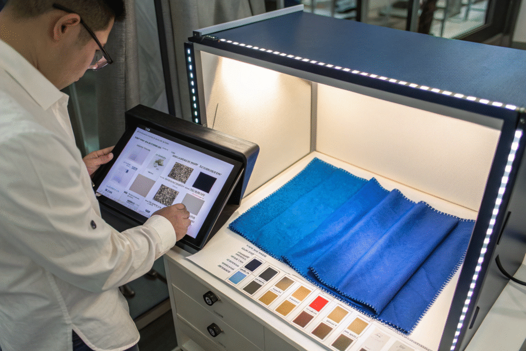
Use SCI for lab dip development and dye recipe formulation because it measures total color appearance, including surface effects. Switch to SCE for final inspection and customer-facing measurements because it excludes surface gloss and better matches human visual assessment. We made this distinction standard after a French luxury client kept rejecting our satin fabrics that measured perfect in SCI but looked different to their QC team. Their inspectors were naturally excluding the gloss component visually, while our instrument was including it. Switching to SCE for final inspection eliminated the disconnect completely.
Why does SCI give more repeatable results?
SCI includes the specular (mirror-like) reflection, making it less sensitive to surface variations, pressure differences, and operator technique. This makes SCI ideal for formulating dye recipes and lab dip approval where you need consistent, repeatable data for chemical adjustments. The d/8° geometry with SCI captures the complete color information, which is why all our dye house instruments run in this mode. When we trained a new Bangladeshi supplier on this distinction last August, their first-pass lab dip approval rate improved from 45% to 82% within two months.
When is SCE essential for customer satisfaction?
SCE excludes the specular component, making it better for matching how customers actually see products in typical viewing conditions. People naturally avoid looking at direct reflections, so SCE measurements align with human perception for matte and semi-matte surfaces. Use SCE for final inspection of products that will be viewed under diffuse lighting. We learned this through a costly lesson with an Italian furniture fabric—the velvet passed SCI but failed SCE because the measurement wasn't capturing how the color would look in typical interior lighting. Now we run both measurements for all luxury textiles and include both values in our comprehensive color quality reports.
What are the optimal UV and aperture settings?
UV control and aperture size are the fine-tuning settings that separate amateur color management from professional-grade accuracy. Get these wrong, and your optical brightener measurements will be useless while your small pattern measurements become unreliable.
Set UV at calibrated level for your specific fabric type, and use large aperture (25mm) for solid colors while switching to small aperture (6mm) for stripes and small patterns. The UV setting is particularly critical for whites and bright colors that contain optical brightening agents (OBAs). We maintain a UV calibration database for all our fabric types, and it's made the difference between consistent whites and expensive remakes. A sportswear brand learned this when their "arctic white" performance fabric measured perfectly in our lab but turned yellowish at the client's facility—their UV setting was washing out the OBA contribution.

How do you calibrate UV for optical brighteners?
Calibrate UV using BCRA tiles or fabric standards with known OBA content, adjusting until your measurements match the certified values. For fabrics with high OBA content, set UV to include the full fluorescent effect. For materials without OBAs, you can typically use the instrument's default UV setting. We developed our UV calibration protocol for textile applications after losing $80,000 on a white shirt order where the fabric looked bluish under store lighting. Now we test all whites under both UV-included and UV-excluded conditions and provide both readings to clients.
What aperture size ensures accurate measurements?
Choose aperture size based on your pattern scale:
- Large aperture (25mm): Ideal for solid colors, provides best accuracy and repeatability
- Medium aperture (15mm): Good for medium-scale patterns
- Small aperture (6mm): Essential for stripes, small prints, and narrow components
We configure our benchtop units with auto-aperture selection that detects pattern size and chooses the appropriate setting. This prevented a disaster with a client's pinstripe suiting fabric where the large aperture was averaging the stripe and background colors, giving false passes. Switching to small aperture revealed the actual color difference between elements. The Textile Institute's measurement guidelines provide detailed aperture selection criteria for different fabric types.
Conclusion
Proper spectrophotometer configuration—d/8° geometry with UV control, D65 primary illuminant with CWF/A secondaries, SCI for development and SCE for inspection, and calibrated UV with pattern-appropriate apertures—is what separates suppliers who struggle with color from those who deliver consistent quality. These settings create the standardized measurement conditions that global brands demand, and they've helped our clients reduce color-related disputes by over 80% while cutting approval times in half.
Your spectrophotometer should be solving color problems, not creating them. If you're tired of measurement mysteries and color disputes, it's time to implement professional-grade configuration that aligns with international standards. Contact our Business Director, Elaine, at elaine@fumaoclothing.com to schedule a spectrophotometer audit and discover how proper instrument setup can transform your color quality control.
