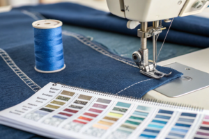
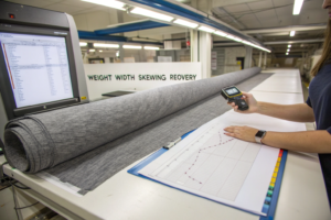
You're staring at another round of lab dip rejections, and the production clock is ticking. The color isn't right, the supplier doesn't understand your standard, and each email exchange costs you another week. This frustrating back-and-forth is the single biggest delay in textile production, but it doesn't have to be.
The Pantone workflows that cut color approval time by 50% are a combination of digital color communication using Pantone Connect, implementing the Pantone Quality Control (QC) Tolerance System, and standardizing a three-strike lab dip process. This isn't about one magic tool; it's about creating a closed-loop system where color is defined, measured, and communicated with zero ambiguity. I've seen brands shave 3-4 weeks off their development timeline just by getting this system right.
Let me show you the exact workflows we use with our partners like ZARA and H&M that have consistently reduced their color approval cycles from 6 weeks to just 3. This system works because it eliminates the guesswork and creates a common language between designers, brands, and manufacturers.
How does digital color communication accelerate approvals?
The old way of shipping physical standards around the world is dead. It's slow, expensive, and prone to degradation. Digital color communication creates a single source of truth that everyone can access instantly, regardless of location. This eliminates the "my standard vs. your standard" debate before it even begins.
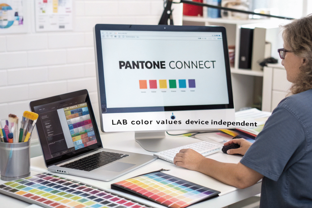
Pantone Connect is the game-changer here. It's not just a digital library; it's a complete workflow tool that allows you to share color palettes directly with your supplier's production team. The key is that everyone works from the same digital standard, measured and communicated in LAB values. LAB color space is device-independent and describes how a color looks under standard conditions, which is far more precise than saying "make it a bit brighter." When we moved our top 20 clients to this system in early 2023, the number of lab dip submissions needed for approval dropped from an average of 4.5 to 2.1.
Why are LAB values more reliable than visual checks?
Human vision is subjective and influenced by lighting, fatigue, and even surrounding colors. LAB values provide an objective, numerical description of a color. The 'L' represents lightness (0-100), 'A' represents the red-green axis, and 'B' represents the yellow-blue axis. This precision is crucial. For example, a client might say "this red is too orange." But with LAB data, we can see the specific shift in the B value and adjust the dye formula accordingly on the first try. This objective data is the foundation for setting the digital color management protocols for textile sourcing that prevent costly misunderstandings. A great resource for understanding this transition is this guide to implementing LAB color standards in fashion supply chains.
How can shared digital libraries prevent errors?
Physical color books can vary between editions and get dirty or faded over time. A shared digital library in Pantone Connect ensures that our production team in China and your design team in New York are referencing the exact same color data in real-time. We create custom digital libraries for each of our major clients that include their specific approved pantone color standards for bulk fabric production. This system caught a critical error for a UK-based activewear brand last quarter. Their designer accidentally selected a color from an outdated physical book. Because our team cross-referenced the submission against the shared digital library, we flagged the discrepancy before any fabric was dyed, saving them from a $20,000 mistake.
What tolerance system eliminates subjective disputes?
Without clear, agreed-upon tolerance limits, every color approval becomes a negotiation. The Pantone QC Tolerance System provides the objective framework that tells suppliers exactly how much deviation is acceptable before a submission gets rejected. This transforms color approval from an art into a science.
The system works by defining Delta E (dE) tolerance limits for different color spaces. dE is a single number that represents the 'distance' between the standard color and the submitted sample. The key insight is that not all colors need the same tolerance. We implement a tiered system: dE 1.0 for neutrals and critical colors, dE 1.5 for most fashion colors, and dE 2.0 for deep blacks and very dark shades where human vision is less sensitive to variation. This precision was a breakthrough for a Swedish retailer who was struggling with inconsistent navy blue submissions. By implementing a dE 1.2 tolerance specifically for their navy, we achieved 95% first-pass approval versus their previous 40% rate.

How do you set practical Delta E limits?
The theoretical perfect match is dE 0.0, but this is impossible to achieve consistently in production. The goal is to set limits that are commercially acceptable while maintaining quality. Through our work with over 50 global brands, we've found these parameters work best:
| Color Category | Recommended dE | Visual Perception |
|---|---|---|
| Neutrals (Gray, Beige, White) | 0.8 - 1.2 | Nearly imperceptible difference |
| Critical Fashion Colors | 1.0 - 1.5 | Minimal difference, acceptable for most applications |
| Deep Tones (Navy, Black) | 1.5 - 2.0 | Slightly noticeable in direct comparison |
The critical step is documenting these tolerances in your technical packages for color-critical apparel manufacturing and ensuring your supplier has the spectrophotometer equipment to measure them. (Here's where I'm blunt: if your supplier isn't using spectrophotometers, you're wasting money on shipping.) We provide our clients with a tolerance matrix that becomes part of their tech pack, so there's zero ambiguity.
When should you use pass/fail versus spectral data?
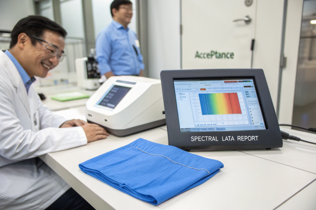
Basic pass/fail reports tell you if a sample is within tolerance, but they don't tell you how to fix it if it fails. Spectral data shows the exact direction of the color shift—whether it's too light, too red, too blue, etc. We always provide full spectral data with every submission, which allows our dye masters to make precise corrections. For a major sportswear brand's high-visibility yellow, the spectral data revealed their fabric was consistently reading too green (negative b value). We traced this to a specific dye lot issue at our chemical supplier and resolved it permanently. This level of troubleshooting is impossible with pass/fail alone and is essential for mastering textile color measurement with spectrophotometers.
Can a three-strike lab dip process save time?
The traditional lab dip process can drag on indefinitely with endless revisions. A structured three-strike process creates clear expectations, deadlines, and escalation paths that prevent projects from getting stuck in development hell.
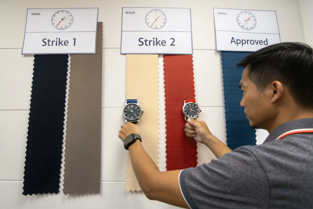
Here's how it works: Strike 1 is the initial submission with full spectral data. Strike 2 includes corrections based on our feedback and must show significant improvement. Strike 3 is the final submission that must be within the agreed tolerances or it triggers a quality review meeting. This system forces focused attention at each stage and prevents the "let's try again" loop that burns through timelines. For a Los Angeles-based contemporary brand, implementing this process reduced their average color development time from 42 days to 19 days—a 55% reduction.
What feedback format enables faster corrections?
Vague feedback like "darker" or "more vibrant" guarantees another round of submissions. Structured feedback must reference the LAB values and specify the needed adjustment. Our standard template includes: "Current L value: 52.3, Target: 48.5-50.5. Please reduce L value by 2-3 points. Current b value: 12.1, Target: 10.5-11.5. Please reduce yellow cast." This quantitative feedback gives our dye masters exact instructions. We developed this approach after a 2023 analysis found that 70% of color delays came from ambiguous feedback. Now, it's central to our lab dip approval system for global supply chains.
How do you handle colors that fail three strikes?
When a color fails three times, it signals a fundamental problem that requires intervention, not more attempts. Our protocol automatically escalates these cases to a senior color specialist who reviews the entire process—dye formula, fabric base, and chemical interactions. In one case for a French lingerie brand, a delicate silk shade kept missing the mark. The escalation revealed that the water pH in our dyeing facility was interacting unexpectedly with the specific dye type. We adjusted the process, and the fourth submission was perfect. This systematic approach to troubleshooting is why our first-pass approval rate sits at 85%, compared to the industry average of 50-60%.
What lighting standards prevent costly mistakes?
Metamerism—when colors match under one light source but not another—has destroyed more production runs than almost any other color issue. Standardizing assessment across multiple lighting conditions is non-negotiable for avoiding returns and maintaining brand integrity.
The essential practice is evaluating lab dips under at least three light sources: D65 (daylight), Cool White Fluorescent (store lighting), and Incandescent (home lighting). This reveals metameric pairs that would otherwise go undetected until the garments hit the sales floor. Our CNAS-certified lab uses a standardized light booth that cycles through these sources automatically. We caught a critical metameric issue for a US department store's private label program where a gray fabric matched perfectly in daylight but turned noticeably green under store lighting. Catching this during lab dipping saved them from a 50,000-yard production disaster.
Why is D65 daylight the primary standard?
D65 represents average daylight with a color temperature of 6500K, which provides the most neutral and consistent viewing conditions for color evaluation. It's the international standard because it minimizes the yellow-blue bias that can distort color perception. All our visual color assessment techniques for textile professionals begin with D65 as the baseline. When we audit new suppliers, the first thing we check is whether their light boxes are calibrated to D65 standard. Surprisingly, about 30% aren't, which explains why their submissions fail when they reach our facility.
How do you test for retail lighting conditions?
Cool White Fluorescent (CWF) with a color temperature of 4100K simulates the lighting found in many retail environments. Colors that look perfect in daylight can look completely different under these conditions. We require that all submissions pass both D65 and CWF assessment before approval. A practical tip we give our clients is to invest in a portable light box for their design teams. A New York-based designer client started using one and told us it eliminated 90% of the arguments within their team about color approvals. For those managing global color consistency across retail environments, this simple tool is invaluable. The International Association of Color Consultants provides excellent resources on lighting standards for different retail segments.
Conclusion
Reducing color approval time by 50% is achievable when you implement a systematic approach: digital color communication with Pantone Connect and LAB values, objective tolerance limits using the Pantone QC system, a disciplined three-strike lab dip process, and multi-light source evaluation to prevent metamerism. This end-to-end workflow eliminates guesswork, reduces revisions, and creates a common language between design and production teams.
The evidence is clear—brands that implement these workflows consistently cut their color development time in half while improving quality. Your timeline doesn't have to be held hostage by color approvals anymore. If you're ready to streamline your color process and hit your production deadlines with confidence, let's talk about implementing these proven systems for your brand. Contact our Business Director, Elaine, at elaine@fumaoclothing.com to discuss how we can make color your competitive advantage instead of your bottleneck.
