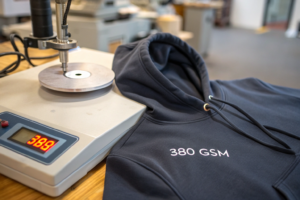
I remember the panic in my client's voice when they called me last quarter. A major US retailer had rejected their entire shipment of 50,000 units because the navy blue fabric varied noticeably between production batches. The color inconsistency was subtle but enough to create visible differences when garments were displayed together. The financial impact was devastating—over $200,000 in losses plus damaged supplier relationships. This scenario happens more often than you'd think, and it's almost always preventable with proper color verification systems.
Verifying batch-to-batch color consistency requires establishing clear Delta E tolerance targets and using physical shade bands as visual references throughout production. The process involves setting numerical color difference limits (typically ΔE ≤ 1.0 for critical applications), creating physical shade standards for each color, and implementing a rigorous QC protocol that combines instrumental measurement with visual assessment under controlled lighting. This dual approach catches both measurable color shifts and visual appearance differences that instruments might miss.
Many manufacturers make the mistake of relying solely on instrumental measurements or visual checks alone. The truth is, you need both. Instruments provide objective data and catch subtle differences the human eye can't detect, while visual assessment captures the overall appearance—including texture and metamerism effects—that a spectrophotometer might not fully represent. Let me walk you through the proven system we've refined over 15 years of supplying color-critical brands.
What are the essential tools for color consistency management?
Building a reliable color control system starts with investing in the right tools and understanding what each one contributes to the process. Trying to manage color consistency without proper equipment is like trying to measure ingredients without measuring cups—you might get close, but you'll never achieve precision.
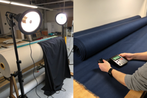
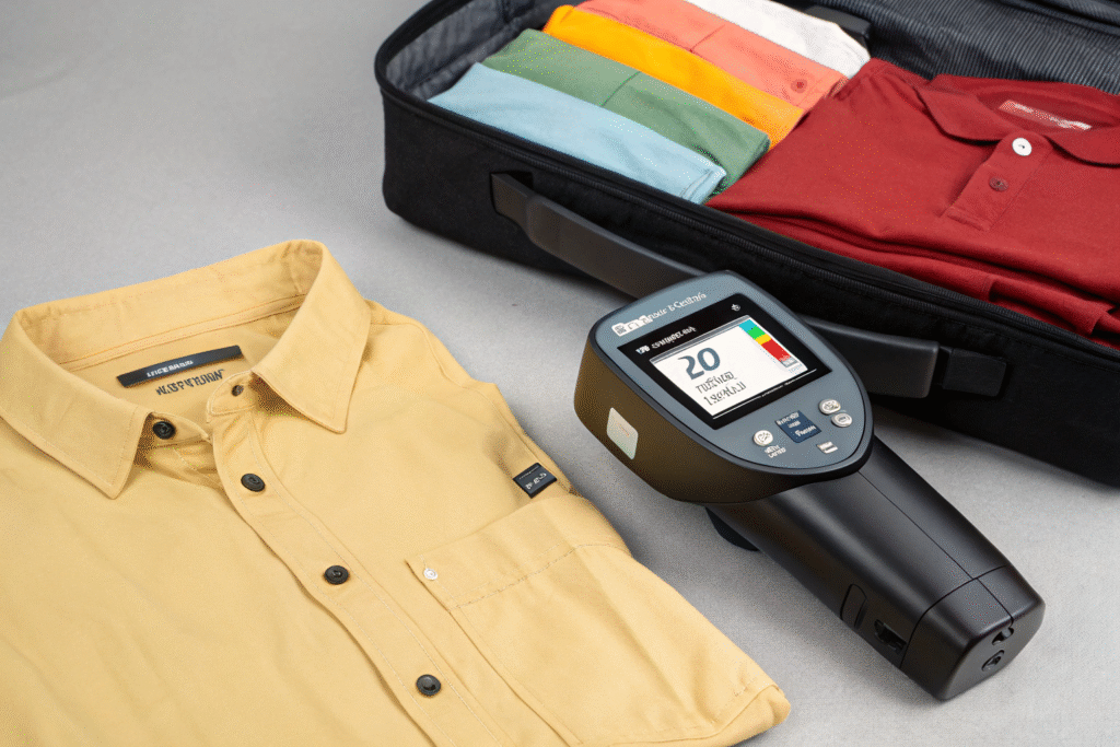
The spectrophotometer is your primary objective measurement tool. This instrument measures color numerically by analyzing how surfaces reflect specific wavelengths of light. We use portable spectrophotometers that can store thousands of standards and provide instant Delta E readings. The key is using the same instrument model and settings across all your facilities and suppliers to ensure measurement consistency. We standardized on Datacolor 800 series units across our production facilities after discovering that different instrument models were giving conflicting readings for the same fabric.
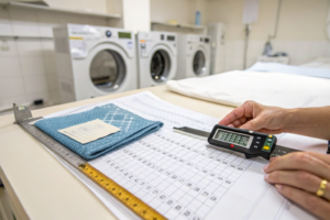
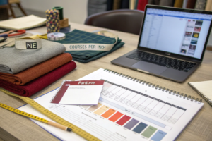
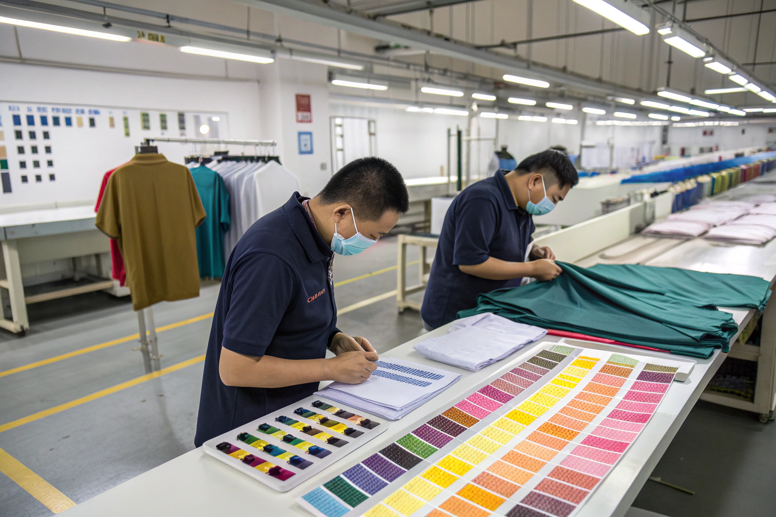
Physical shade bands are your visual reality check. These are physical fabric swatches representing the acceptable color range—typically including the standard shade, plus lighter and darker limits. We create shade bands for every color in every fabric type, as the same dye formula can look different on various base fabrics. The human eye remains surprisingly good at detecting certain types of color differences, particularly those related to texture and depth, that instruments might not capture adequately.
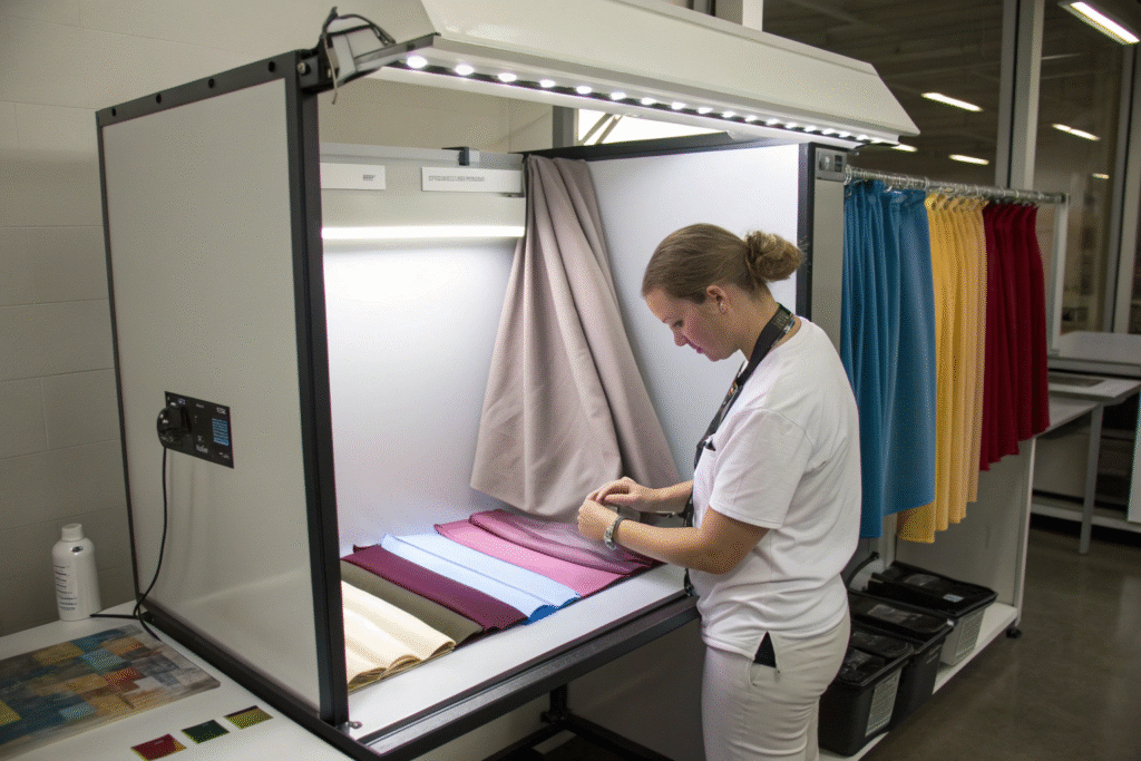
Standardized lighting is non-negotiable for visual assessment. We use D65 daylight simulators in light booths that meet international standards. This eliminates the variable of changing ambient light and ensures everyone is assessing color under the same conditions. Metamerism—when colors match under one light source but not another—is a common problem that standardized lighting helps identify early.
Why can't you rely solely on spectrophotometer readings?
While spectrophotometers provide essential objective data, they have limitations. They measure color from a small area and might miss larger-scale inconsistencies. They also can't fully capture the visual impact of fabric texture, luster, or directional effects. I learned this lesson early when a batch measured within ΔE 0.8 tolerance but looked noticeably different due to a subtle change in fabric construction that affected how light interacted with the surface. Now we always combine instrumental reading with visual assessment by trained staff.
How do you create effective physical shade bands?
Creating useful shade bands requires more than just cutting swatches. We develop a range that represents the acceptable tolerance—typically the standard plus 0.5 ΔE lighter and 0.5 ΔE darker for critical applications. Each band is clearly labeled with the color standard, date created, and ΔE value. We replace shade bands every six months as colors can fade over time, even in storage. Proper storage away from light and contaminants is essential. Following established protocols for creating and maintaining physical color standards in textile production ensures long-term consistency.
How do you establish the right Delta E targets?
Setting appropriate Delta E tolerance levels is both a science and an art. The target needs to be tight enough to ensure visual consistency but practical enough for production realities. Through years of working with brands across different market segments, we've developed clear guidelines.
For most apparel applications, we recommend ΔE ≤ 1.0 as the production target. This level is generally imperceptible to the average observer under normal viewing conditions. For critical applications like solid color dresses or matched separates where color consistency is paramount, we tighten this to ΔE ≤ 0.8. For less critical applications like printed linings or dark heavyweight fabrics where slight variations are less noticeable, ΔE ≤ 1.5 might be acceptable.
The tolerance should also consider the color position. Lighter colors and neutrals typically require tighter tolerances as the human eye detects variations more easily in these ranges. A ΔE of 1.0 in a beige fabric is much more noticeable than the same ΔE in a deep navy. We establish color-specific tolerances based on this understanding rather than applying one standard across all colors.
Why do different color positions require different tolerances?
The human eye has varying sensitivity to color differences depending on hue, lightness, and chroma. We're most sensitive to differences in neutral colors (grays, beiges) and light pastels, and less sensitive to variations in very dark or highly saturated colors. Our tolerance system accounts for this—we might set ΔE ≤ 0.7 for light grays and ΔE ≤ 1.2 for black. This approach balances visual requirements with production feasibility. Understanding these principles is key to setting practical color tolerance limits for textile production.
How do you handle metameric pairs in production?
Metamerism occurs when two colors match under one light source but not another. This is particularly common when using different dye classes or fiber types. We test all approvals under multiple light sources (D65 daylight, TL84 store lighting, Incandescent A) to identify potential metamerism. If metamerism is detected, we adjust the formula or, if unavoidable, get client approval specifically noting the metameric nature of the match. We recently prevented a major issue for a client whose fabric passed under D65 but turned noticeably green under store lighting—catching this during development saved a production disaster.
What does a practical batch approval workflow look like?
Having the right tools and targets means nothing without a disciplined workflow. Our color approval process has evolved through continuous improvement and learning from mistakes. Here's the system that has reduced our color-related rejections by 95% since implementation.
When a new batch arrives at our QC facility, it undergoes a 24-hour conditioning period in our standard lab environment (65% RH, 70°F). This ensures moisture content stabilizes, as humidity can significantly affect color measurement. We then take measurements from five different locations across the fabric width—both edges, both quarter points, and center—to check for side-to-side or end-to-end variation. Each measurement is compared against the stored standard, and the average ΔE is calculated along with the maximum deviation.
Visual assessment follows in our light booth with the physical shade bands. Our trained QC staff evaluates the fabric next to the standard and shade bands under multiple light sources. They specifically look for differences in depth, hue, and overall appearance that might not be fully captured by the instrument. Any batch that fails either instrumental or visual assessment is immediately rejected and returned to the dye house with specific feedback.
What are the most common causes of batch-to-batch variation?
Through years of troubleshooting, we've identified the usual suspects: dye lot variation, water quality changes, temperature fluctuations during dyeing, and differences in fabric preparation. We maintain a database of these issues and their solutions. For example, we discovered that seasonal changes in water pH at one of our dye houses was causing consistent color shifts. Installing pH correction systems solved this. Another common issue is fiber batch variation—different lots of the same fiber type can dye slightly differently, which is why we test dyeability for each new fiber lot.
How do you document and communicate color decisions?
Clear documentation prevents misunderstandings and provides a reference for future production. Our color approval reports include the average ΔE, maximum ΔE, pass/fail status, and comments from the visual assessment. We use digital systems that allow clients to view results in real-time. For approved batches, we retain physical references that are stored with the batch information. This documentation becomes invaluable when matching colors in future seasons or troubleshooting issues. The system we've developed for managing textile color data across global supply chains has been particularly valuable for clients with multiple manufacturing partners.
How do you handle failing batches and implement corrective actions?
Even with the best systems, some batches will fail color approval. How you handle these situations separates professional suppliers from amateurs. Our corrective action process focuses on both immediate solutions and preventing recurrence.
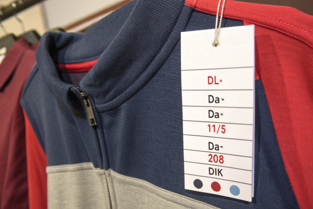
When a batch fails, we provide the dye house with specific data: which color parameters are out of tolerance (DL, Da, Db), the direction of the deviation, and the visual assessment notes. This precise feedback allows them to make targeted corrections rather than guessing. For example, if the batch is reading +1.5 Da (too red) and -0.8 DL* (slightly darker), they know exactly how to adjust the recipe.
We categorize failures by severity and frequency. Single minor failures might only require recipe adjustment, while repeated failures or major deviations trigger deeper investigation. This might involve auditing the dye house's process controls, checking raw material consistency, or verifying weighing accuracy. We maintain a supplier scorecard that tracks color consistency performance, which informs our sourcing decisions.
What's your process for evaluating and implementing shade corrections?
For batches that fail but are close to tolerance, we evaluate whether a re-treatment (additional dyeing) can bring them within spec without compromising fabric quality. We test re-treatment options on swatches before committing the entire batch. For batches too far from standard, we require complete re-dyeing. The decision balances cost, timing, and potential quality impact. Our rule of thumb: if the original ΔE > 2.0, complete re-dyeing is usually necessary as re-treatment rarely achieves good results at this level of deviation.
How do you use failure data to prevent future problems?
We analyze color failure data quarterly to identify patterns and systemic issues. This analysis led us to implement fiber dyeability testing for all incoming raw materials after discovering that 40% of our color variations stemmed from undetected fiber differences. We also share aggregated, anonymized data with our dye houses to help them improve their processes. This collaborative approach has reduced our overall color failure rate from 15% to under 3% over three years. The investment in statistical process control for textile dyeing operations has paid dividends in consistency and reduced waste.
Conclusion
Achieving consistent batch-to-batch color requires a systematic approach that combines precise instrumental measurement with trained visual assessment. Establishing clear Delta E targets based on color criticality, maintaining accurate physical shade bands, and implementing a disciplined approval workflow are all essential components. The investment in proper tools, training, and processes pays for itself many times over by eliminating costly rejections, reducing remakes, and building your reputation for reliability.
Remember that color consistency isn't just a technical requirement—it's a fundamental quality attribute that directly impacts your brand's perceived value. Customers may not notice perfect color consistency, but they will definitely notice inconsistencies. The system we've outlined has been proven across thousands of production runs and can be adapted to operations of any scale.
If you're struggling with color variations or want to implement a more robust color control system, we can help. We offer color management consulting and can set up customized systems for your specific needs. Contact our Business Director, Elaine, at elaine@fumaoclothing.com to discuss your color challenges and receive our Color Consistency Checklist with practical steps you can implement immediately.